Project: Switchback House
Architects: Edmonds + Lee Architects
Location: San Francisco, California, United States
Area: 3800.0 ft2
Project Year 2016
Photography: Joe Fletcher
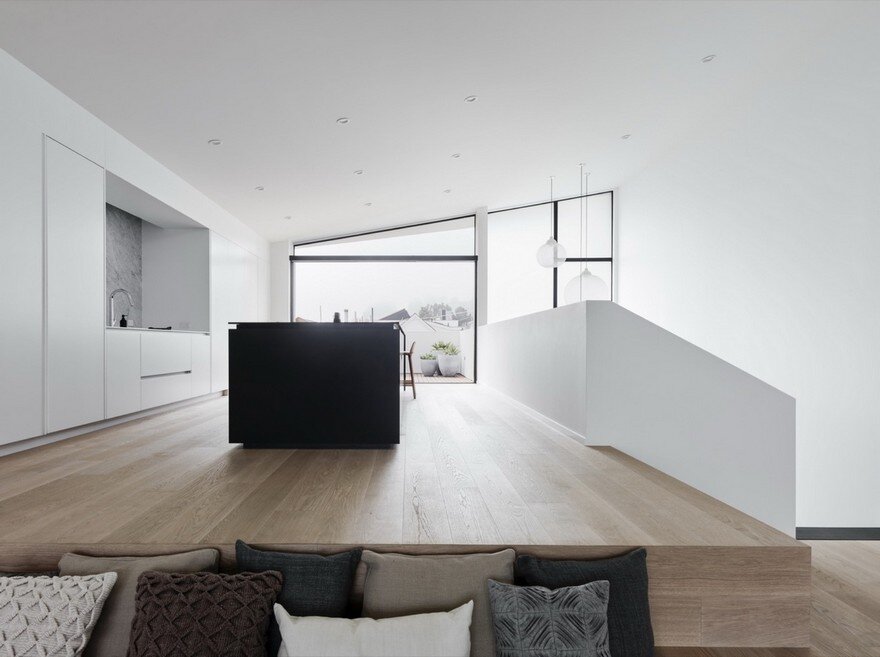
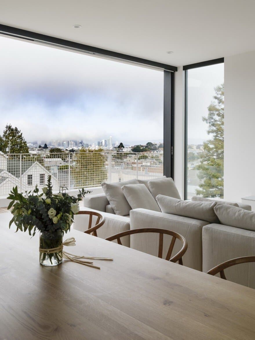
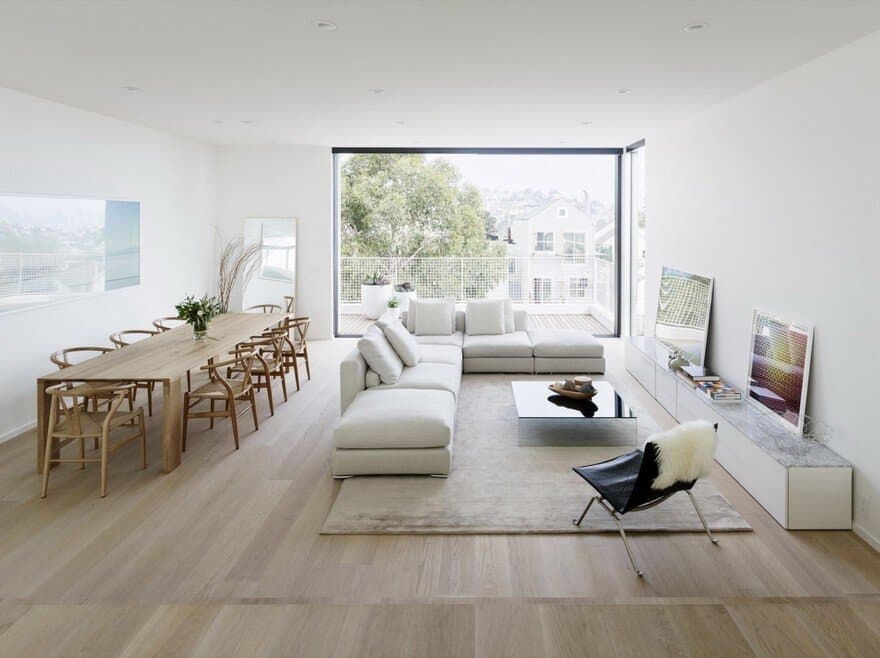
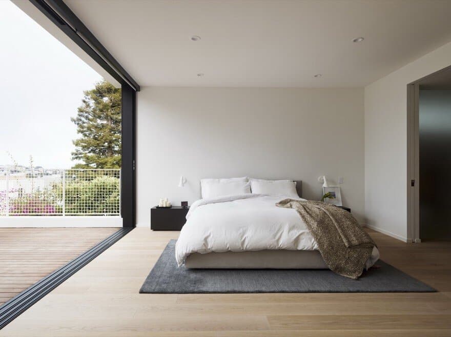
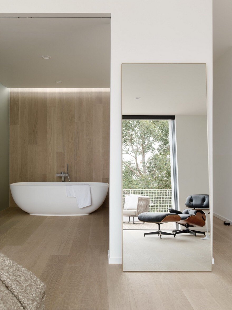
A loft-style house designed by the architects for their own family, this budget-sensitive human-scaled project wove together the architects’ deep knowledge of San Francisco’s urban context and codes with their crisp and clear material and architectural aesthetic.
Practically, the pair, who have two children, needed (at least) three bedrooms and enough living space for their family to feel perfectly situated: close enough that their now-youngish children didn’t have to be sidelined into a basement or attic, but ultimately spacious enough that as they do grow up, they can become independent – from each other, and from their parents. Edmonds + Lee also decided to divide their building into two units, making use of Lee’s development expertise combined with Edmonds’ architectural focus. The lower floor can be—and currently is used as—an income-producing rental, but the house is designed flexibly enough that the owners can turn the structure back into a single-family home.
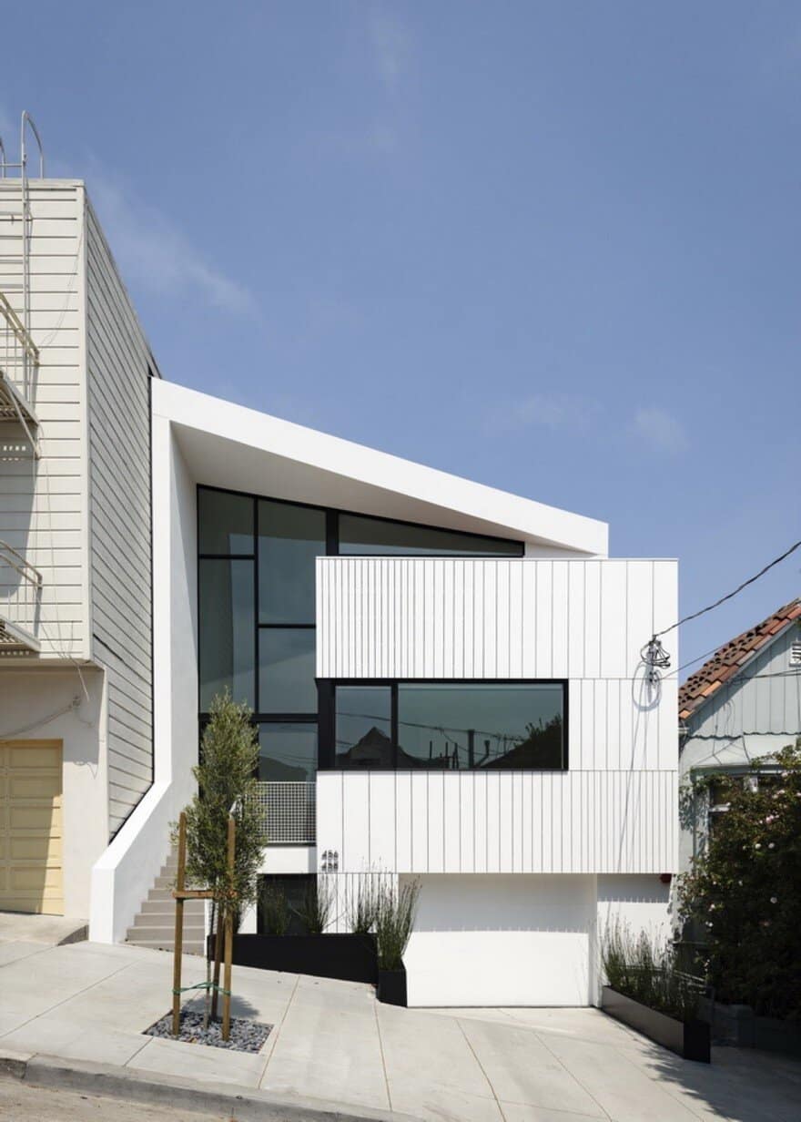
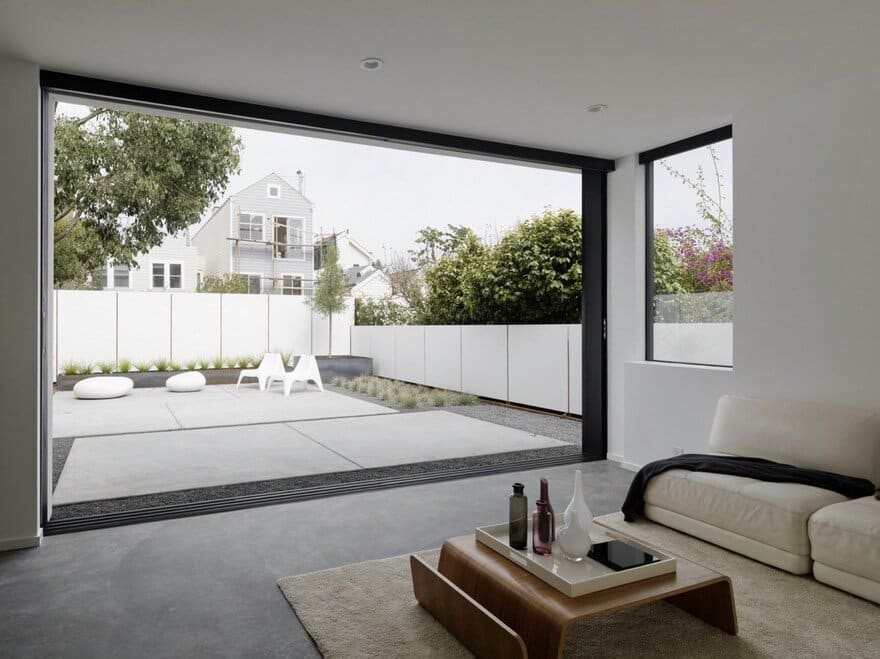
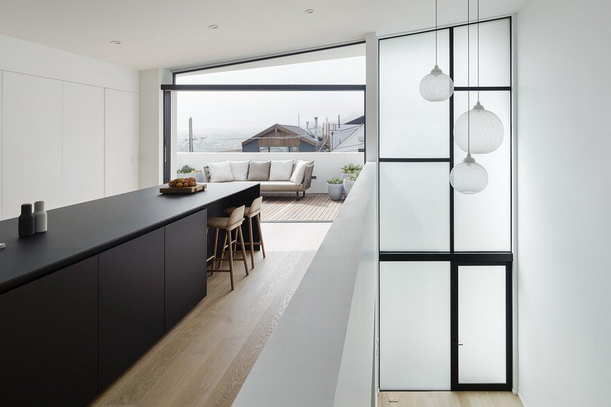
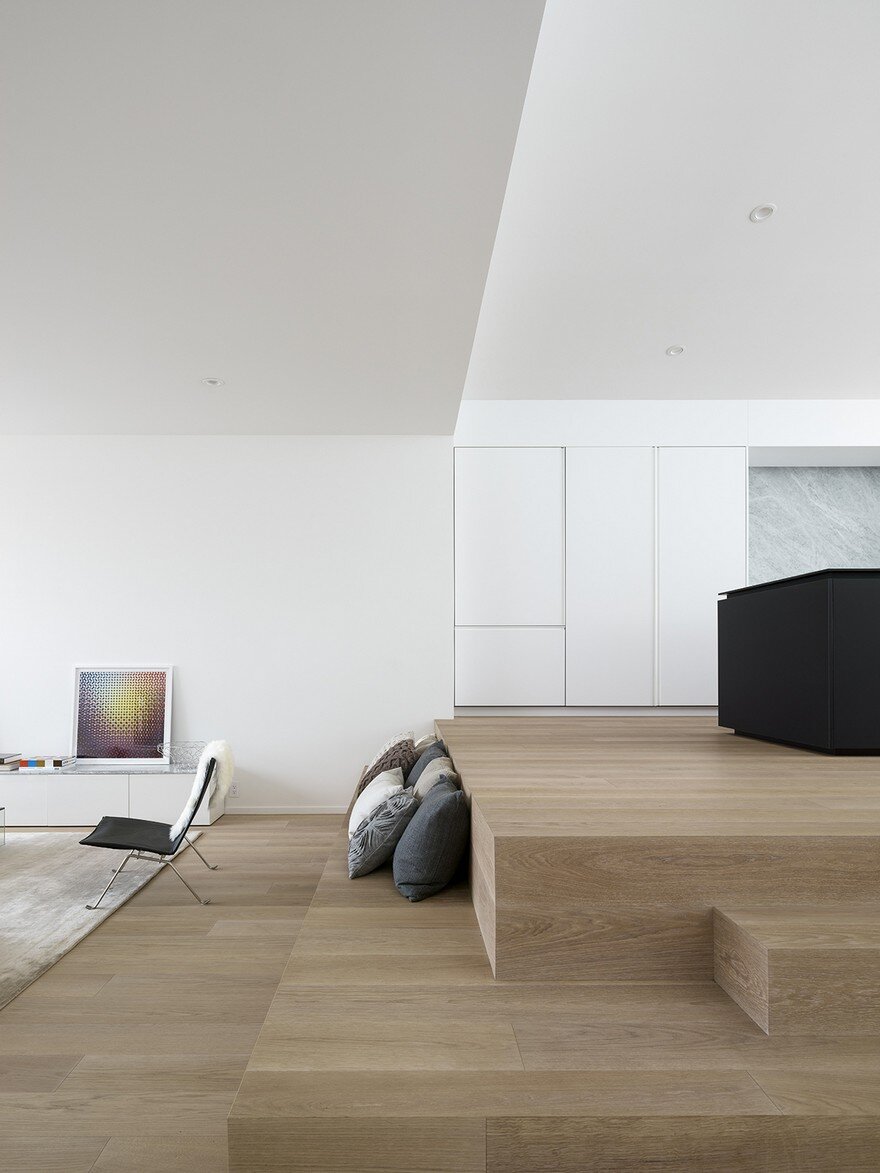
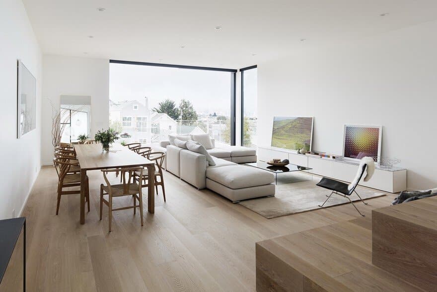
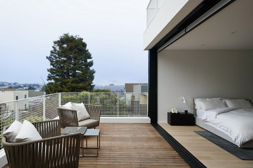
Working as not only their own clients but also their own budget-sensitive developers, the architects were able to avoid the typical market-driven pressure of maximizing square feet and instead focus on qualitative issues. As a result, they were able to work creatively—by flipping the plan to place the living room on the top floor and bedrooms on the lower level— to bring to life the feeling of loft-style living that they wanted, without giving up the intimate neighborhood feel of their immediate surroundings or the connection to San Francisco’s vibrant streets.
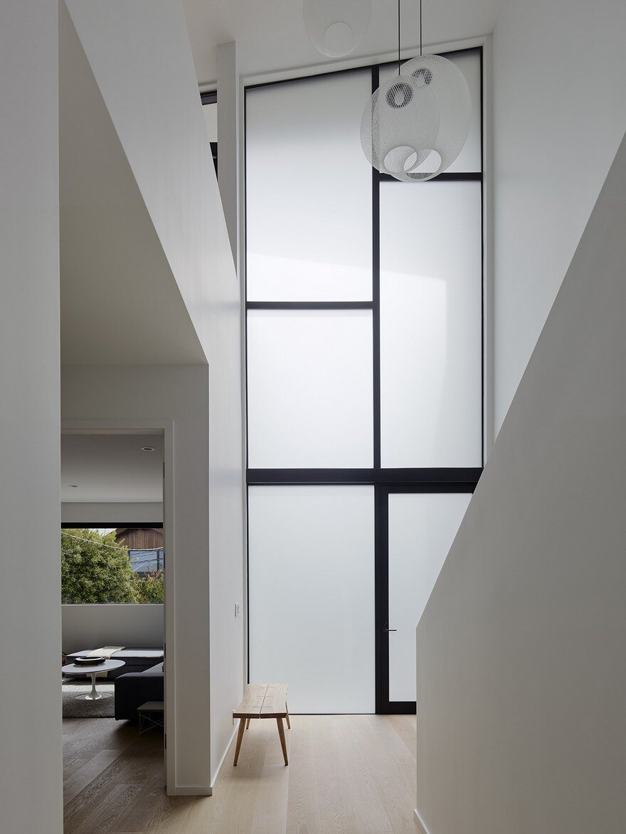
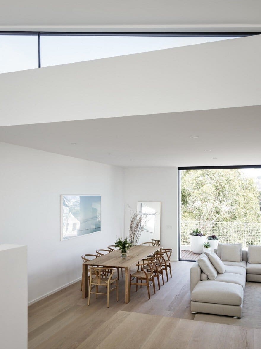
Because much of Edmonds + Lee’s practice is centered around multifamily buildings, the architects celebrated the urban density this project brings to the street. While it can feel compelling for those who have the resources to do so to try and insulate themselves from San Francisco, to use zoning and architecture to protect themselves and their families from the possible encroachment of an ever-densifying city, Edmonds and Lee wanted to celebrate the density, while still creating an interior space that feels light, airy, spacious, and open to the sky.
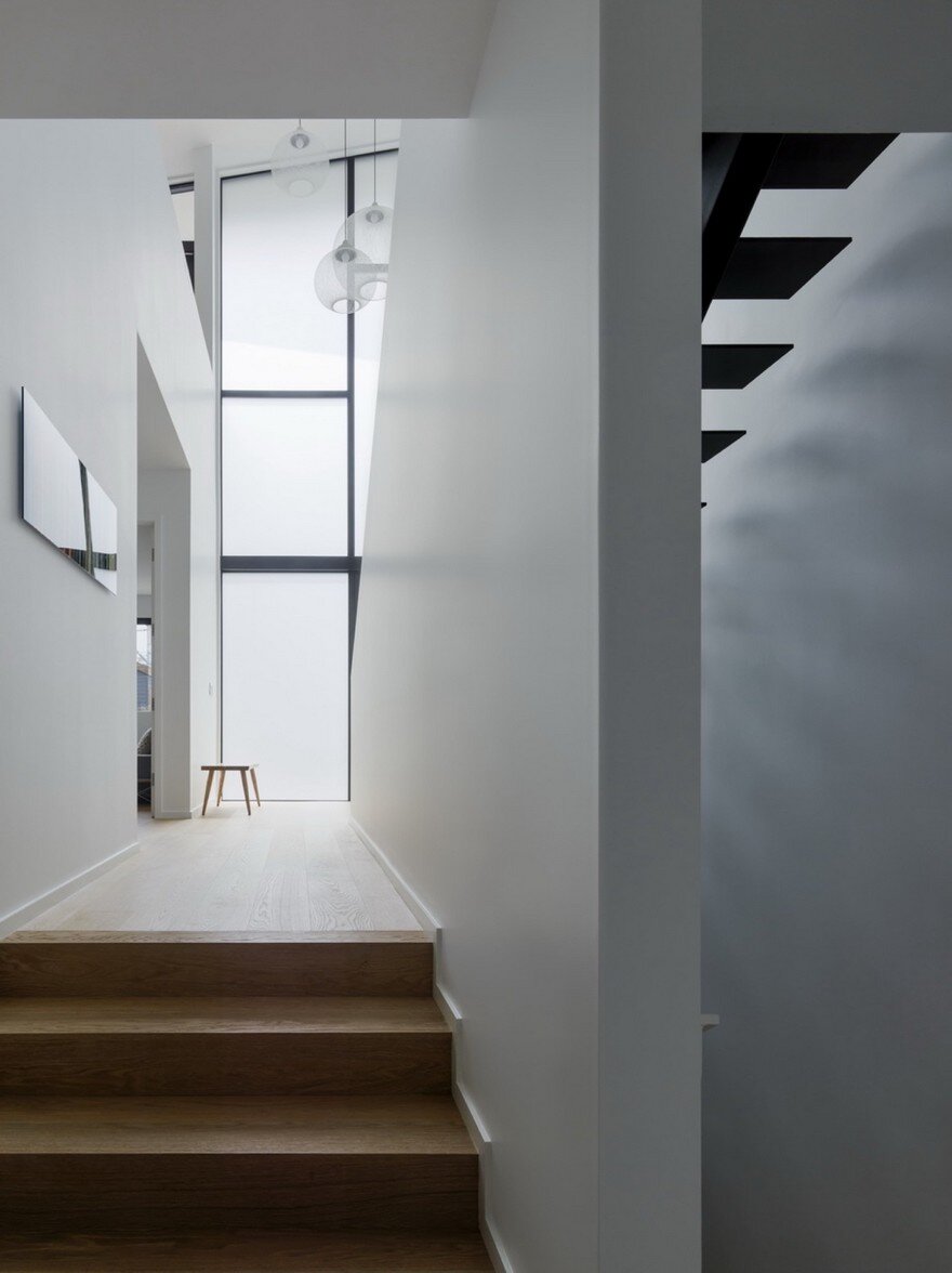
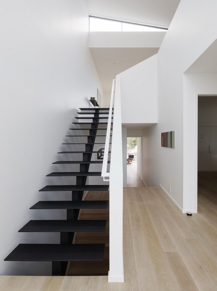
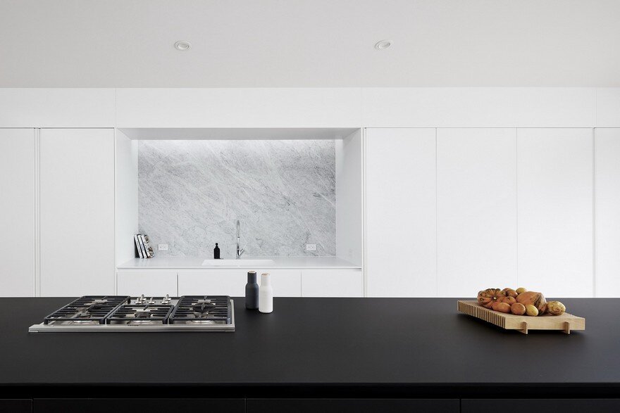
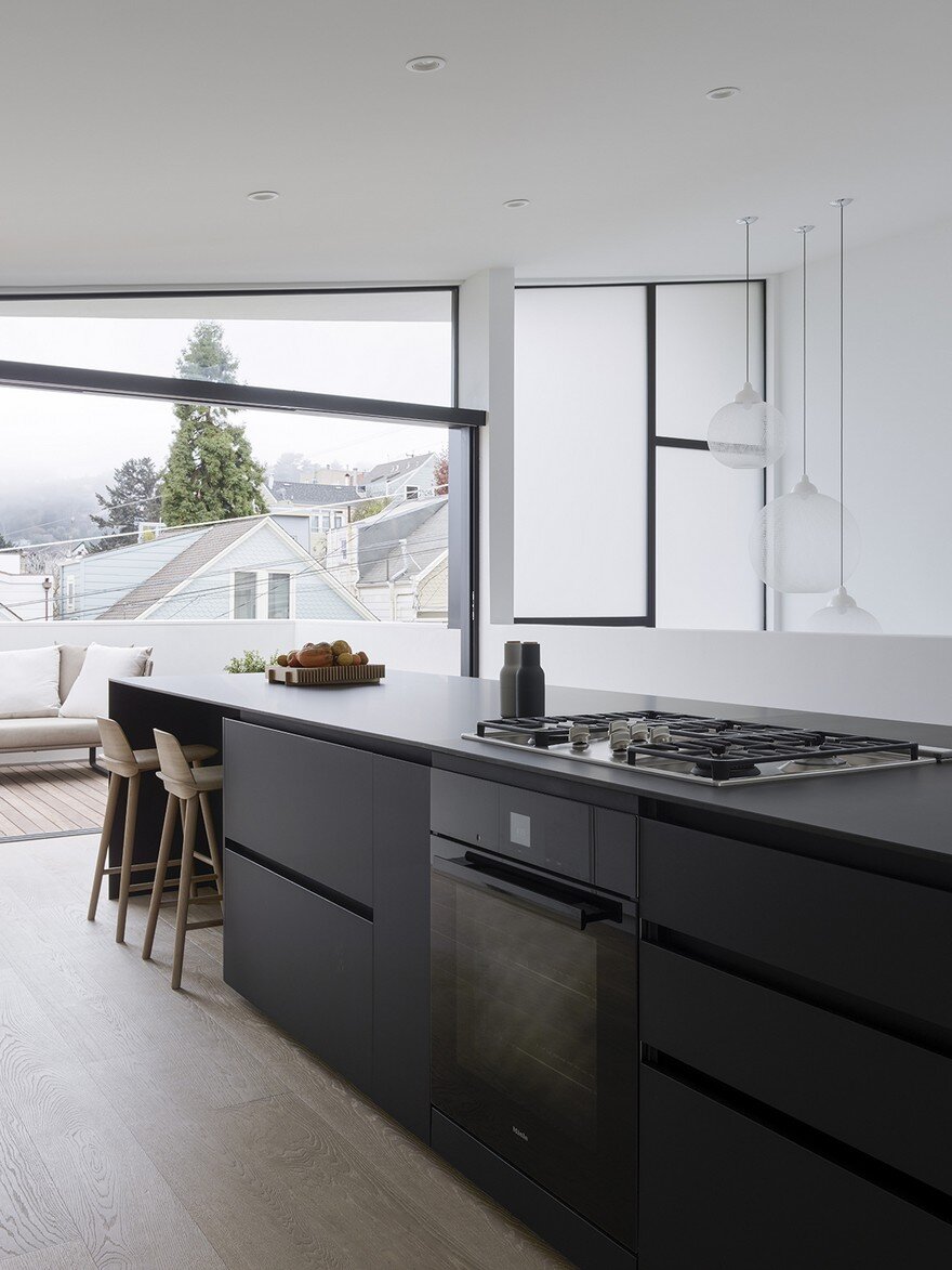
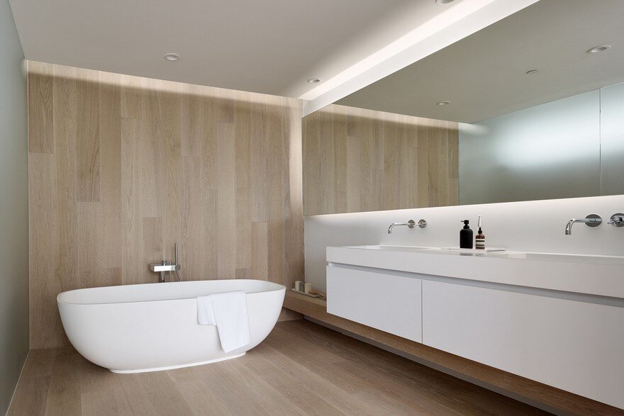
Their familiarity with common architectural constraints led to innovative cost-sensitive solutions: the guardrails are simple drywall, the stair is painted steel, and much of the house’s detailing made creative use of everyday materials. The facade is built from a rhythmic display of pre-manufactured trim boards; the sinks are molded Corian; and the architects undertook the ultimate Ikea Hack: measuring the standard size of the big-box retailer’s shelving, and building closet spaces to fit to the centimeter, creating a custom millwork-level aesthetic for a fraction of the price. And that’s central to the magic of the house; it was built by people who really do live within a budget, who had a vested interested in building within that budget, who experience financial as well as design constraints, but who embraced and celebrated these limitations and used them to give rise to incredibly creative and aesthetically compelling solutions. Working on Switchback reminded Edmonds and Lee of their time at Columbia as it became almost like a school project, part unshakable rules, and equal part unshakable excitement for pushing the envelope wherever it can be furthered.

