Designer: Black & Milk
Project: Modern New Home in Hampstead
Team: Olga Alekseev, Anatoly Alekseev
Architect: Claridge Architects
Location: Hampstead, London, UK
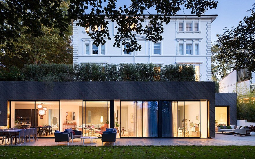
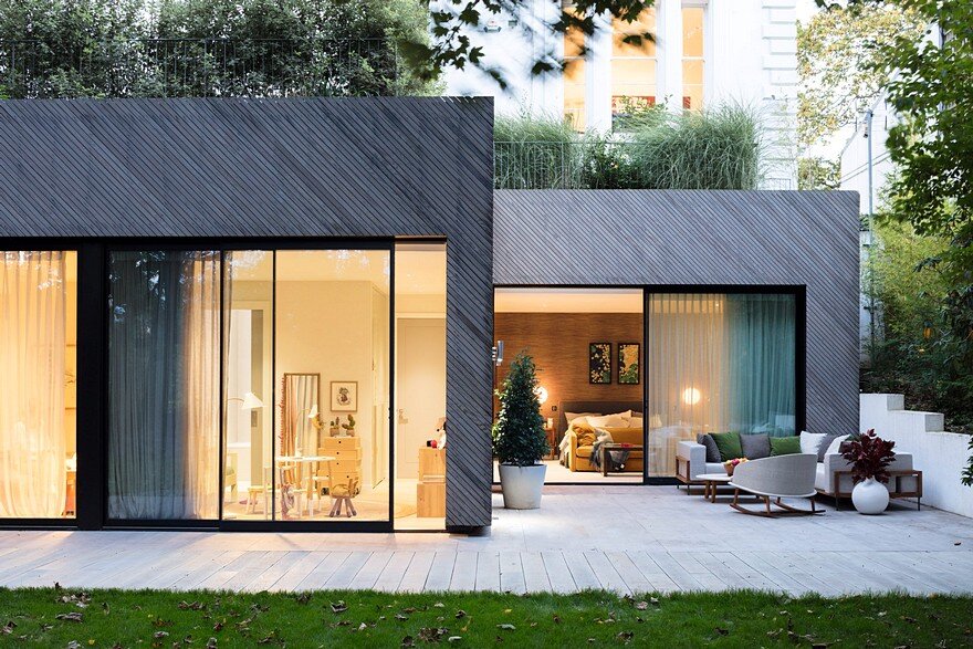
A young family bought this newly built home from a property developer. They loved its location in Hampstead, north London, a neighbourhood with a village feel bordered by heathland and woods, but weren’t keen on the generic, luxury look the developer had chosen for its interior. The house is minimal and contemporary, yet its decor was more suited to a period home with high ceilings. The new owners wanted modern interior design, to complement the property’s exciting architecture. We replaced the predictable, off-the-peg look the developers had used with a scheme that feels contemporary but also personal, designed to suit the owners’ sociable lifestyle. Huge picture windows in every room overlook ancient woodland, so inviting nature in was also important. This was to be a design-conscious but relaxed home, that wears its luxury fixtures and finishes lightly.
About the Modern New Home
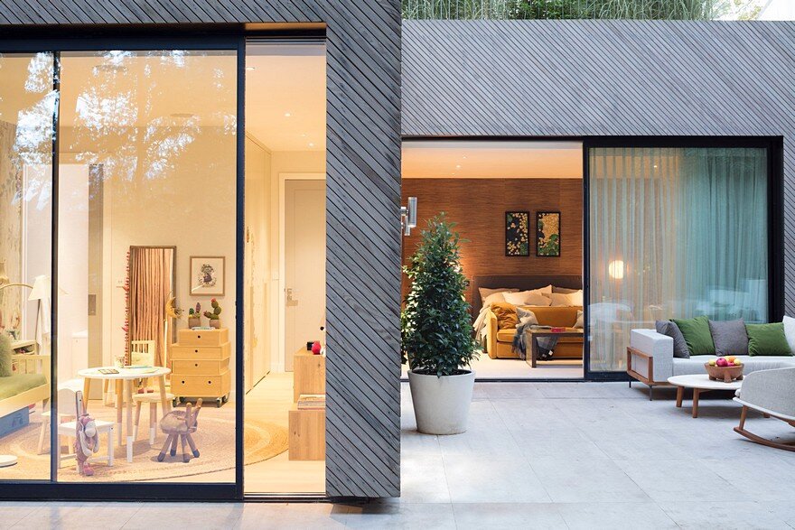
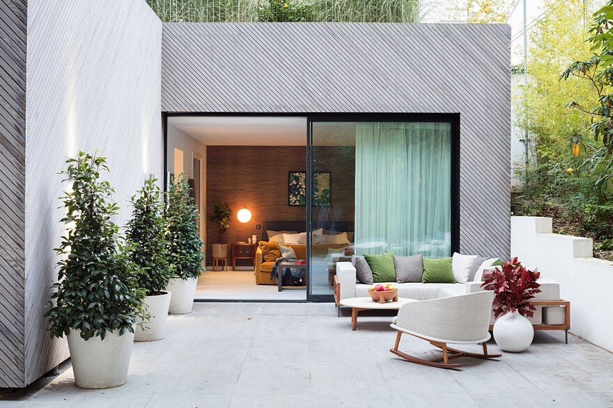
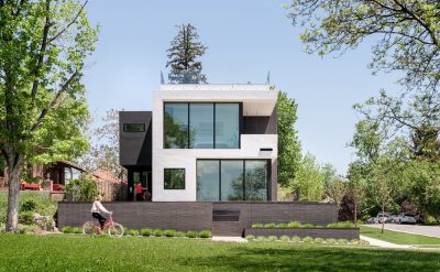
The house was designed by award-winning practice Claridge Architects. It has a generous open-plan living space, three bedrooms all with ensuite bathrooms, an additional guest bathroom with a concealed shower, and a TV room. It sits within a generous garden on a private development in Hampstead, London. It has a footprint of 200 sq m with 2.7m ceilings, and each room boasts floor to ceiling windows. Kebony, a sustainable alternative to tropical hardwood, has been used extensively in the build. The property was included in London’s annual Open House event, a celebration of the capital’s best architecture.
Space Layout in Modern New Home
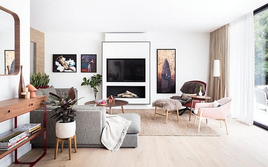
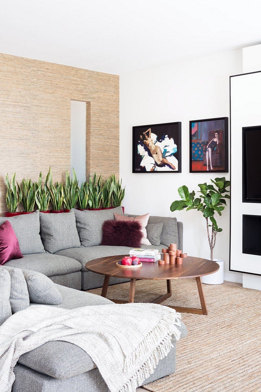
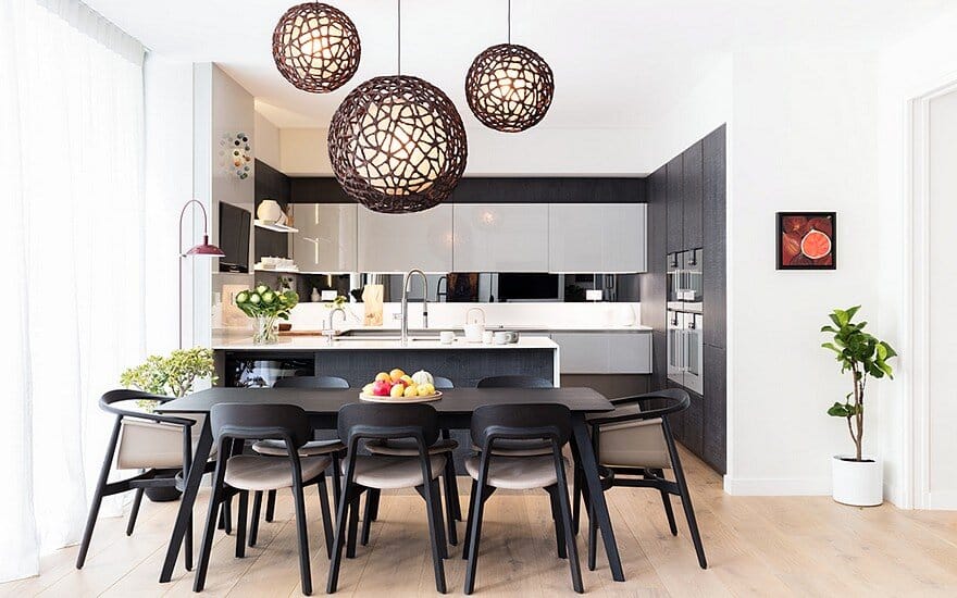
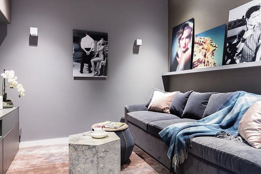
The original layout was sound, but we fine-tuned some details to make the best use of space and ensure this home really suits its owners and their lifestyle. The living room was tweaked to create a large seating area with a corner sofa and a separate reading area. We also designed a contemporary fireplace, with an easy-to-use bioethanol fire. The flexible dining space has a table that suits family meal times, but when friends and relatives visit, it can extend to seat a party of 10. We added a sofa bed in the TV room and converted the cloakroom into a guest bathroom, with a shower hidden behind a bespoke glass and iron partition made in Italy. We also redesigned the shower room to make better use of its space, and installed a tub for child-friendly bath times.
The flooring
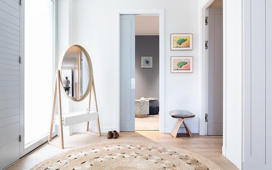
Understated luxury, with plenty of warmth, texture and natural materials, is at the heart of this home’s look. That’s why we replaced the original grey floor tiles – too cold! – with wide engineered oak boards, laid over underfloor heating.
The bathrooms
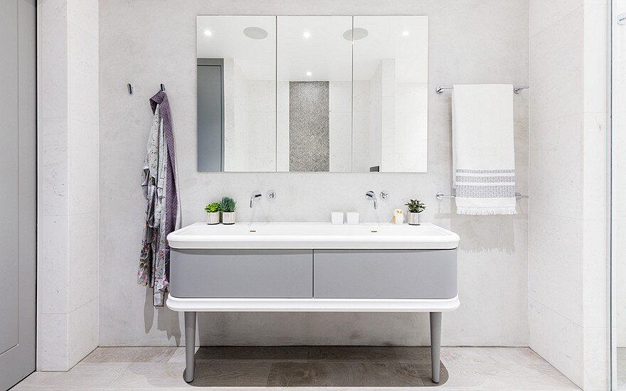
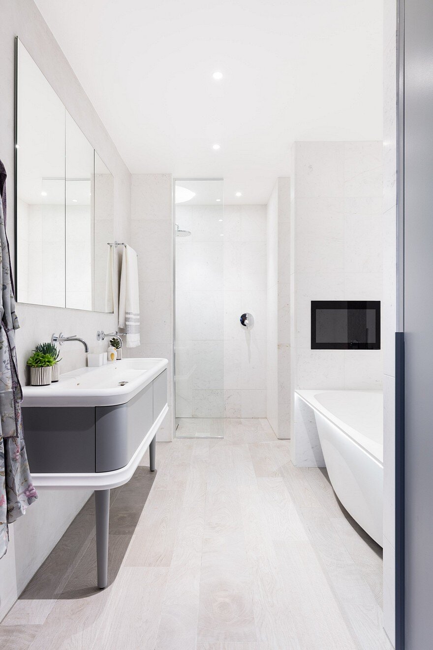
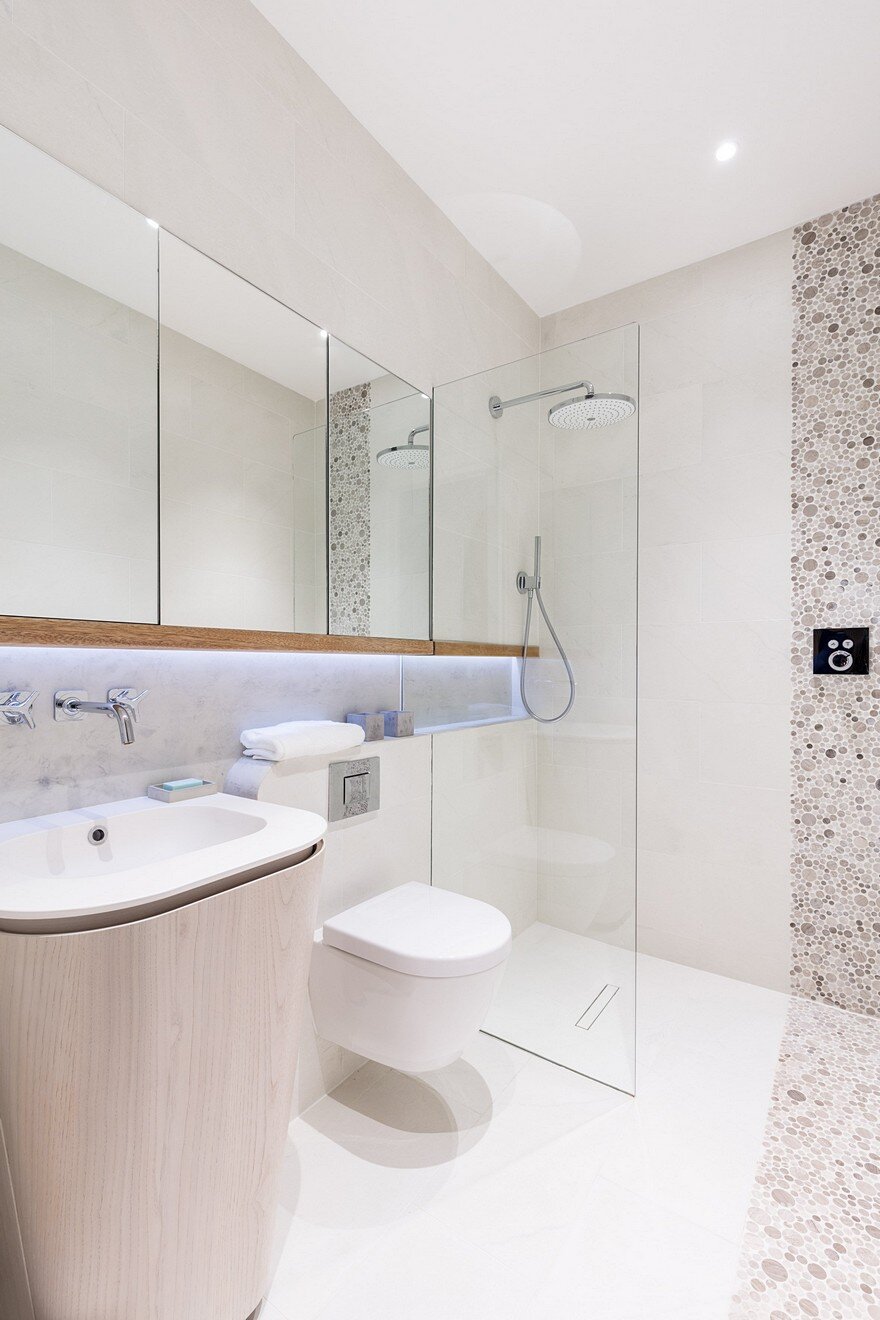
In the guest shower room, black ironwork references the house’s window frames. We teamed it with Beton Cire, a form of fine plaster made in France, on the walls. In the other three ensuite bathrooms, natural wood features on the floor, vanity units and decorative panels, for warmth. In the kid’s bathroom, we used handcrafted red-dotted tiles from Domus for a pop of fun. The mix of materials in all the bathrooms – concrete, ironwork, wood, and glass – keeps them looking contemporary, but also cosy.
The walls
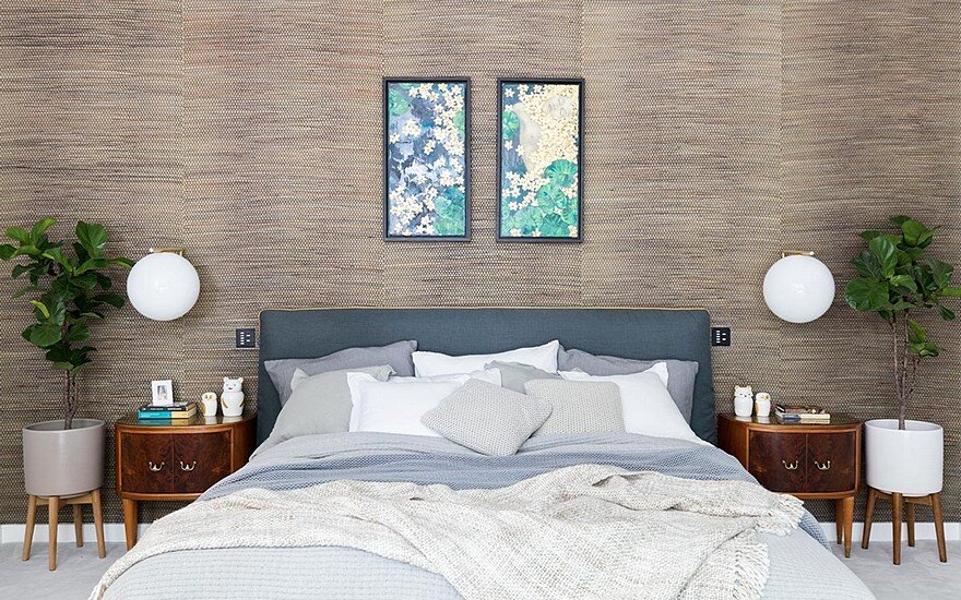
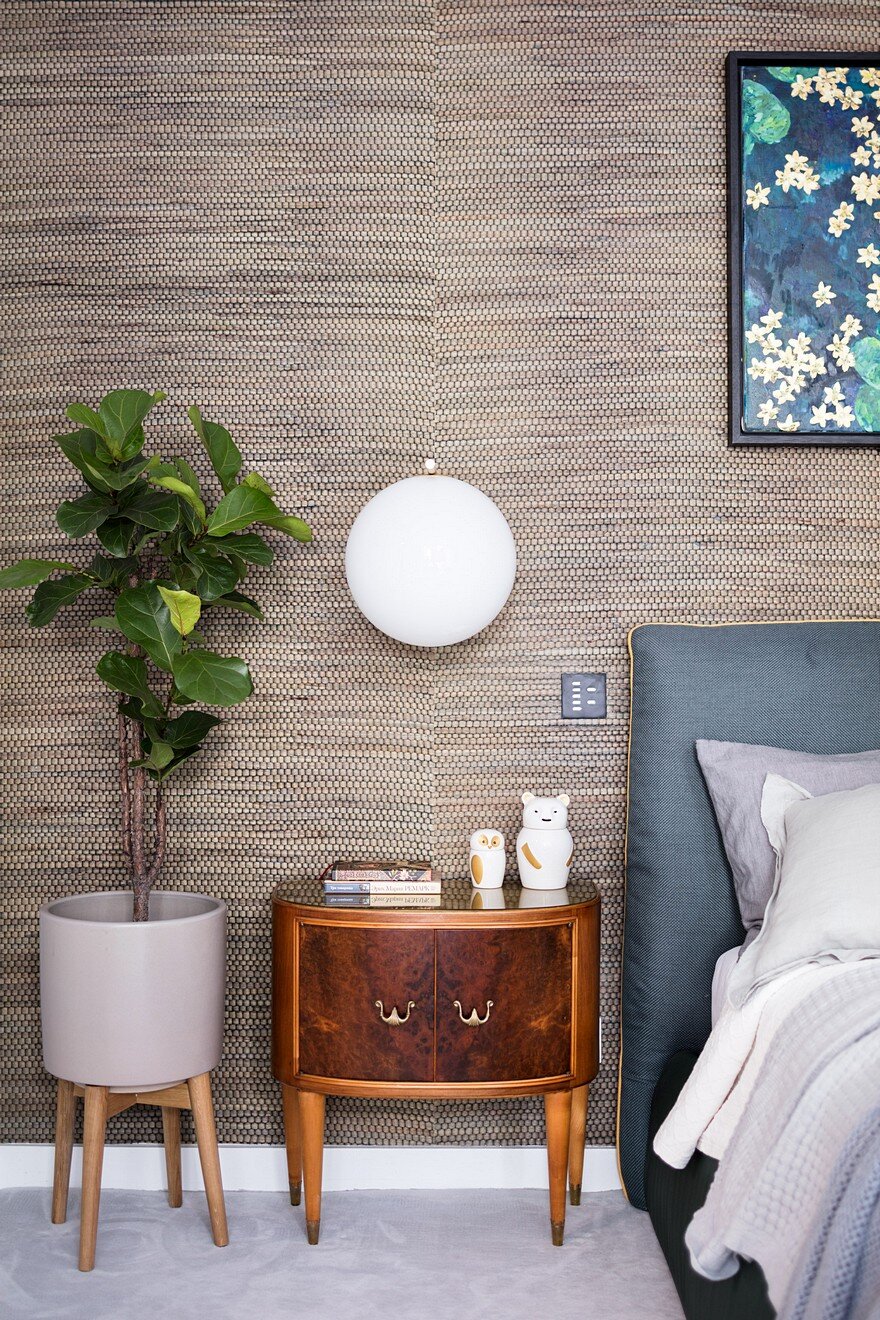
We kept to a neutral colour scheme but added feature walls of natural fibre wallpaper from Phillip Jefferson to create a cosy atmosphere, introduce some texture and connect outside with in.
The furniture
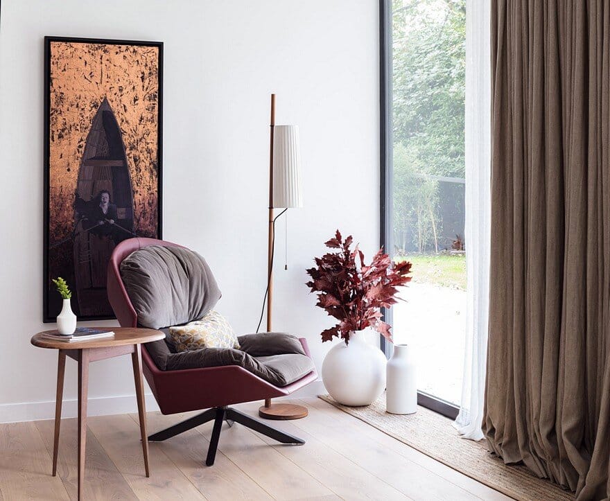
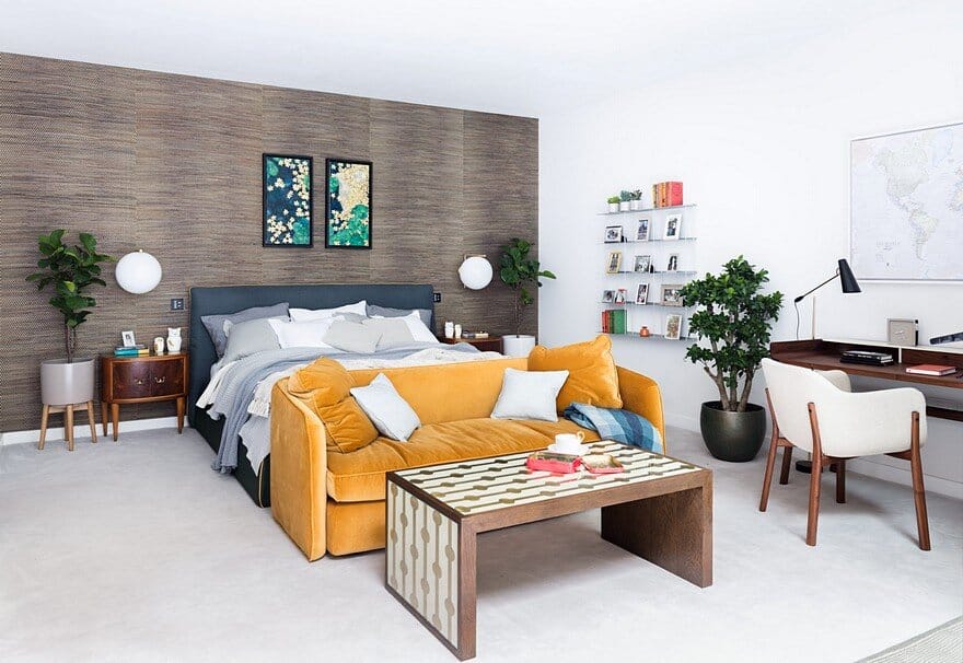
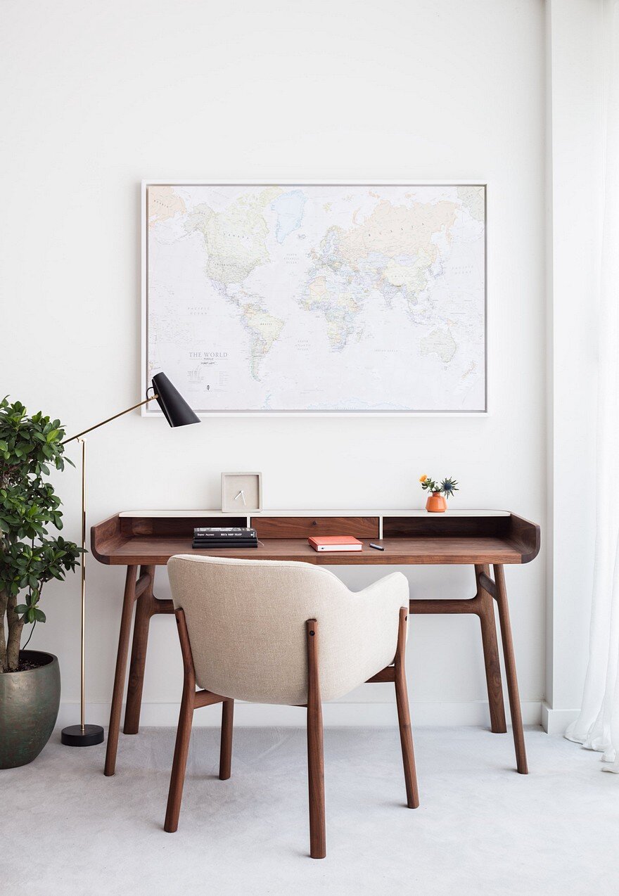
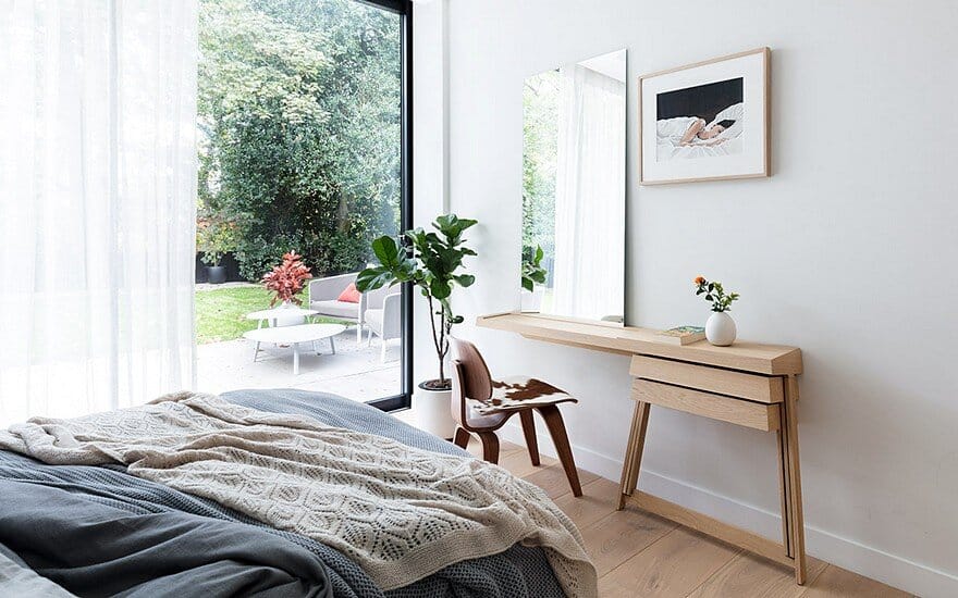
We have thousands of contacts in the design world and trawled them to find the perfect furniture for this home. We sourced pieces and fittings from over 30 different suppliers in 15 countries. The walnut coffee table was made by a Canadian craftsman, while the statement armchair is by Italian furniture maker Moroso. For a bespoke edge, we also upholstered some pieces in fabric specifically chosen to complement this scheme. The corner sofa from Scandinavian design team Norr11, for example, is covered in Kvadrat fabric. In the master bedroom, we tweaked the clean modern look by adding 1950s side tables by Osvaldo Borsani, found at a London vintage fair. In the study area, we used De La Espada furniture – its design and exceptional quality fits beautifully with this home’s aesthetic.
The colour scheme
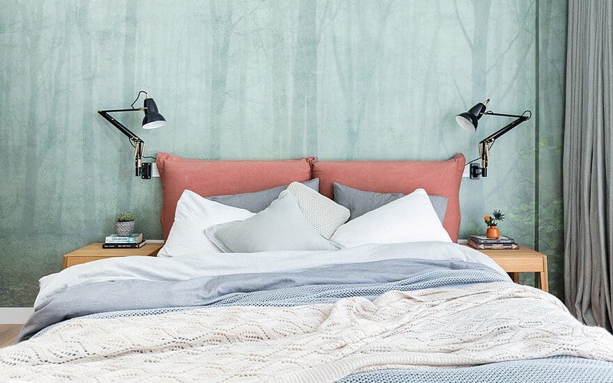
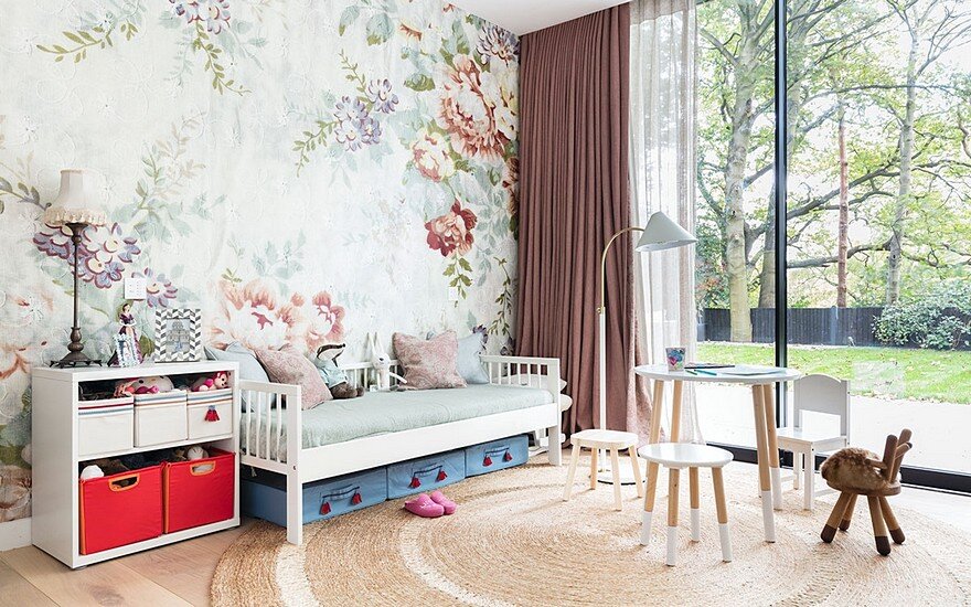
Natural tones run throughout, with each room boasting its own palette. The living room looks to autumn for inspiration, with earthy colours, burgundy accents and pops of black that tie in with the window frames. In the guest bedroom, shades of light blue, salmon and green combine. The child’s bedroom is mostly neutral, but one wall is papered with an oversized floral pattern to bring in the ‘wow’ factor. Dusky-rose curtains complement, to create a scheme that’s unexpected and not remotely babyish. The master bedroom is the most colourful, with a natural fibre wallpaper in woody brown teamed with a bed upholstered in dark blue-grey fabric. The bright mustard colour of its piping runs onto the velvet sofa, and all the tones are balanced by pale walls and floors, for a scheme that’s original, but also relaxed.
The lighting
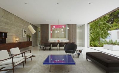
The house gets plenty of light through large windows and from spotlights fitted throughout, but we’ve supplemented this with a mix of ceiling, wall and floor lights, which zone the space and create a more intimate atmosphere. Beautiful round pendants by Kenneth Cobonpue, handmade in the Philippines, bring dramatic impact to the dining area while the floor lamp by Matthew Hilton is the perfect finishing touch for the reading area. Its slim silhouette doesn’t draw attention away from the striking artwork by Canadian artist Sandra Lamb, and its narrow, pleated shade seems to mirror the washed linen curtains in the background.
The artwork and decorative items
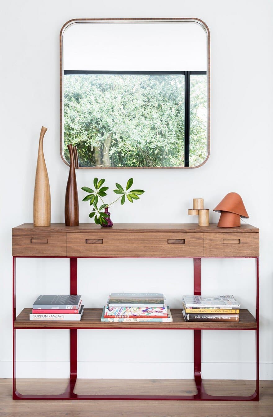
Creative styling transforms a good-looking house into a really personal and complete home. That’s why we spent lots of time choosing the right accessories and textiles. We sourced hemp rugs from Australia to complement the oak floor and used 100 percent washed linen for the curtains. We worked with the owners to find artworks they loved from independent galleries around the world. Each piece was delivered to our workshop so we could design frames to perfectly suit the interior. Bringing the ancient woodland that surrounds the house inside was central to this home’s design, so adding plants to every room was essential. The owners travel a great deal, so we used smart containers to keep each plant watered while they are away.

