Project: MullenLowe Ad Agency Offices
Architects: TPG Architecture
Location: Winston-Salem, North Carolina, United States
Architect in Charge: Larry Berger, RA
Lead Designer: Carly Jacobson, LEED AP
Area 37500.0 ft2
Photography: Eric Laignel
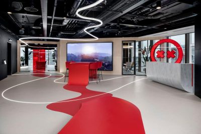
After a successful teaming for the design of their Boston headquarters, MullenLowe engaged TPG Architecture to design its new office in Winston-Salem, NC: a 37,500 square foot space in the city’s newly developed Wake Forest Innovation Quarter. The Ad Agency offices design was an opportunity to create a strong communications touchpoint expressing MullenLowe’s identity as a “challenger” in the advertising industry, a scrappy do-everything ad firm with a global reach.
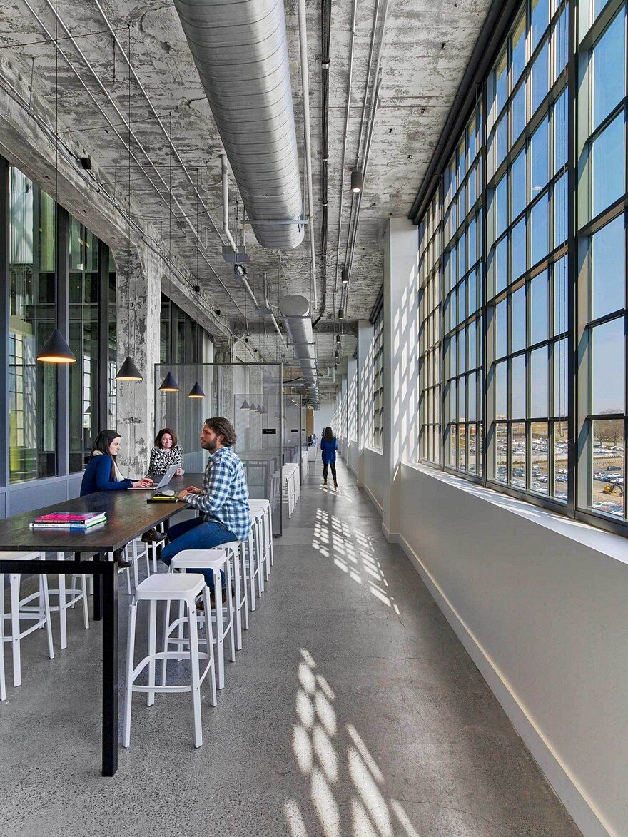
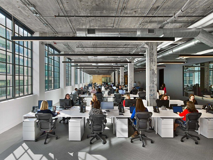
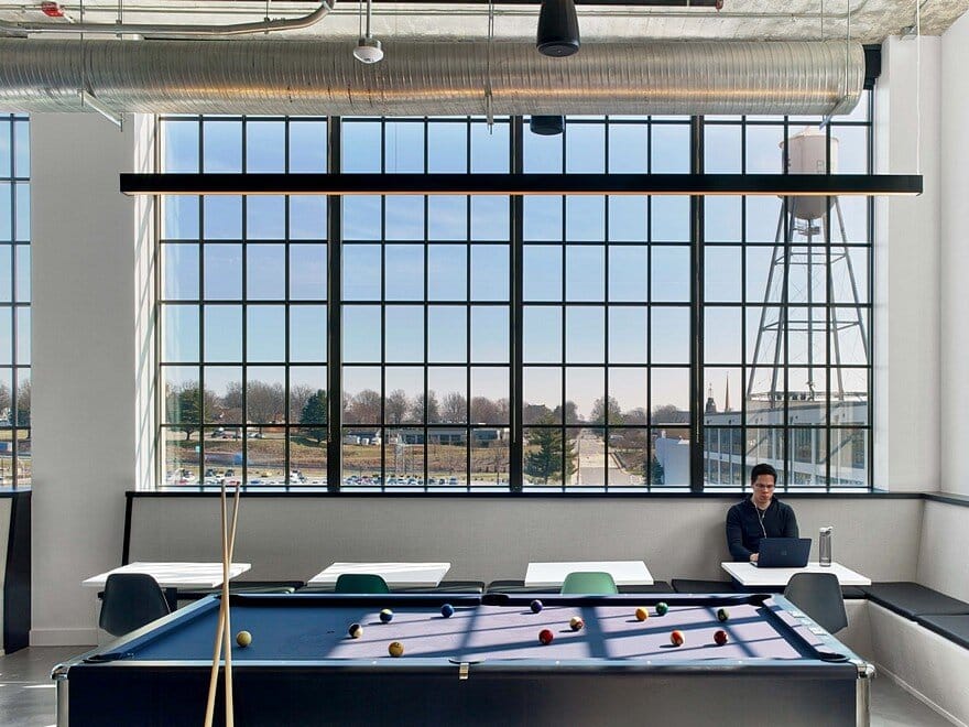
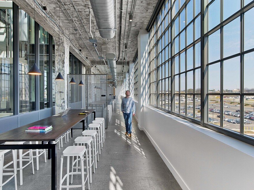
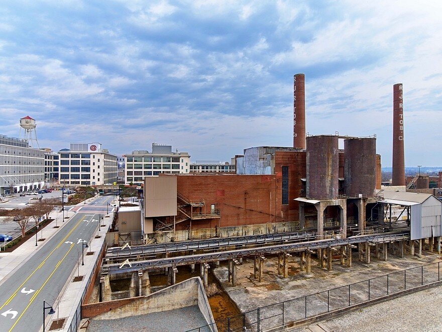
MullenLowe’s staff work in multiple disciplines for diverse clientele, so their space had to be flexible and inspirational. The space itself was breathtaking when the design team first walked through. Built in the 1930’s, the building was originally a tobacco factory. A large, deep floorplate, 14’ ceilings and metal-frame windows were the raw materials that provided the framework for MullenLowe’s new offices.
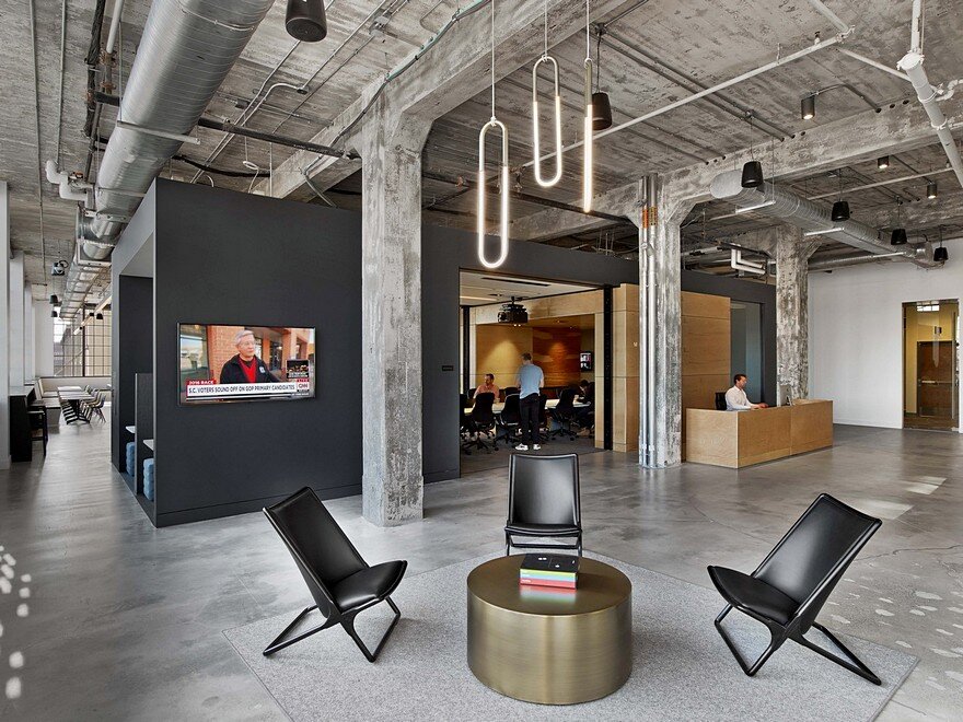
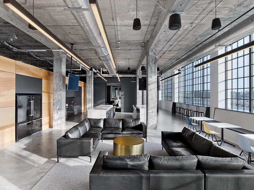
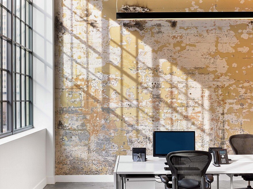
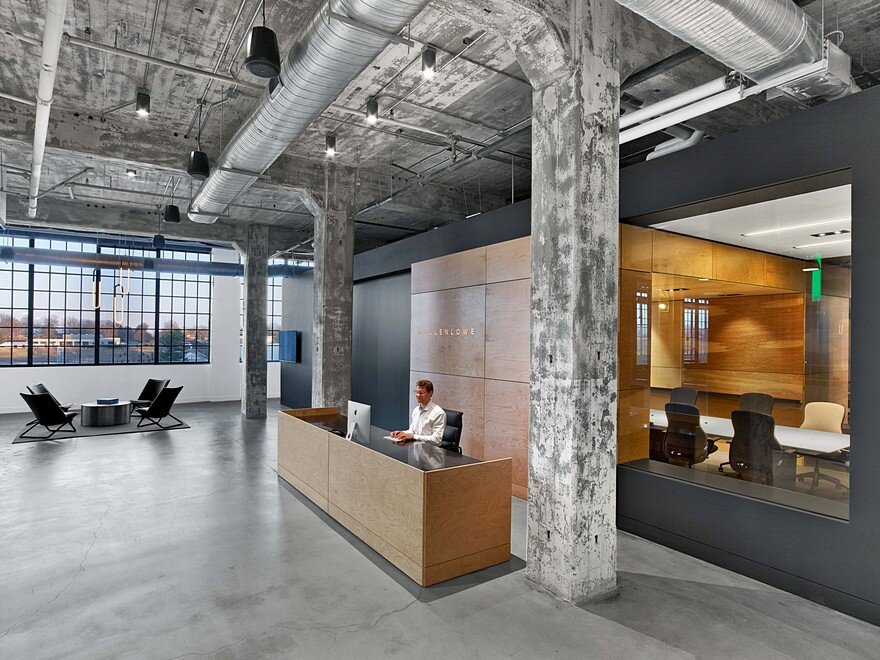
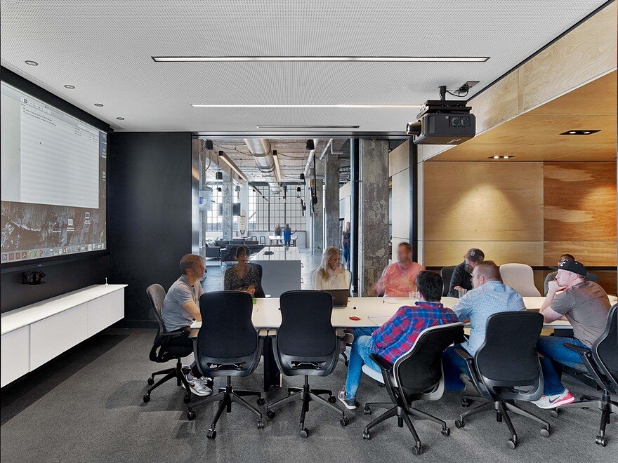
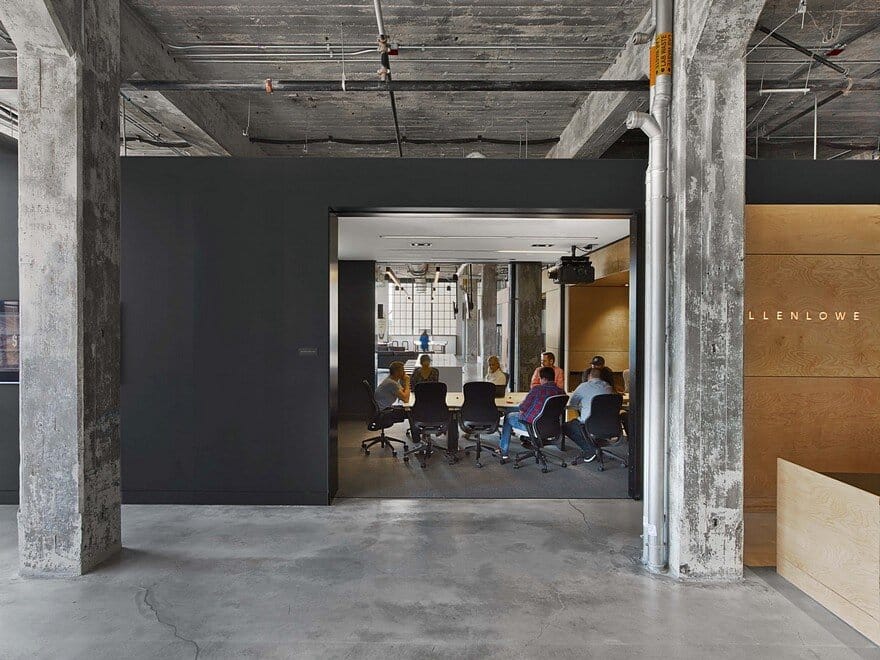
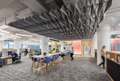
The design concept was to respect and celebrate the existing structure, leaving the walls and ceiling untouched by using floating free forms – rectangular boxes built between the columns – to create space within the space.
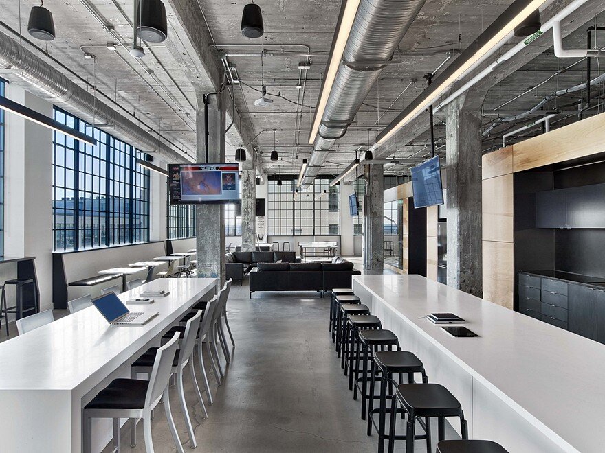
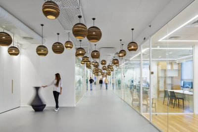
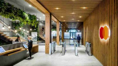
The L-shaped floor plate naturally split the space in two distinct wings. The reception area is logically situated at the vertex of the wings, in an existing open atrium with stairs to the lobby. By placing reception there and using the free form boxes to subdivide the space, the design team was able to bring focus and continuity to the plan, dividing the raw space into functional neighborhoods and providing myriad open and inspiring creative environments. The program required an assortment of collaborative spaces including conference rooms, huddle booths, photo and recording studios, and a media screening room with stadium seating.
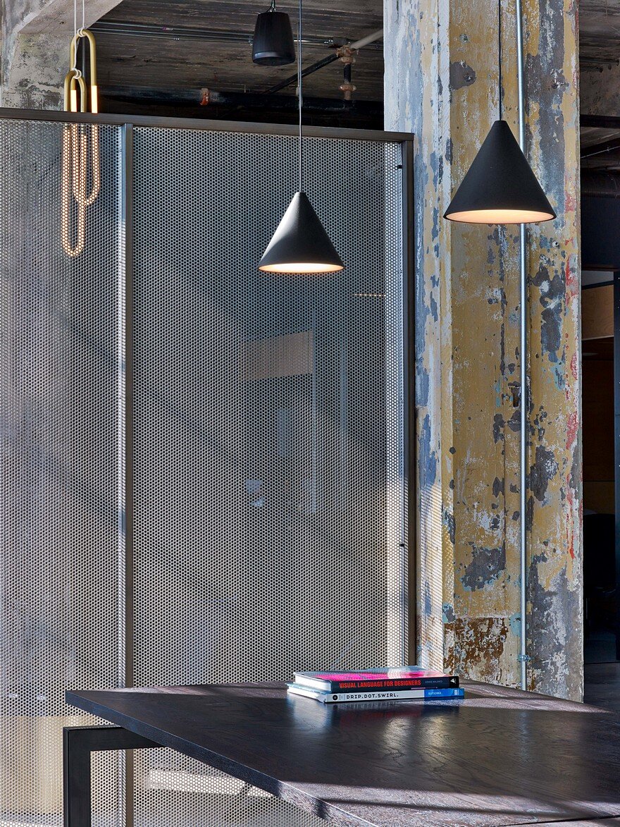
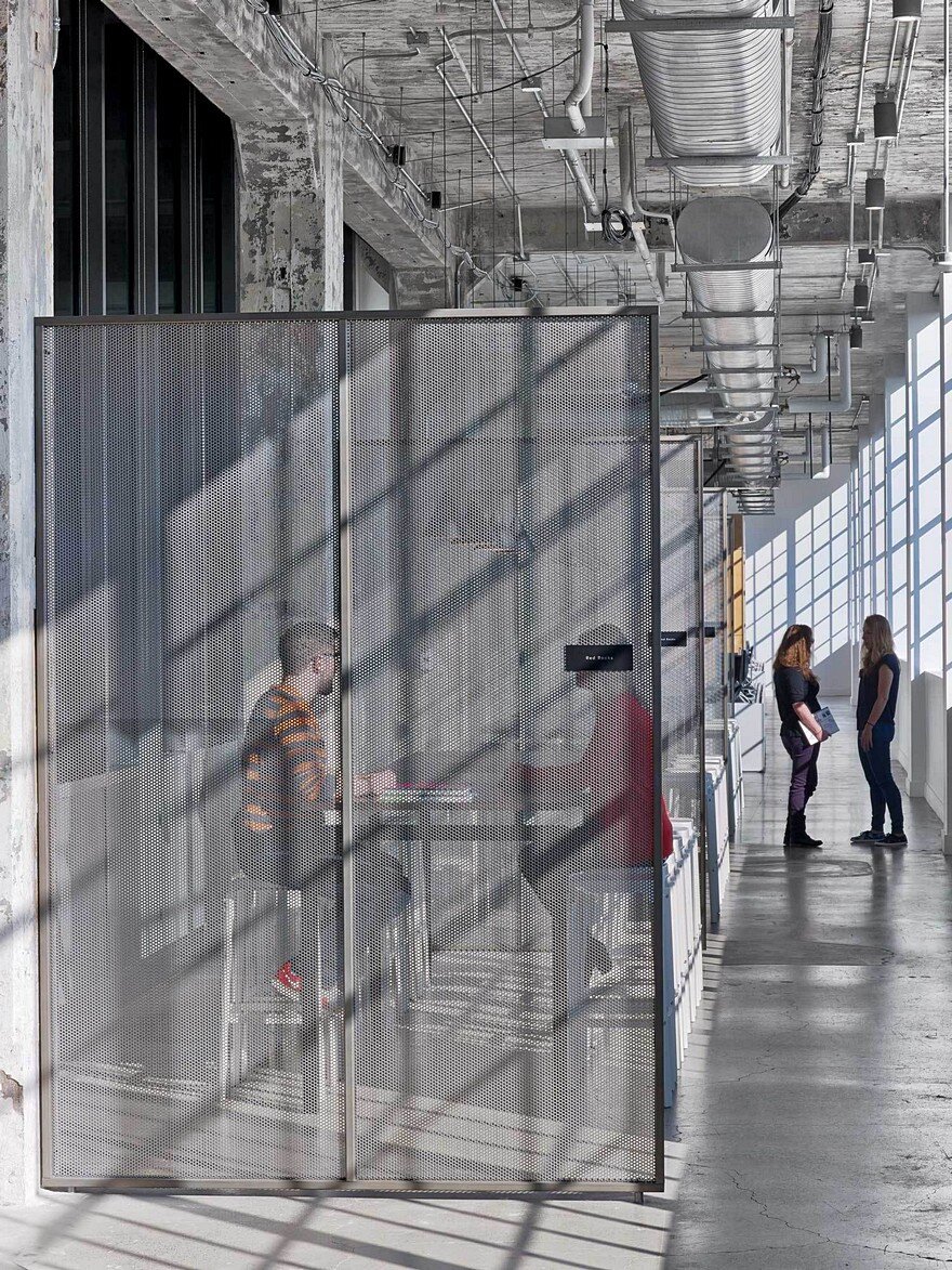
Structural columns and beams were left exposed, still coated with nearly a century of layered paint, which was minimally sandblasted to prevent peeling. Finishes and furniture were inspired by the raw space; the free form boxes are clad in plywood and dark-gray painted sheetrock, while the chair colors were sampled from the peeling paint on the concrete walls. The designers devised a system of perforated metal screens to allow for magnetic pin-up space throughout the office without interrupting the openness and fluidity of the floor.
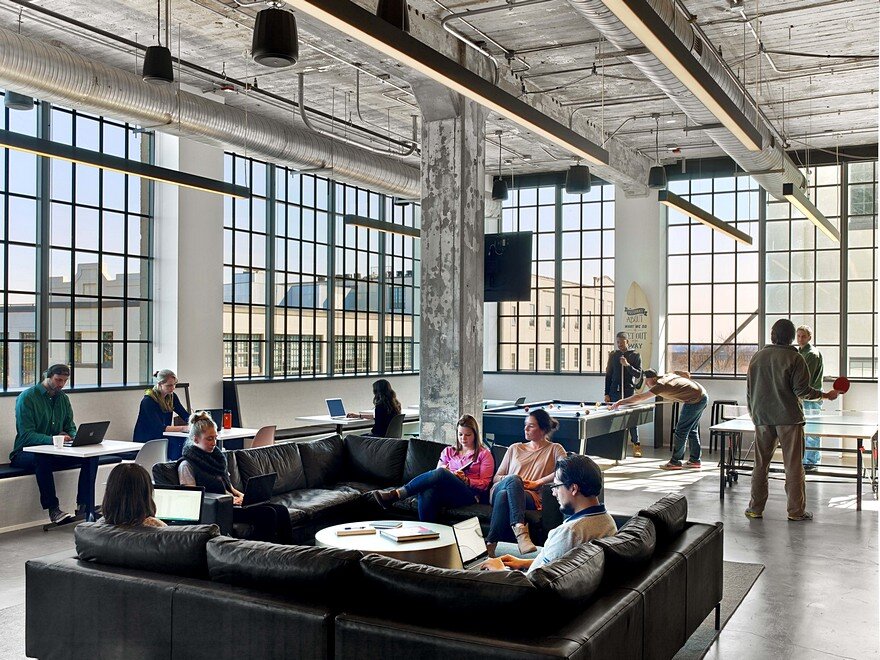
Today, MullenLowe’s space is more conducive for hosting events for local groups such as the Arts Council, as well as outside vendors, such as the local coffee house who provide the staff with on-site barista. Internally, the open work environment and common areas allow for more accidental collisions and natural collaborations, all of which are selling points when hiring new talent and pitching clients.

