Project: So-Ho Borgo Vittoria / Transformation of an Apartment into a Small Office
Architects: Plateau Collaboratif
Location: Turin, Italy
Size: 65 sqm
Year Completed: 2021
Photo Credits: Claudiu Asmarandei – llum collettivo
The apartment, located on the top floor of a building in Borgo Vittoria in Turin, was renovated for a new owner, a young graphic and web designer needing space for living and working.
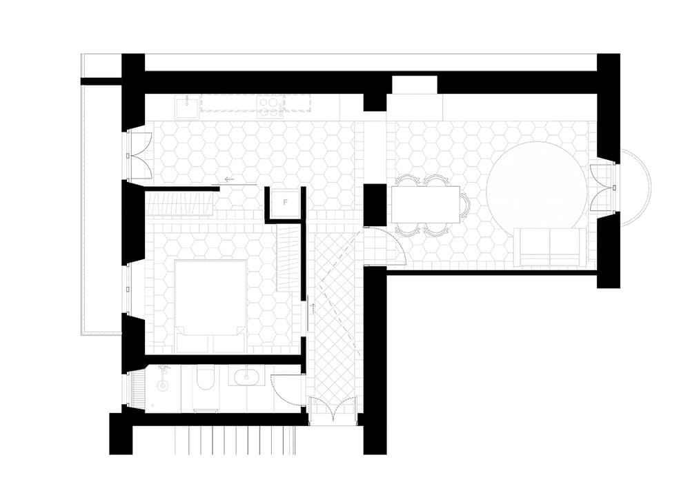
Construction works were focused on few demolitions of non-bearing walls to create an open plan filled by natural light.
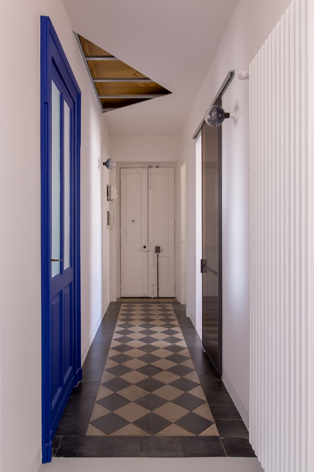
In order to preserve all the existing cement tile flooring, the new electrical, water and heating were designed to pass on top of a new false ceiling that covers and insulates the entire apartment.
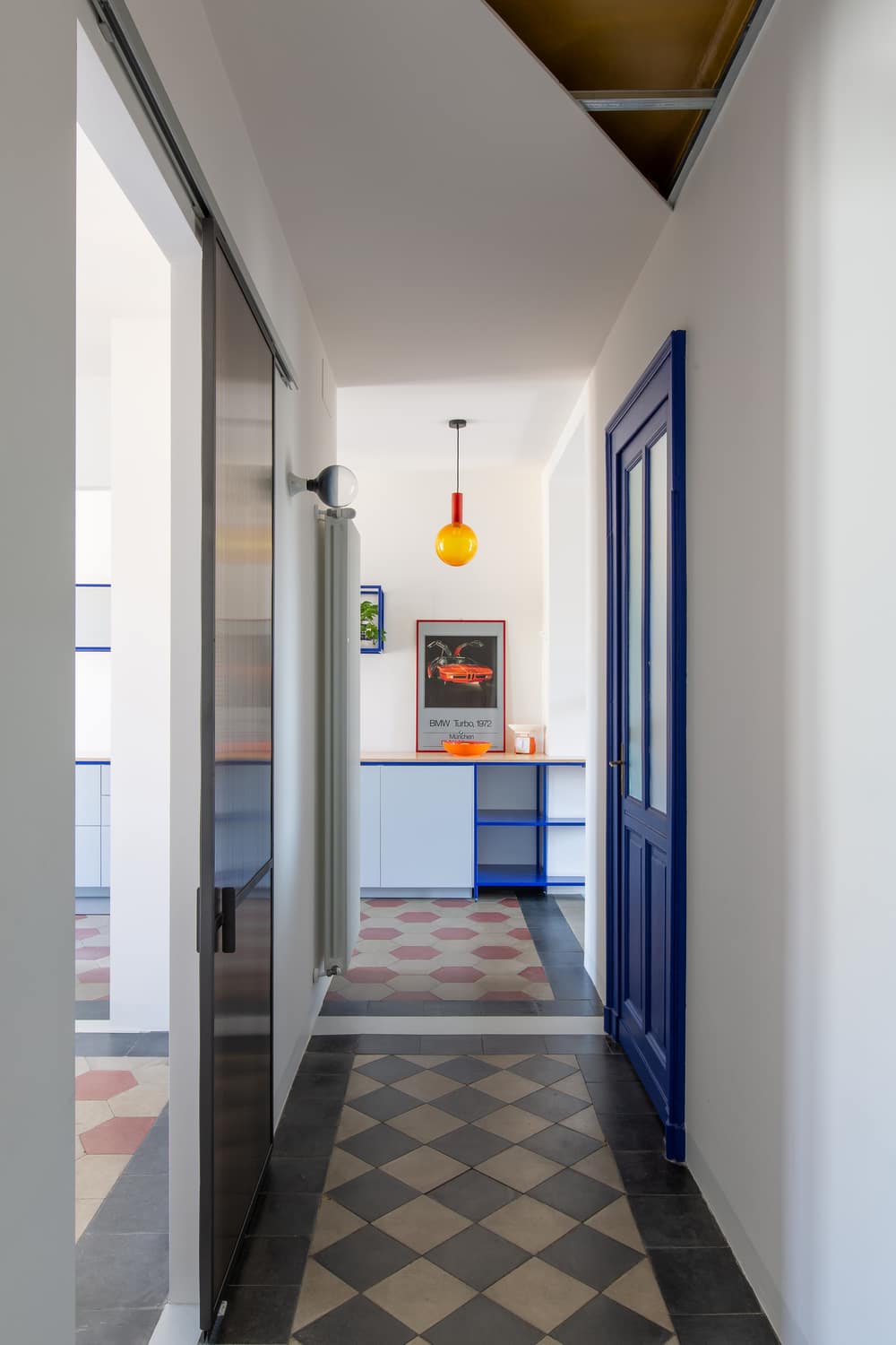
A triangular cut, gives character to the entrance corridor, exposing the metal structure and the original gold-coloured ceiling.
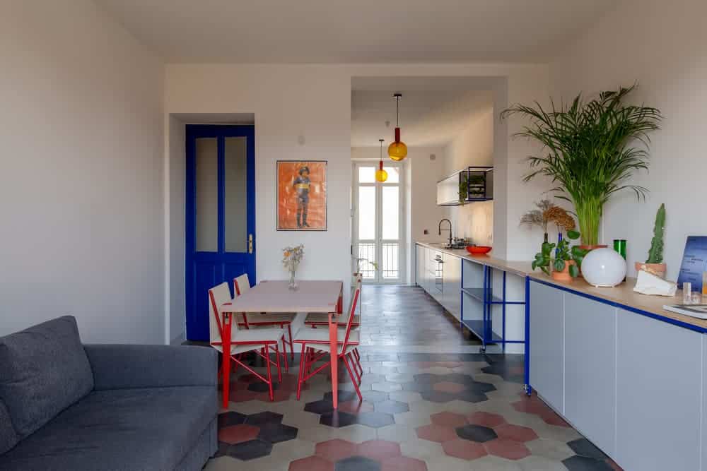
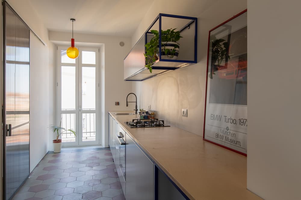
The open space is organised along a 10 meters custom-made dispositive that binds visually and functionally the kitchen area with the living room; moreover a movable module was designed in order to grant a flexible use of the living and working spaces.
The entrance fixture, a focal point from the entrance, was realized with a metal structure, lacquered cabinets and plywood top. It is composed by a moveable module built on wheels, that allows a flexible use of the space: based on its position it can act as a desk, looking out at the mountain tops, a kitchen island for a cozy breakfast, or allow access to a hidden closet.
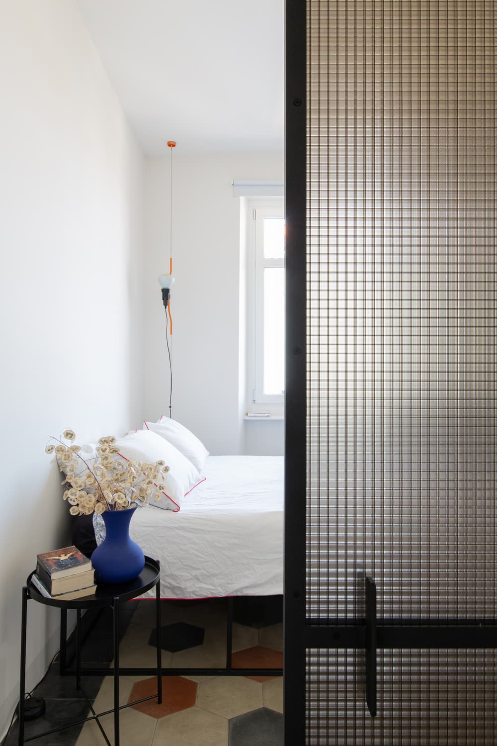
The predominant color is electric blue, characterizing the metal frames of the kitchen/living fixture, as well as decorating the original bedroom door. This color is contrasted by the original hexagonal cement tiles and the orange used for the lamps. The bedroom is defined spatially by two sliding doors, that allow its connection to kitchen and bathroom. The elves of the doors where realized using two layers of polycarbonate panels, creating a square pattern reminiscent to the one found in reinforced glass. The translucency thus created allows to redefine the boundaries of the room and the light that enters it, reducing the tunnel effect of the original plan.
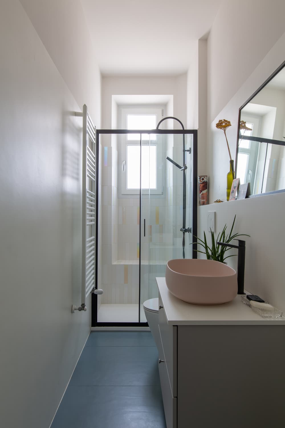
The bathroom maintains its original location, but it is entirely remodeled. A wider shower cabinet is placed by the existing window, making it the most illuminated spot of the room. Moreover light is still played with thanks to the iridescent tiles covering the shower cabinet, giving it an ever-changing appearance.

