Project: VW Apartment in The Gymnasium Tower
Architecture: Raz Melamed
Location: Tel Aviv, Israel
Photographer: Amit Geron
Kitchen: Poliform Varenna
Furniture: Poliform and Flexform
Rugs: Josephon
Chairs: LEMA
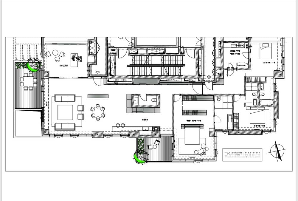
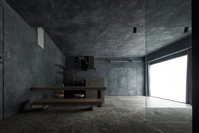
At the top of the tower in the center of Tel Aviv, this apartment is poetically peppered in shades of gray that are festively decorated with colorful art all throughout. To start, this unit was two apartments that were then converted by architect Raz Melamed into one house with a division into a private wing and a public wing, meeting the needs of this Israeli art collector who asked for an apartment that would promote his prideful, colorful, and happy art collection.
At the start of this process, the construction of the floorplan was carefully crafted to meet the customer’s requests, with each request having a design and aesthetic solution: the first of which was to create a partition between the hallway and the entrance to the house to create privacy. This request gave rise to an architectural constraint that led Melamed to examine the space and the first step into the house.
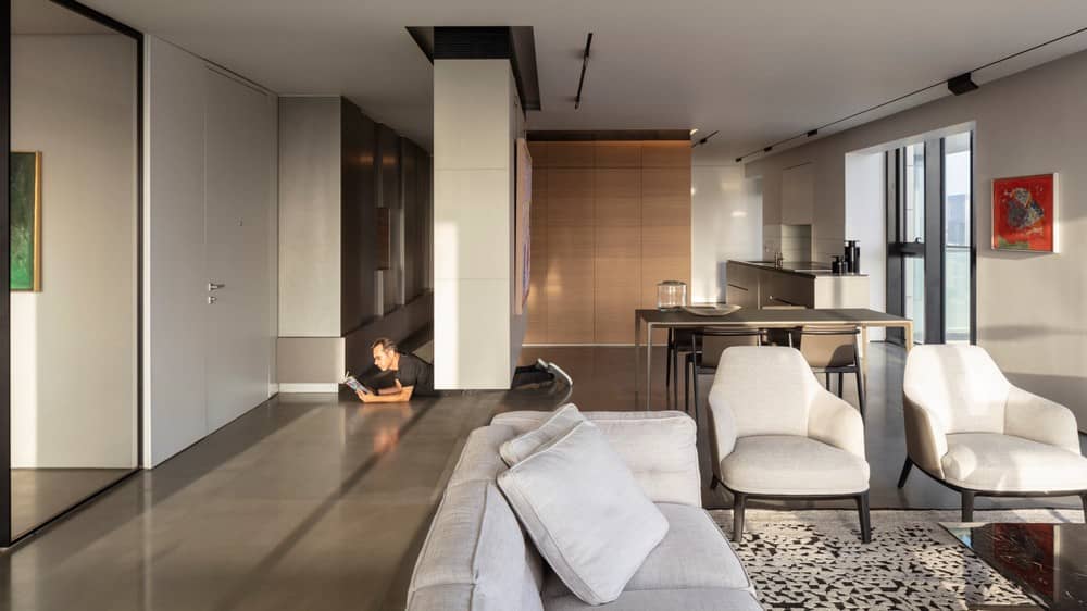
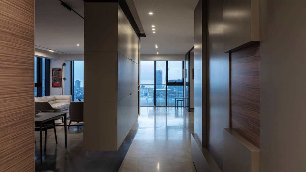
The architectural solution he actually designed was not a traditional wall but a floating carpentry cube that does not touch the floor, thus creating a continuous look across the floor to the landscape from the entrance and reinforcing the long view towards the corridor and private wing.
The carpentry incorporates an air conditioning grill for effective air supply and allows for the lowering of the air ducts. All its facets are smooth, and in the one facing the front door a niche has been opened for the display of art sculptures. A concrete gray finish was chosen for this piece, a shade that accompanies many more tones of gray that appear throughout the VW apartment.
Another request of the tenant was a study that faces the public space that includes a TV corner. The customer also specified that the plan incorporate the ability to host several guests a plan that would address the privacy of the hosts as well as the guests.
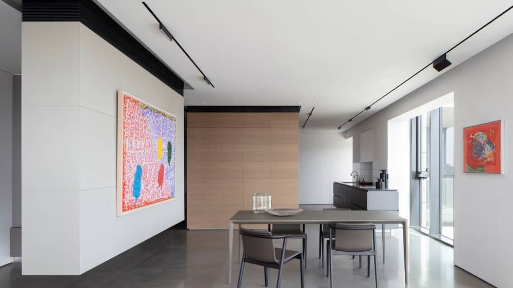
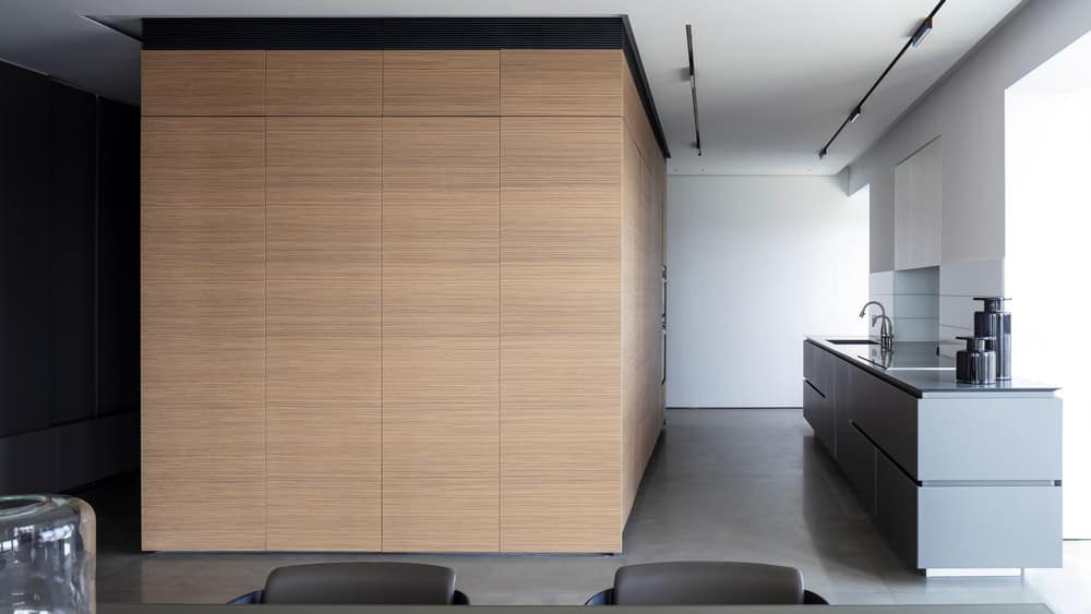
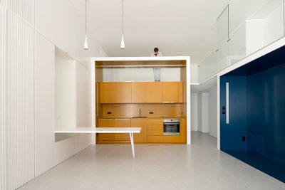
The first challenge was a room that stood in between the two original apartments built of thick concrete walls that stood in the center of the space, blocking the entire space. For this, the architect designed a wooden cube that hides the pillars, and is used on one side to store the kitchen cabinets, on the other side to hide the kitchen appliances, and on the remaining 2 sides to the walls of the guest toilets. This cube stands as a standing unit in space and generates interest as it is detached from both material and architecture. This piece is primarily responsible for defining the house as a “game of dice” along with the floating entrance cube next to it. In fact, this singular piece created the inspiration to incorporate dice throughout the entire house. The VW apartment is playful arrangement of two units in the same geometry, the proximity of which creates a significant architectural connection in the space.
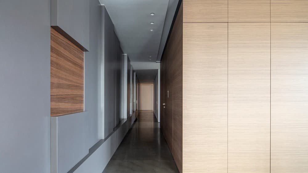
When walking through the corridor you are met with a playful arrangement of depths that leads to the suite. In this space, walnut veneer cubes are embedded in gray wooden cubes, with carpentry partly attached to the wall and partly moving away from it, sculpting the space in a decorative three dimensional feel. This design elegantly hides the building’s shafts, electrical cabinet, and even serves as a camouflage for a coat closet, audio cabinet, and water switch. Behind the front door, in a niche with a very narrow depth the architect carefully crafted a place designated for keys and miscellaneous items. This design made the long hallway particularly interesting, without sacrificing practical use and easy access to any of its hidden functions, including even a kitchenette with a minibar and an espresso machine inside the guest suite suite.
The entrance to the VW apartment leads in a uniform gray stone flooring of an impressive size and high quality. The customer likes the color gray which is why so many of his shades have been chosen for the various carpentries carpentries.
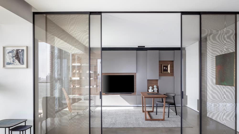
At the entrance is the study that overlooks the same view as the living room. It also serves as a TV room out of a desire to give up technology in the living room. The entrance to this room is through sliding glass doors with a bronze mesh planted in them, a shade that blends in perfect harmony with the gray and wood around it. There is a strong presence of wood in the room both in portable furniture such as the minimal wood table and in permanent furniture, like the decorative storage cabinet that opens with handles with a recess in which veneer has been implanted in a unique detail. All the furniture sits on a rug that is reminiscent in its shades of that in the living room, but this pattern is more relaxed in order to create quiet in the space for work work.
The closet plays in three dimensions just like the hallway closet from a combination of color and material of the various parts of the VW apartment, and here too very thin gray iron shelves have been added to display art art.
The lighting in the house is in black stripes on the ceiling that stretch from east to west, reinforcing those spots that are oriented from north to south. The lighting design highlights the lengths of the space as well as the cabinets as it is parallel to them them.
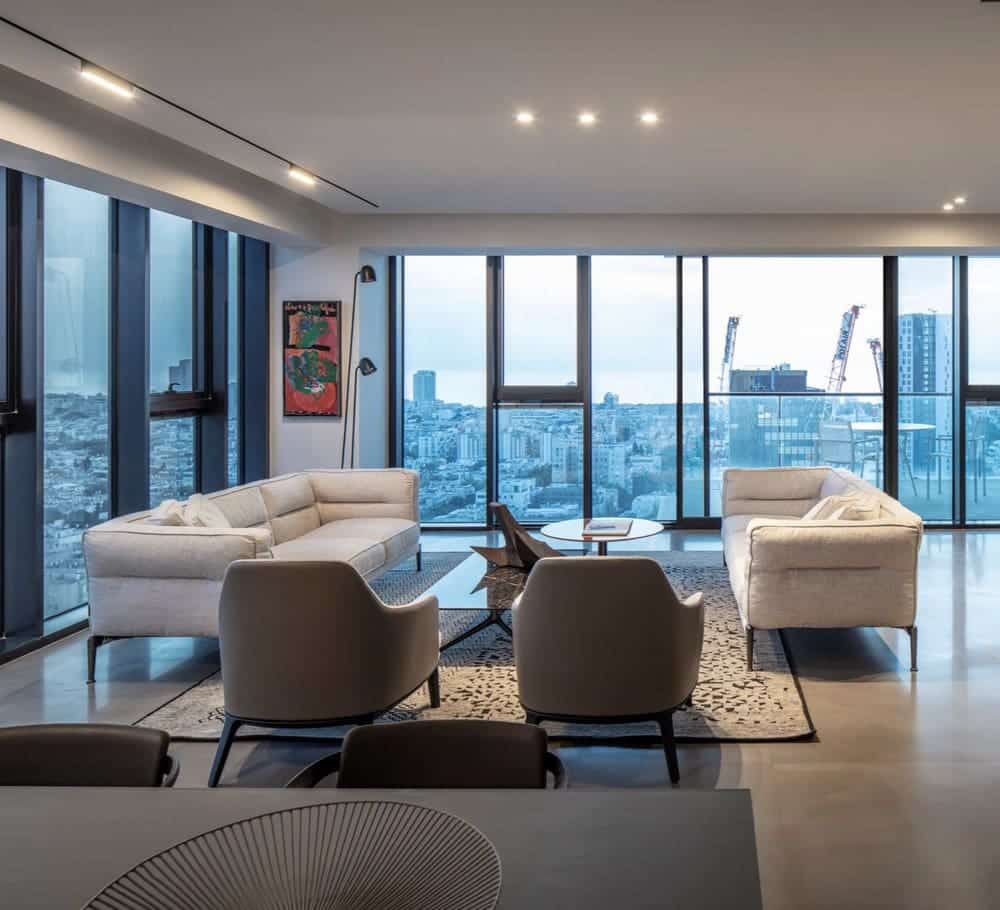
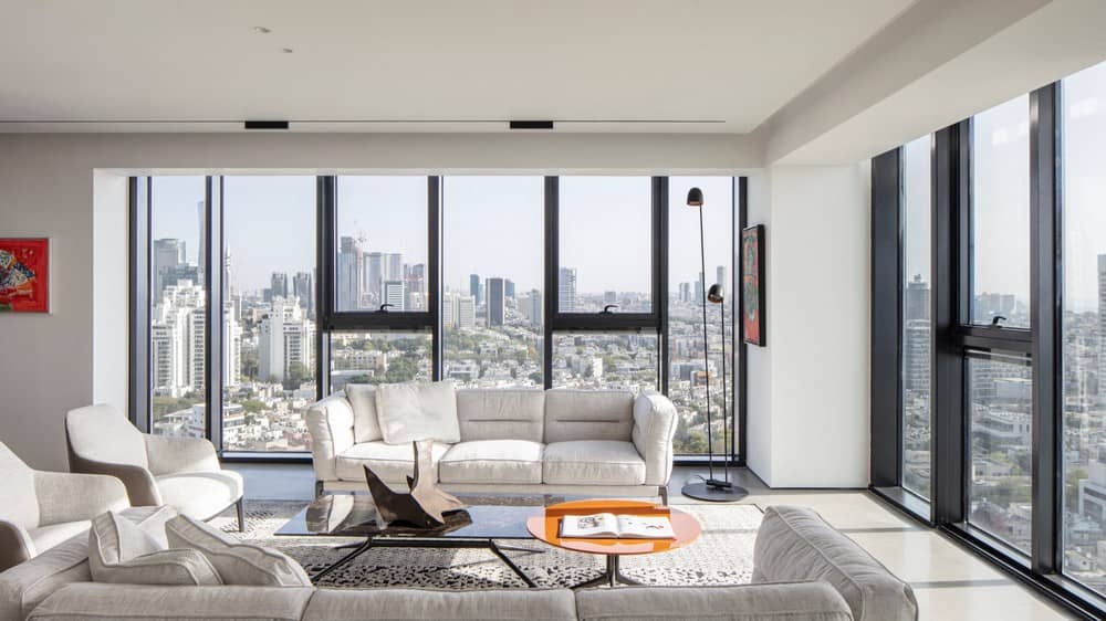
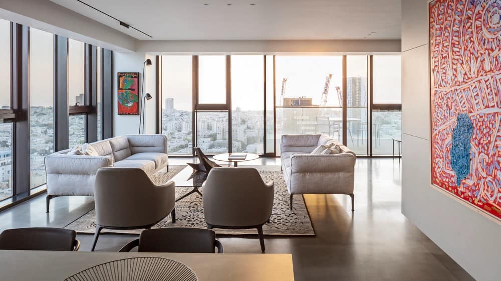
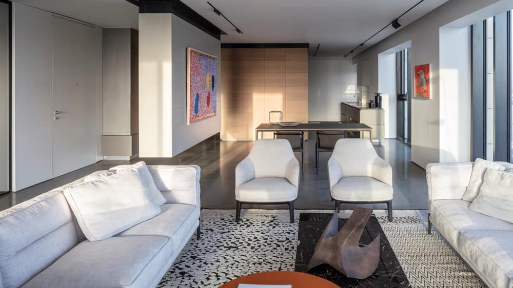
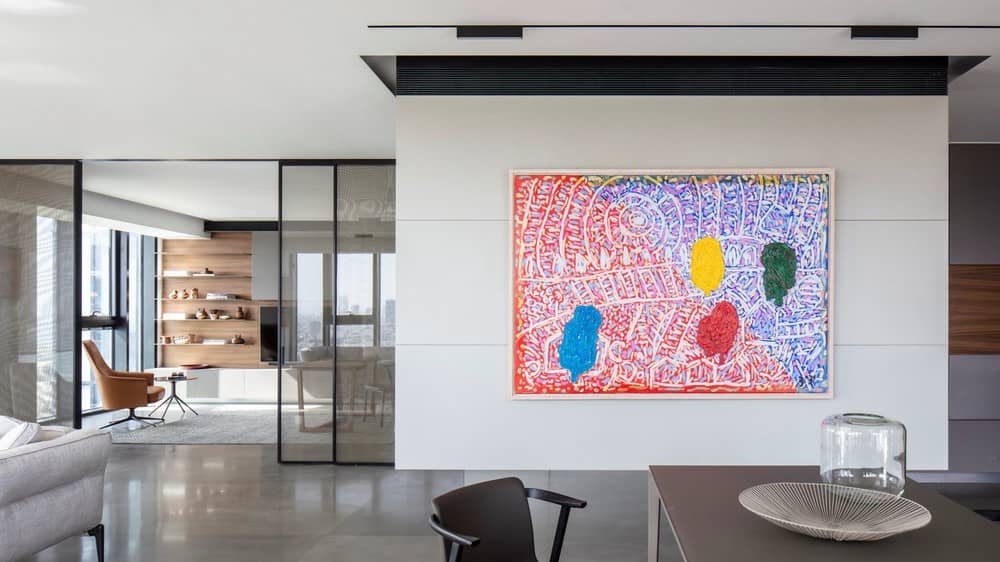
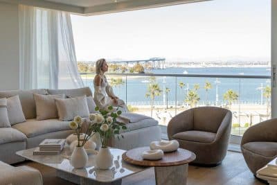
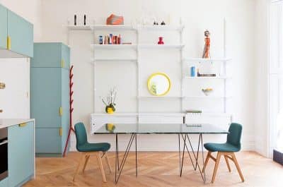
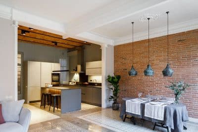
The living room is also furnished in shades of gray with soft and luxurious armchairs. At their center is a set of floating tables in round and rectangular geometry, with a marble top that bounces the shades one notch up. The dark shade of gray can also be recognized in the dining room chairs that surround the minimalist and light dining table. The art that hangs from both sides is the one that adds a burst of color to the dining and hospitality experience experience.
The kitchen is built on a low gray counter, above which climbs a white wall cladding patterned with lines reminiscent of the design language of the hallway cubes. The cladding continues into a space between two columns, which gave rise to a deep surface above which is a cabinet for further storage. In front of the low surface is the high wooden front that contains the appliances and hides another work surface in the pocket doors. On the side facing the dining area, the dining utensils are stored for maximum convenience convenience.
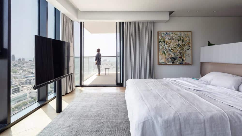
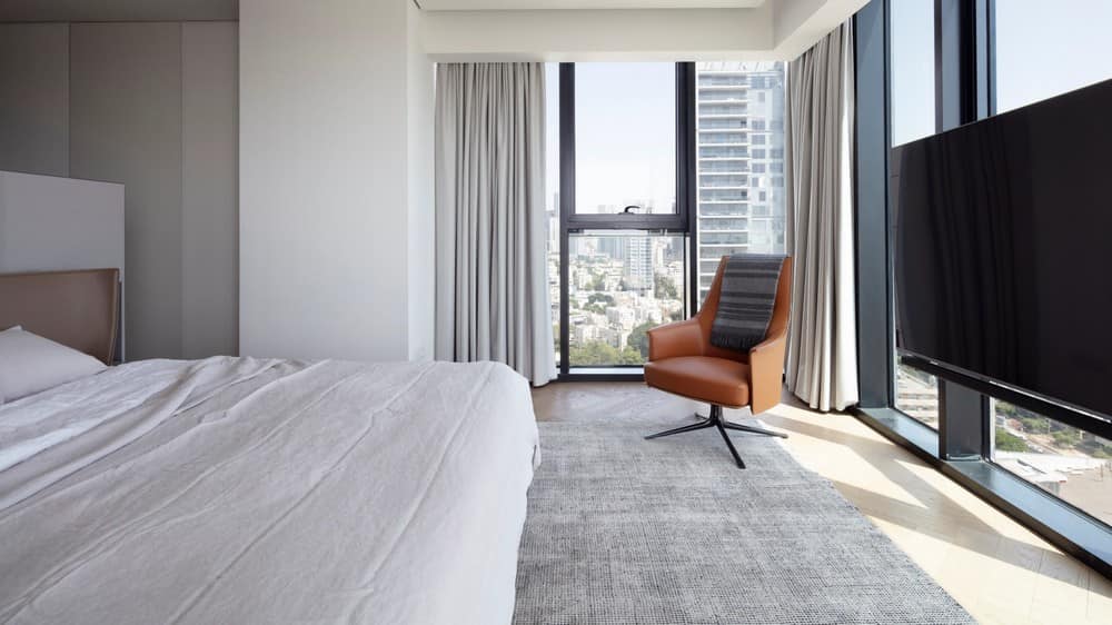
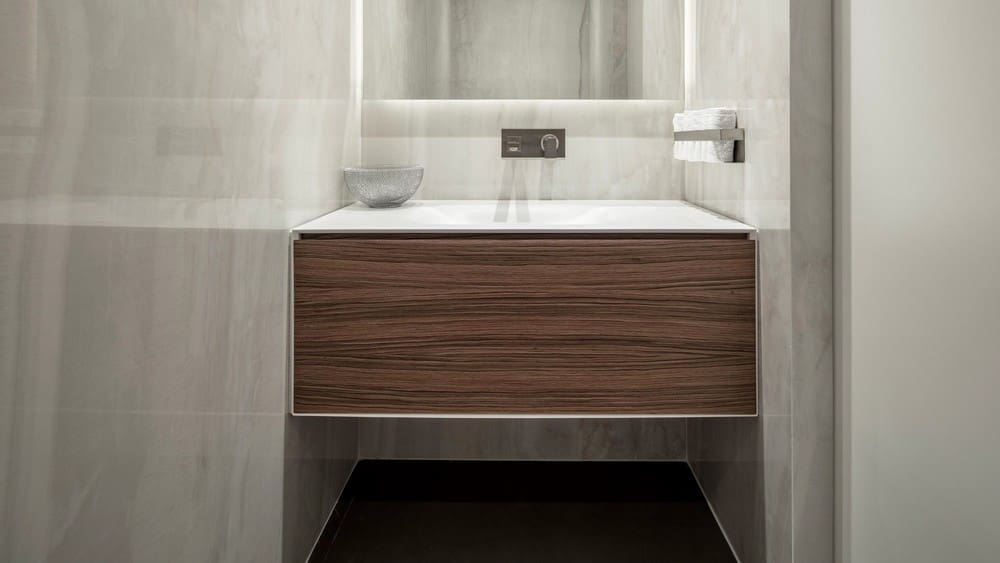
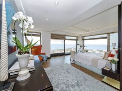
The master suite continues the use of dice at the entrance, two parallel cabinets are revealed, standing, a door connecting them and forming an entire cube when it closes. The back of a leather bed rests on carpentry with a glossy finish at a low height, from which cubes that have been turned into bedside tables have been subtracted and appear to really burst out of the sides of the bed. The longitudinal lighting has been converted to a white hue, and the artwork hung on the walls of the suite is in soothing and serene colors . The carpet is soft and warm as the curtains covering the display cases are hung in a broken white hue, and there is an exit through them to the perimeter balcony that reaches up to the kitchen. The adjoining bathroom is canopied with white cladding with gray tendons, and under the mirror hung a floating walnut cabinet that maintains minimalism in material and color, just like the guest toilet toilet.
The two guest rooms are at the end of the corridor when the entrance to them is through a wooden door, and when it is closed it creates a closed cube with the corridor on the one hand and creates privacy for the guests on the other hand hand.
The design encompasses every part of the house the dice game enters every room, small or large, public, or central, and turns the VW apartment into a complex of materials and shades of interesting and spectacular three dimensionality.

