Project: Eva Street House
Architecture: Elizabeth Baird Architecture & Design
Interior finish selections: Elizabeth Baird Architecture & Design in collaboration with Purveyor Design
Furniture: Purveyor Design
Built by SRD Builder
Landscape Architecture: Shademaker Studio
Location: Austin, Texas , United States
Completion date 2018
Photography: Cambria Harkey, Casey Dunn, Stephen Cunningham, Sidney Wilder
Text by Elizabeth Baird Architecture & Design
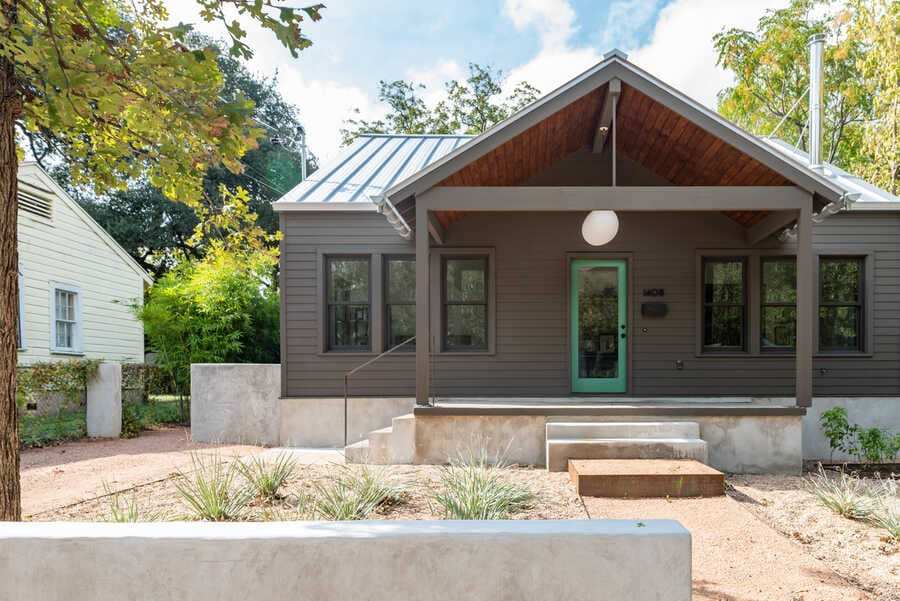
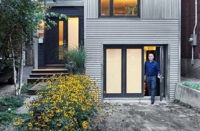
The original 1930 bungalow’s main value was its prime location near South Congress. Otherwise, the existing structure was dark and dated. The original structure’s living spaces were cut off from the backyard by the master bedroom and a utility room. Thus, it was stripped to the studs and a few slight but powerful changes were made to the interior walls to create a more livable floor plan.
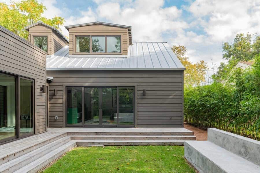
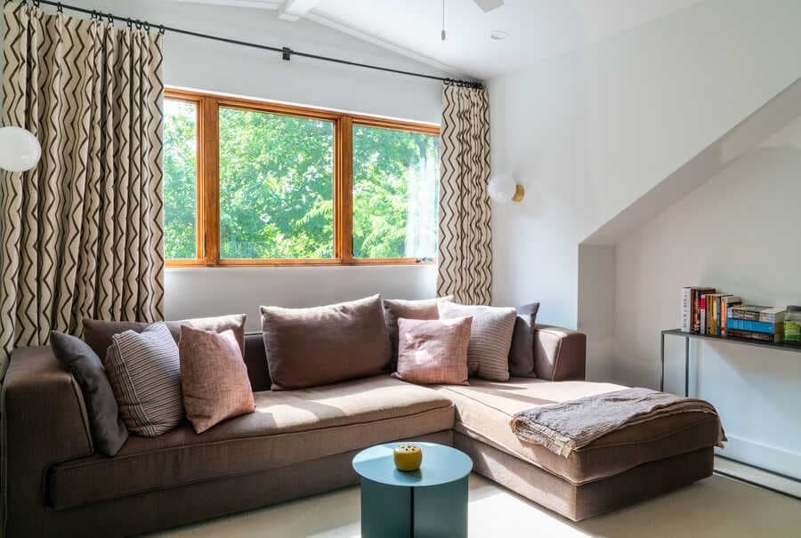
While the existing bedrooms stayed put, walls were arranged to create a more private entrance into both through a small hallway away from the front door. To take advantage of the steep pitch of the roof, a master suite was created out of the existing attic space. Two new large dormer windows bring light into the new second floor which also includes a small office space.
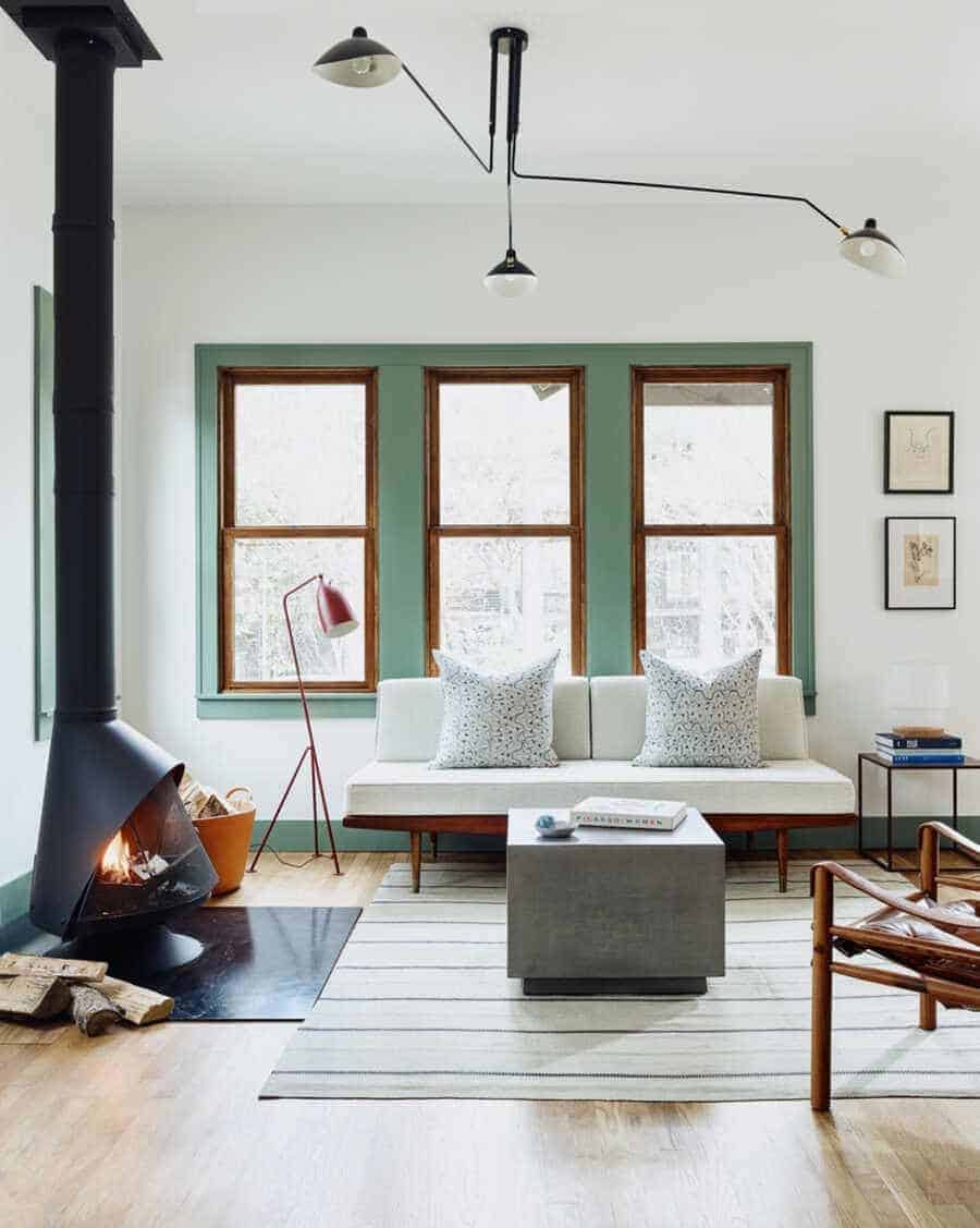
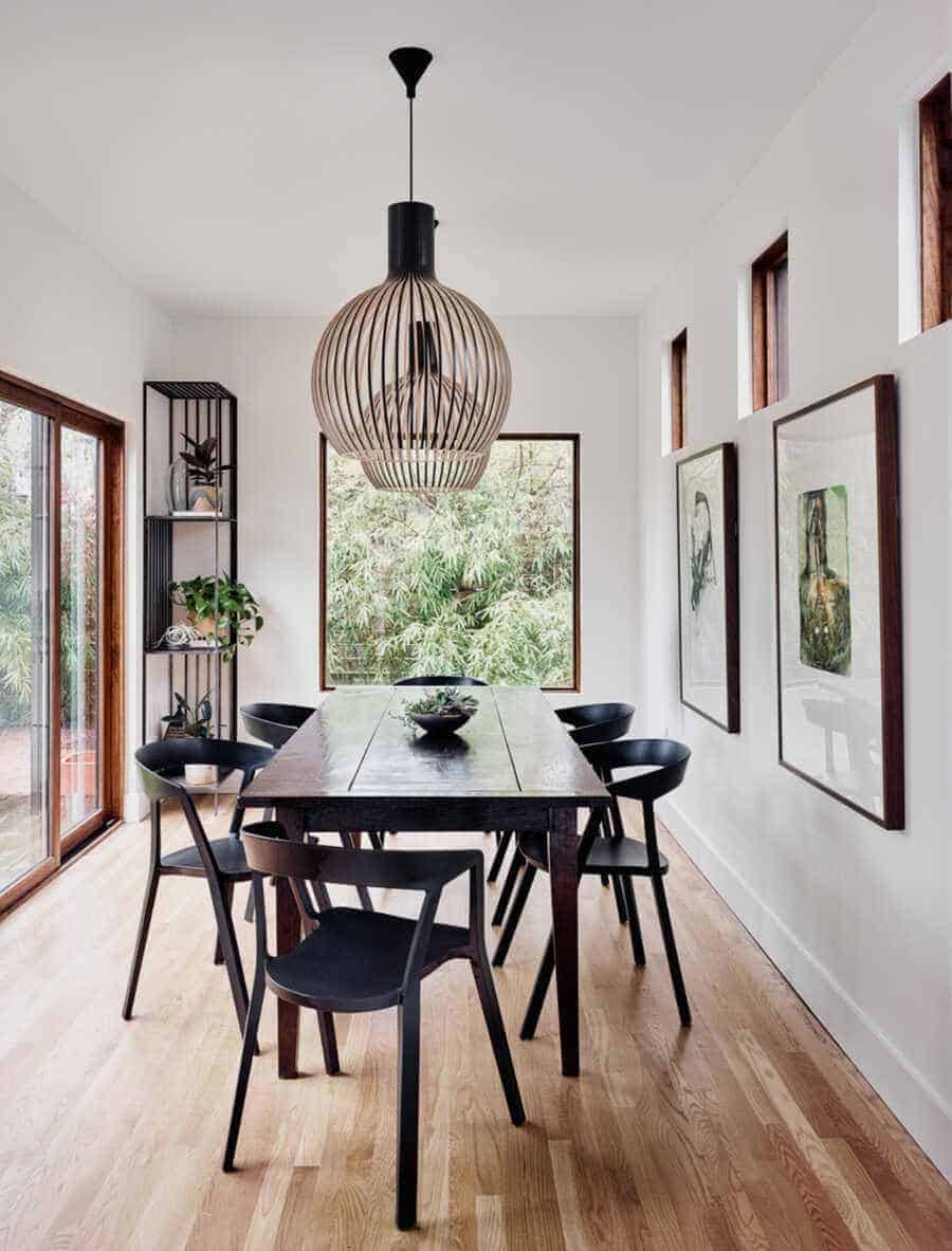
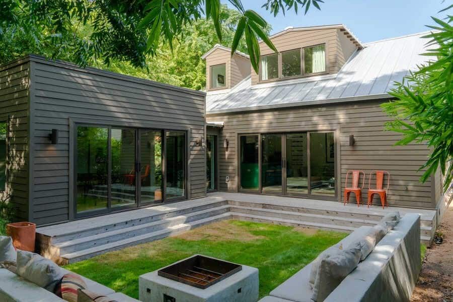
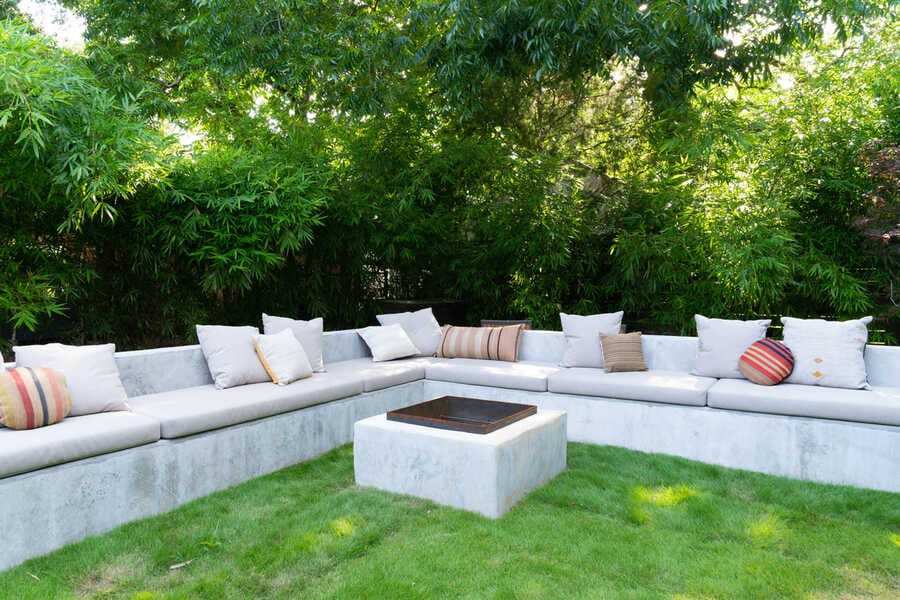
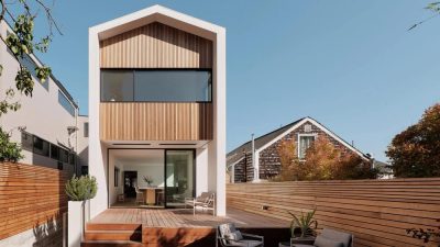
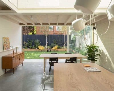
The relocation of the master suite allowed the living room to shift to the back of the house where 12 foot wide sliding glass doors allow views and access to the back deck and new outdoor seating. Attached to the back of the Eva Street House, a new dining space frames the outdoor entertaining space while opening onto the deck again with large sliding glass doors. An L-shaped bench encloses the open edges of the backyard to create a private urban enclave: It directs your focus to the house when sitting outside and looking back in.
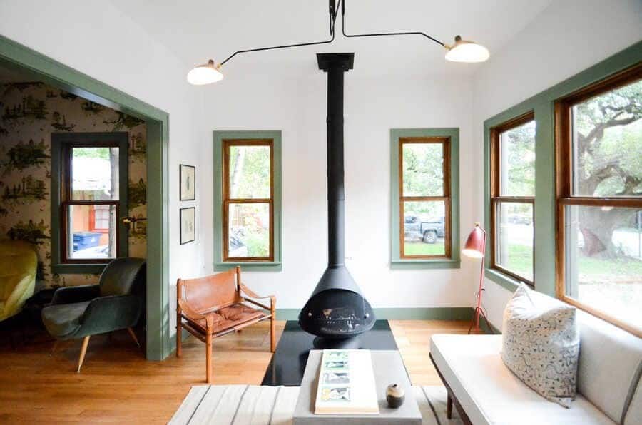
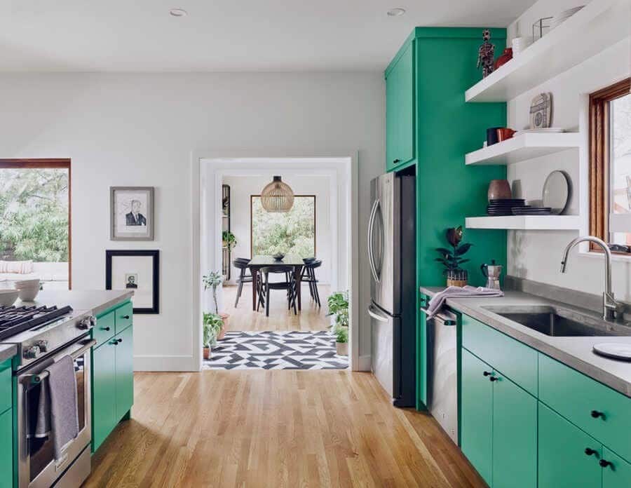
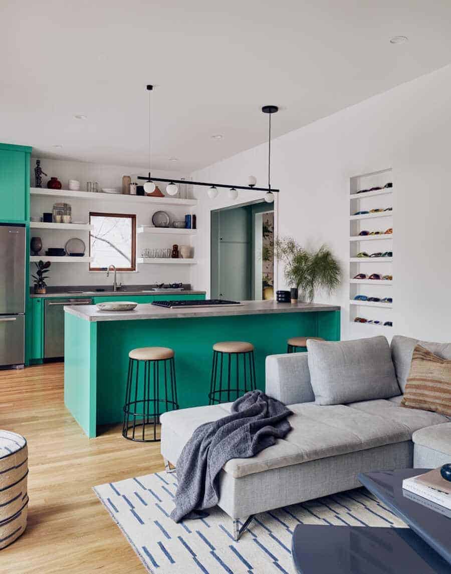
The existing openings between communal living spaces were widened to allow view corridors through the house and into the back yard, establishing a strong connection to the landscape. The kitchen and bathroom were both kept in their original locations to keep construction cost to a minimum.
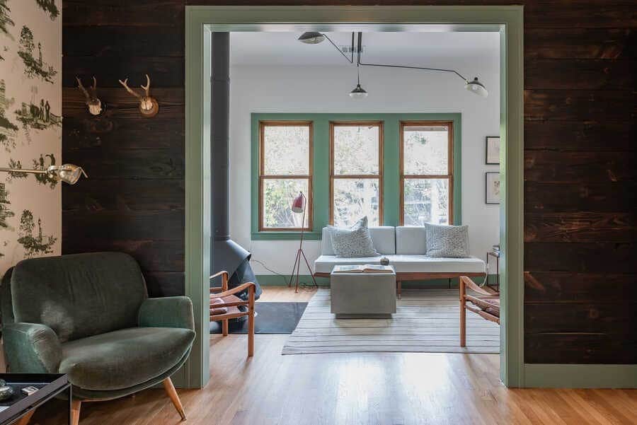
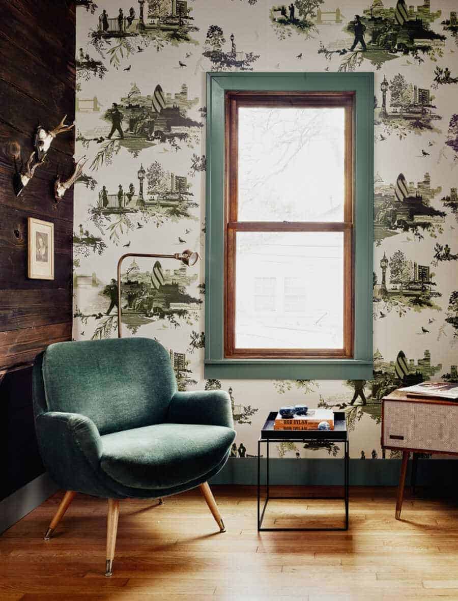
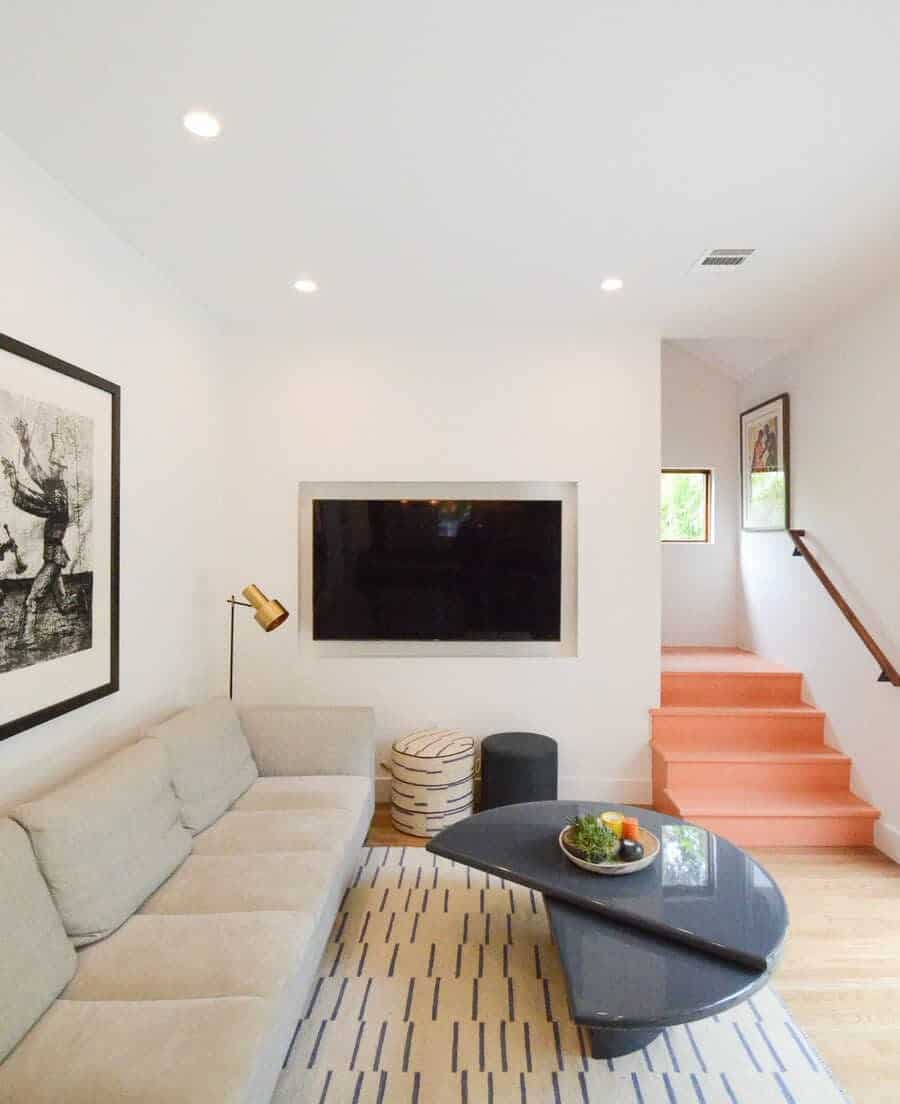
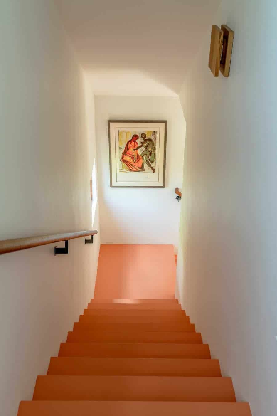
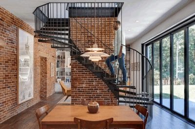
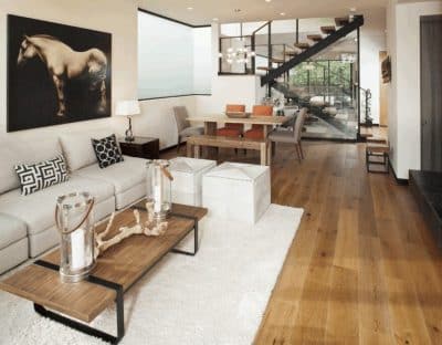
New materials add a fresh edge to the existing dwelling while making the transition from the old structure to the new seamless. The original shiplap walls in the “conservatory” were updated and darkened using the Japanese Shou sugi ban technique. The black-and-white tile pattern in the breezeway to the dining room extension references the home’s original kitchen while breaking up the large expanses of wooden floor, as does the decorative wood pattern in the kitchen. Painted stairs reduce the cost while accenting the homeowner’s art collection and adding a fresh touch. The varied materials and colors, incorporating many styles and eras, draw not only from the clients tastes but also from the eclectic vibes of nearby South Congress.

