Project: SF Historic House
Architects: Walker Warner Architects
Team:
Principal: Brooks Walker
Senior Project Manager: Brian Lang
Architectural Staff: Matthew Marsten, Hana Bittner
Consultant Team:
Architecture: Walker Warner Architects
Interiors: Redmond Aldrich Design
Landscape: Scott Lewis Landscape Architecture
Builder: Matarozzi Pelsinger Builders
Location: San Francisco, California
Photography: Matthew Millman
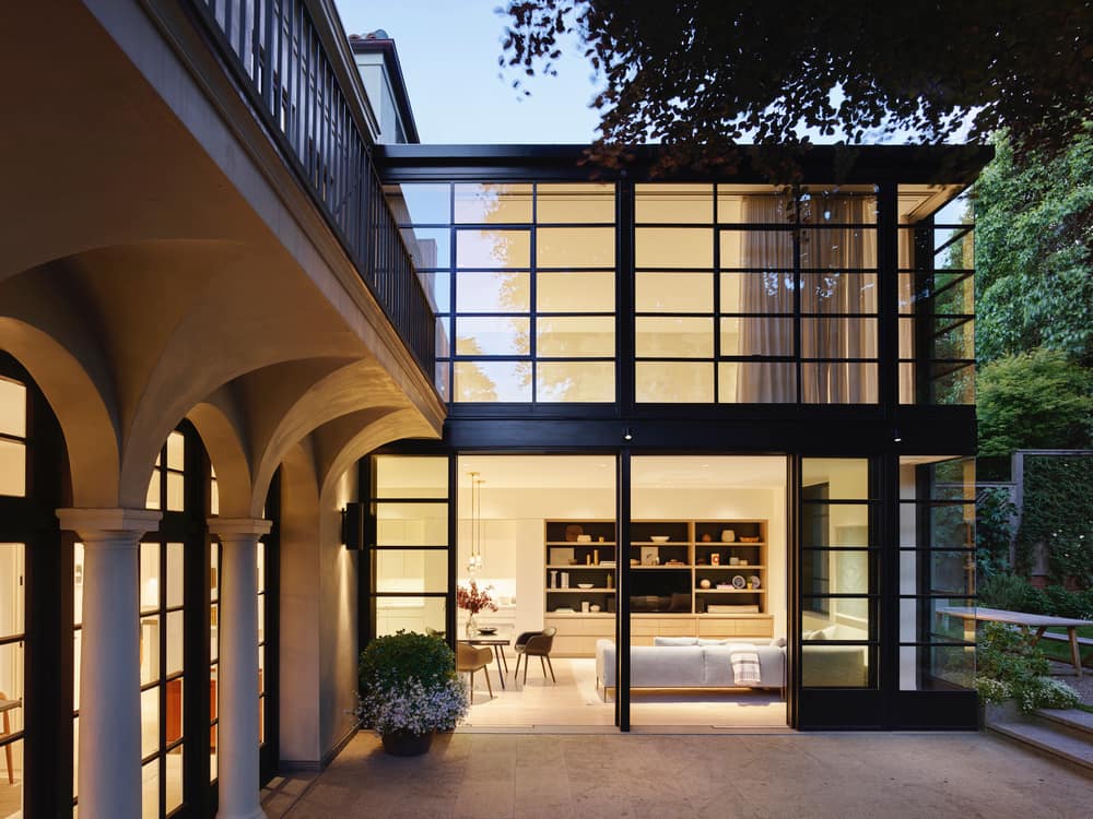
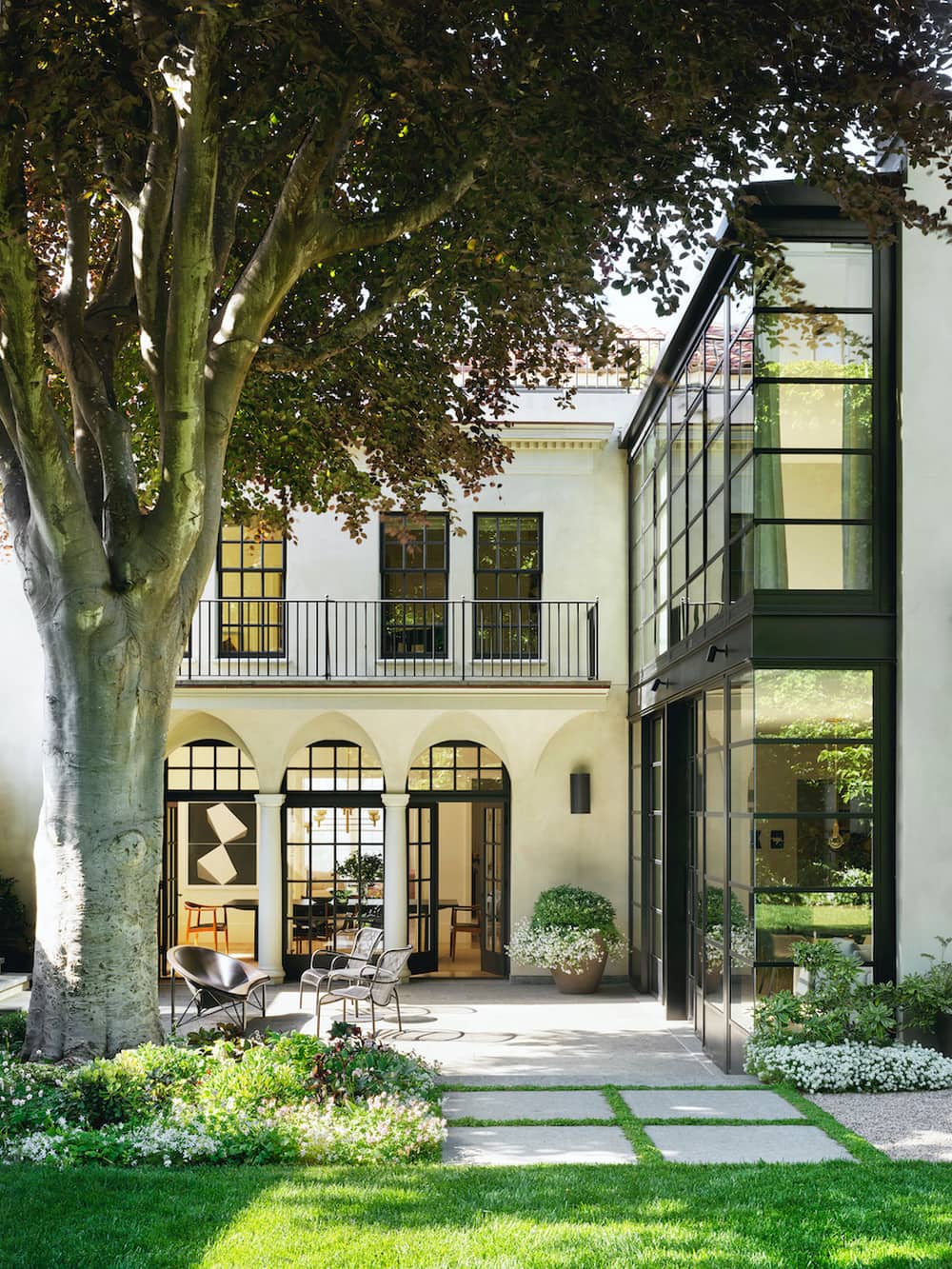
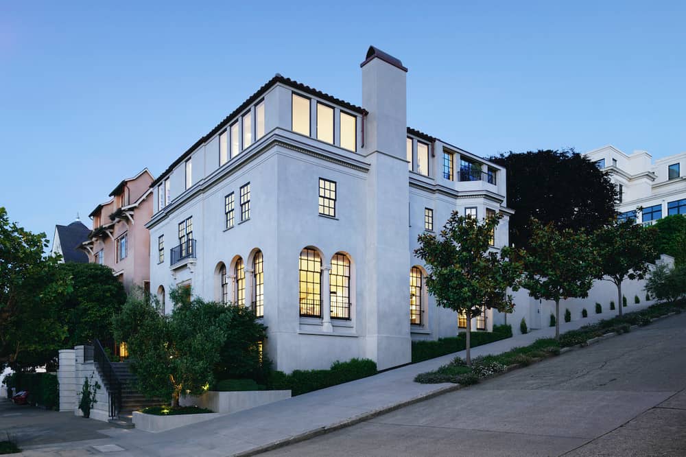
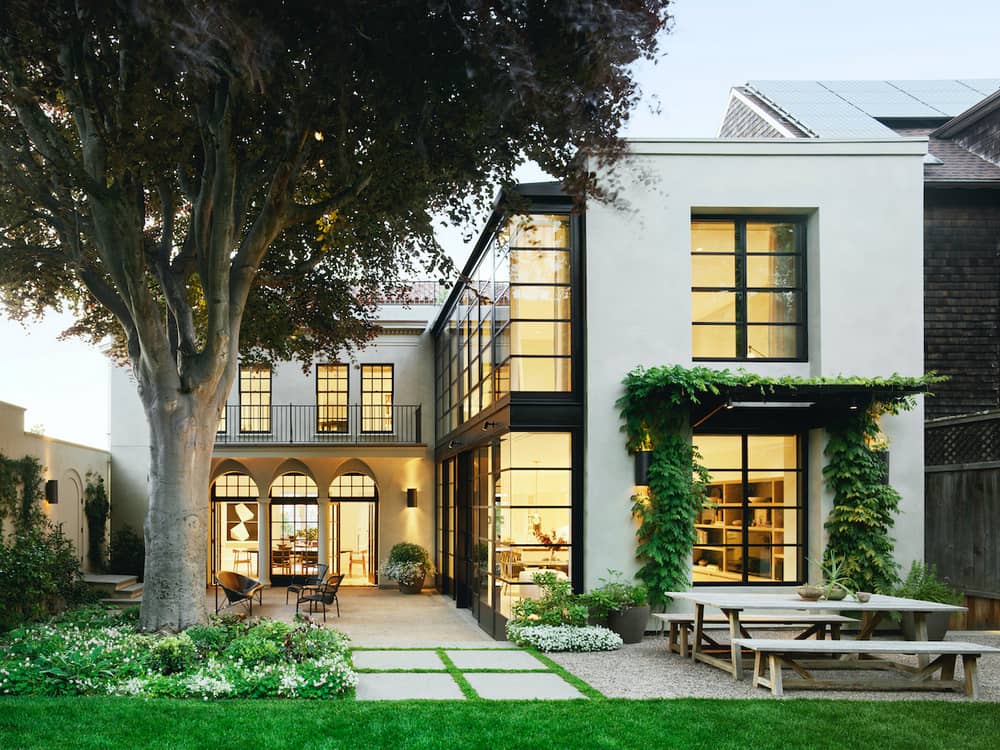
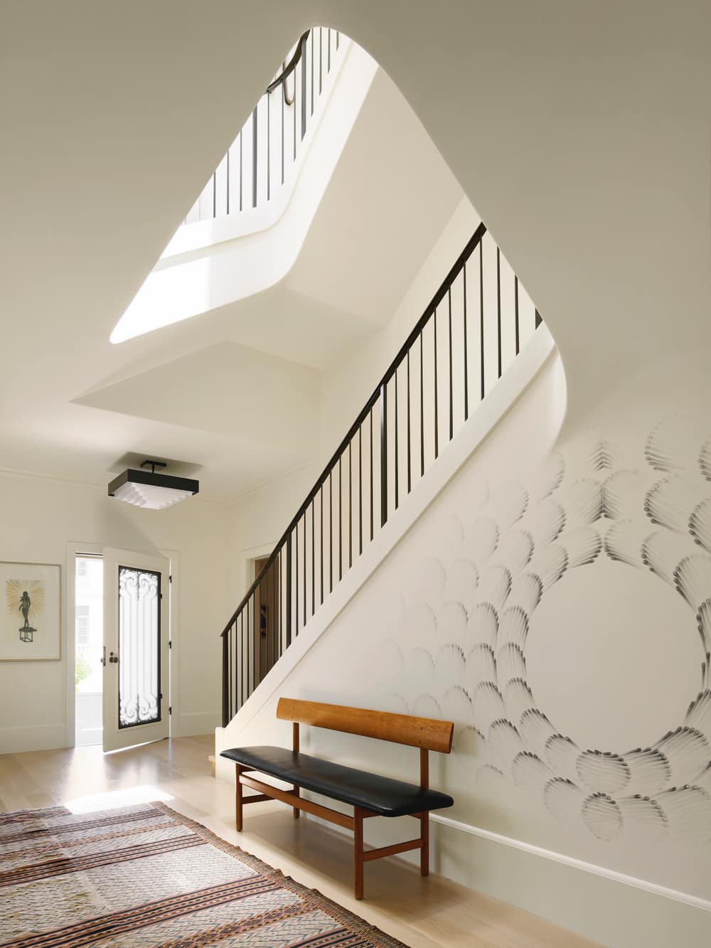
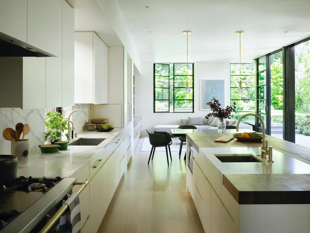
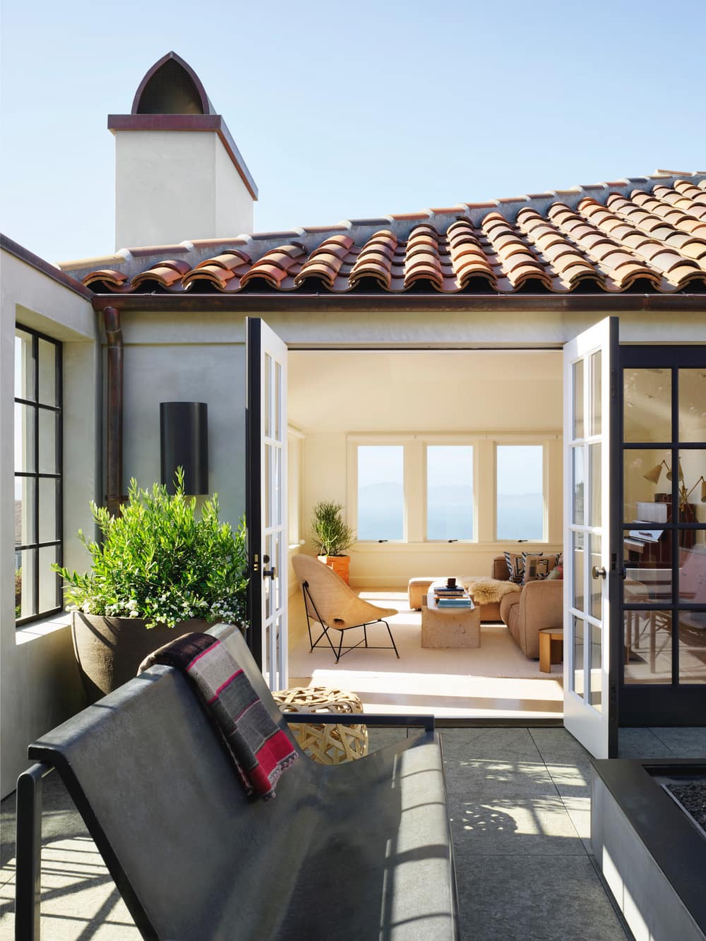
Originally built in the 1920s, the renovation of this historic Italian Renaissance style home was a delicate balance between preserving its historical character while leaning forward to respond to a more contemporary way of living. To bring the building up to earthquake code, the home had to be taken down to the studs and the foundation reinforced with steel. With San Francisco having strict historic preservation regulations, it was essential to preserve the look and feel of the public facades of the building. Decorative wooden cornices and columns were replaced with custom fiberglass reproductions, recreating the original architectural details. With the addition, we were able to introduce a modern two-story geometric volume that floods the new spaces with natural light and connects to the vibrant garden with the century old Copper Beach tree as a front and center focal point.
“We ended up drawing inspiration from the historic London townhomes where you see the modernist interventions in contrast to the historic architecture, and it’s clear what’s what,” notes Brooks Walker, Principal, Walker Warner Architects. Before starting the remodel, the house underwent an evaluation due to its old character. The process resulted in the home’s qualification as a historic resource. “The report identified two and a half facades to the building that couldn’t be touched: the primary street facade, the side facade, and a portion of the backyard. The addition was designed beyond that, where the old kitchen used to be,” notes Brooks Walker. Respecting these rules meant clearly delineating the old and the new. To do so, the architect was inspired by what is usually done on the other side of the Atlantic.
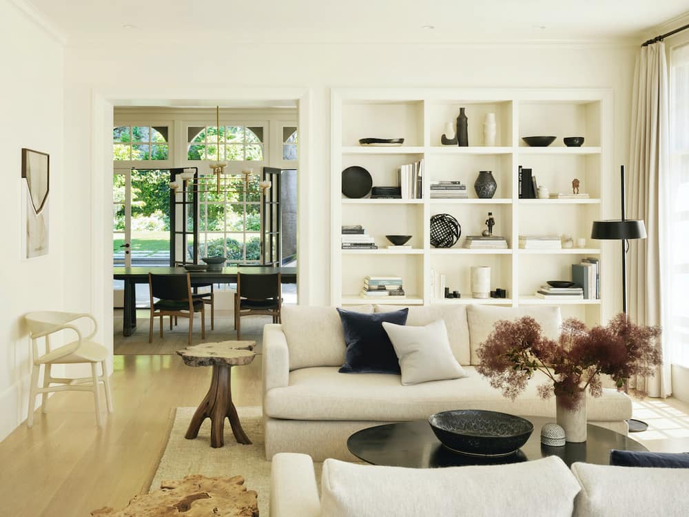
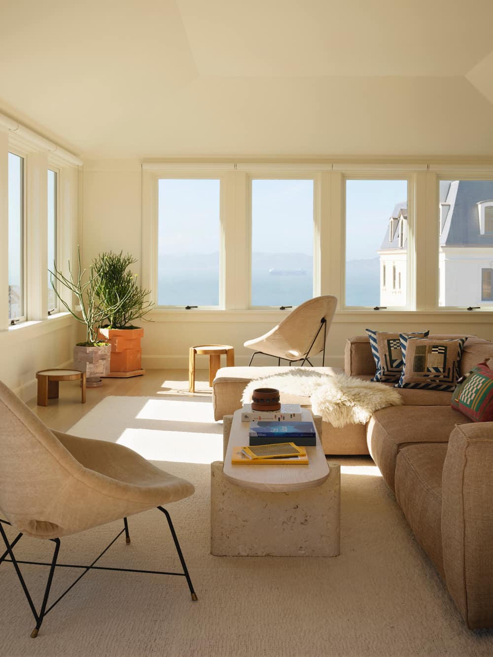
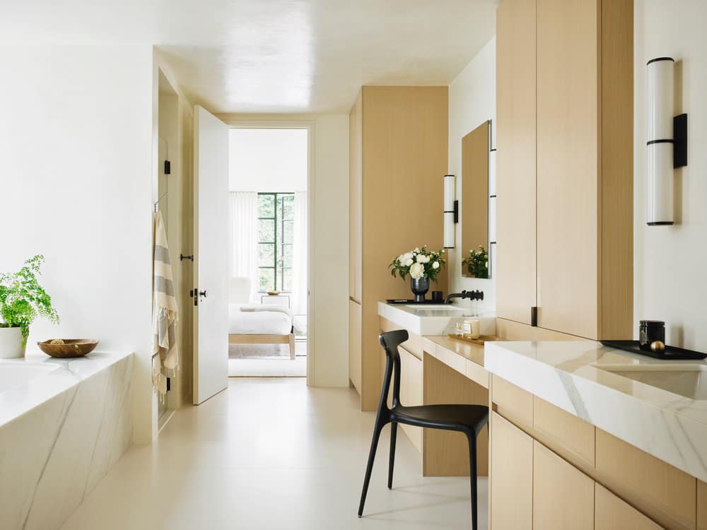
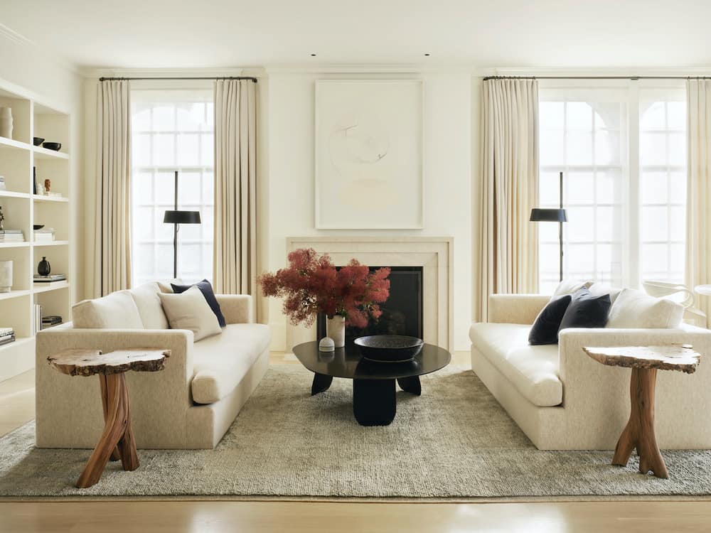
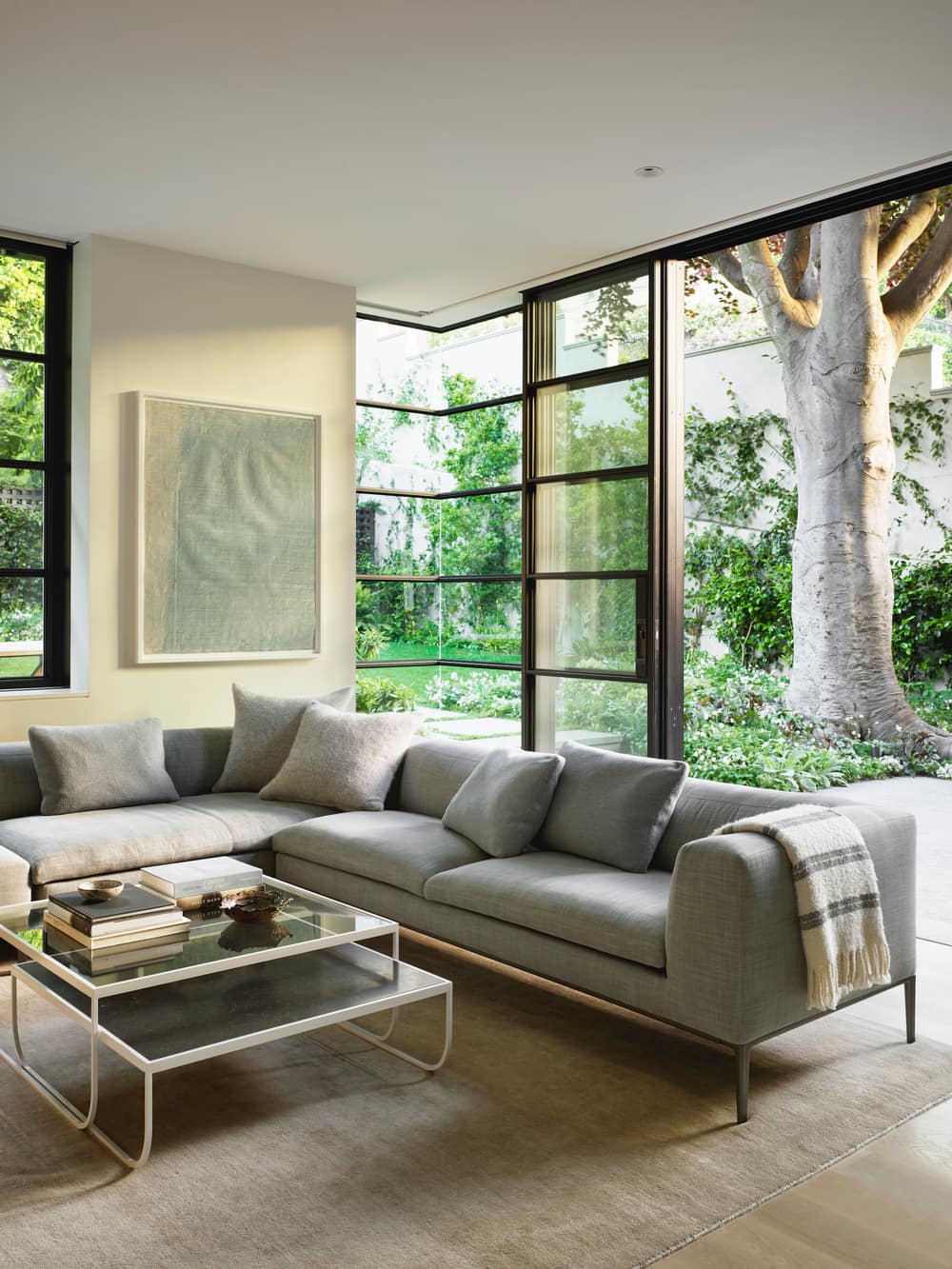
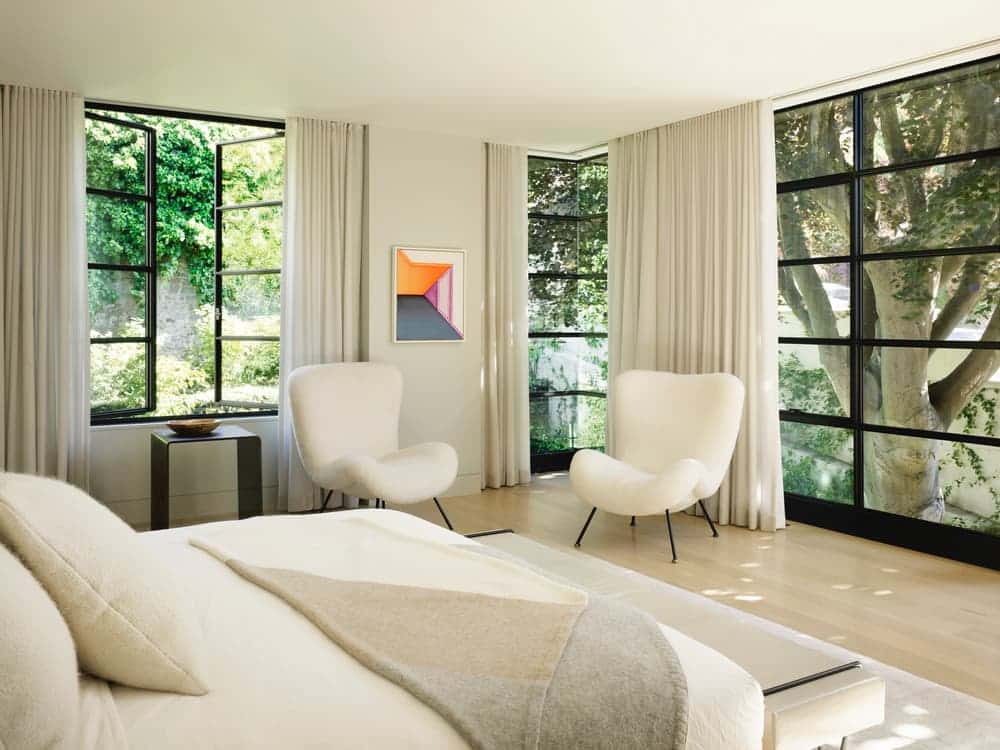
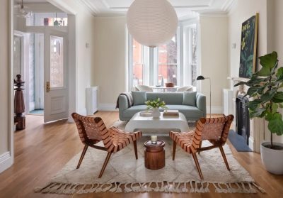
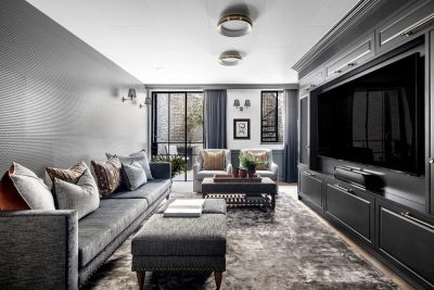
Interior designer Chloe Warner from Redmond Aldrich Design played a major role in finding the right balance between the owners’ aesthetics and creating the transition between the different spaces. She relied on muted tones (beige, gray, white, and cream) to shape the calm atmosphere. “We used natural neutral colors; the joke was the house was done in ‘shades of a mouse.’ The owners wanted it to be textured and layered but not have the furnishings be loud in any way,” says Chloe Warner.
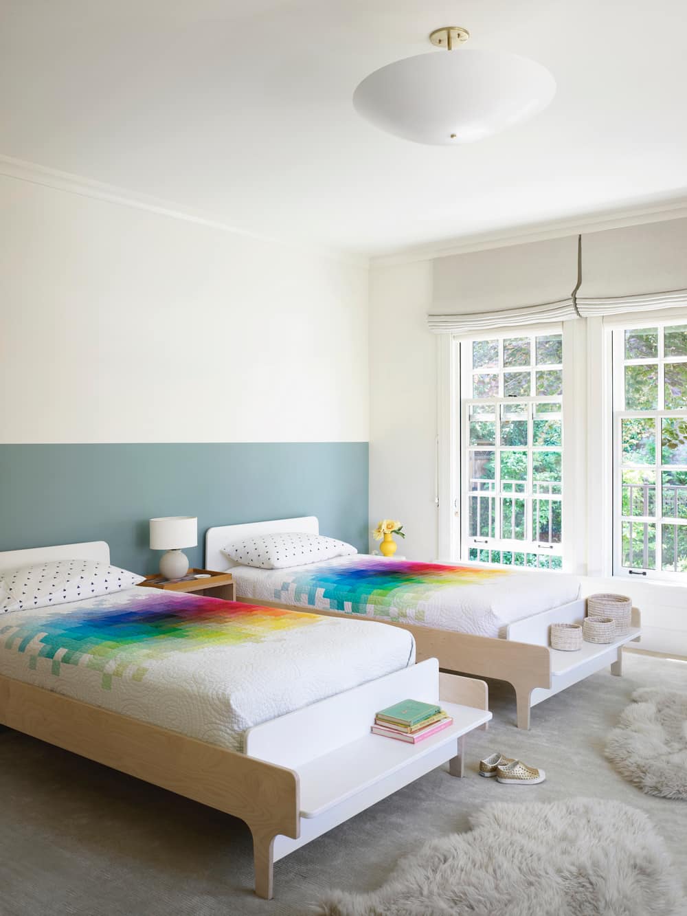
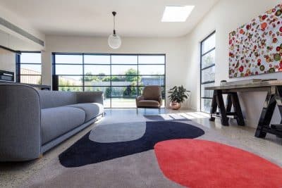
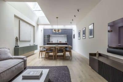
The color palette imbues the entire home with easygoing elegance, and a flood of natural light creates a bright, open atmosphere that feels quintessentially Californian. Blonde hardwood floors and luxurious shades of cream create the ideal backdrop for the home’s surrounding natural beauty. Artwork supplies pops of color. Nestled in the center of the house, the living room showcases an artful execution of elegant, minimalist comfort. Contemporary statement pieces, such the cast plaster Rose Uniake table, add depth among the layered neutrals.
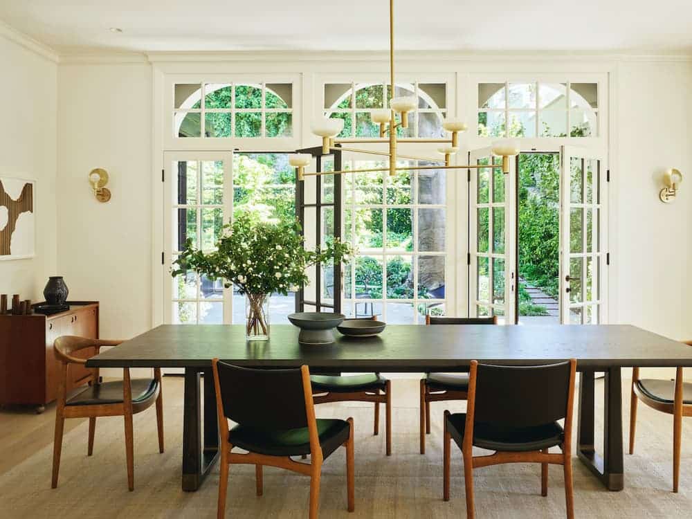
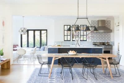
Casement windows and long wool curtains create a warm, cozy atmosphere while maintaining the room’s expansive feel. In the dining room, a commanding Ilse Crawford brass console nods to the grandeur of the home’s original Edwardian style. Its presence is amplified by the home’s nuanced color palette and balanced with a bold, black and white contemporary art piece featuring striking geometric forms.
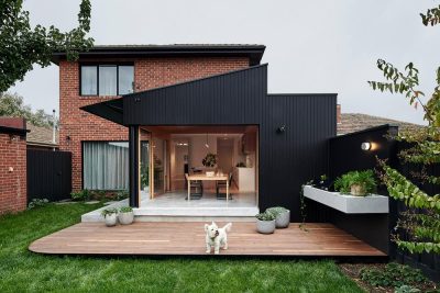
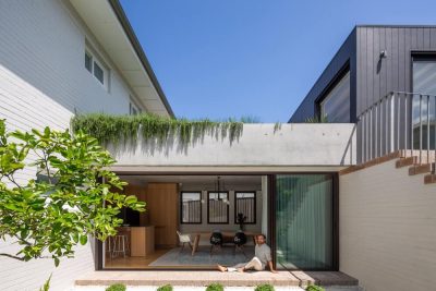
The harmony between classic and contemporary continues in the backyard addition. The steel-cased glass box addition adds contrast to the original exterior architecture, creating an airy, modern back facade. An urban walled garden showcases native plants and a century-old Copper Beech tree. “The beech tree was key in this project. The clients wanted to be near it, preserve it, and feature it. We did everything possible to get the family literally close to the tree and under its canopy during their daily life,” notes Scott R. Lewis, Principal, Scott Lewis Landscape Architecture. Standing alongside the glass and steel addition, the gorgeous original archways offer seamless indoor-outdoor living—yet another feature that makes this SF historic house the perfect home for a young vibrant family.
