Project: Taking Down the Walls
Architects: Studio Dulu
Planning Team: Adi Klein, Adi Fershtman, & Nitzan Hebron
Location: Ben Shemen Village, Israel
Owners: A couple and their three children
Plot: one acre
Property: 230 sqm
Photo Credits: Uzi Porat
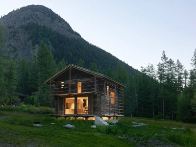
The owners of this property, located in the heart of the Ben-Shemen village and surrounded by glorious woody terrain, recognized its immense potential, and hired the services of Studio Dulu to design a pleasant home for a family of five in the spirit of its surrounding nature.
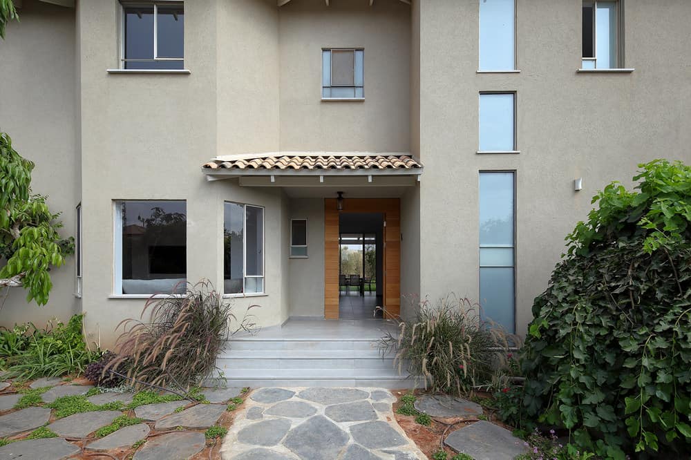
This beautiful rustic home is owned by a family of five: a father who is a hi-tech professional, a mother who was born and bred locally, and their three young children. A rustic cobbled path leads to the property. The facade, in mocha color, was fitted with a wooden front door and pale window profiles. The garden is abundant in plants that blend harmoniously with the Judaean mountains in the distance and the 100-year-old cypress tree woods that surround the village. Surprisingly, despite the rural nature setting, the interior was planned with a modern-contemporary touch, with dominant materials used across the property such as cement style floors, wood, glass, and Corian.
The property was purchased two decades ago for investment purposes. However, the couple recognized the potential of the one-acre plot that overlooked meadows, an olive grove and a breathtaking view of the local woodland and decided to make it their own.
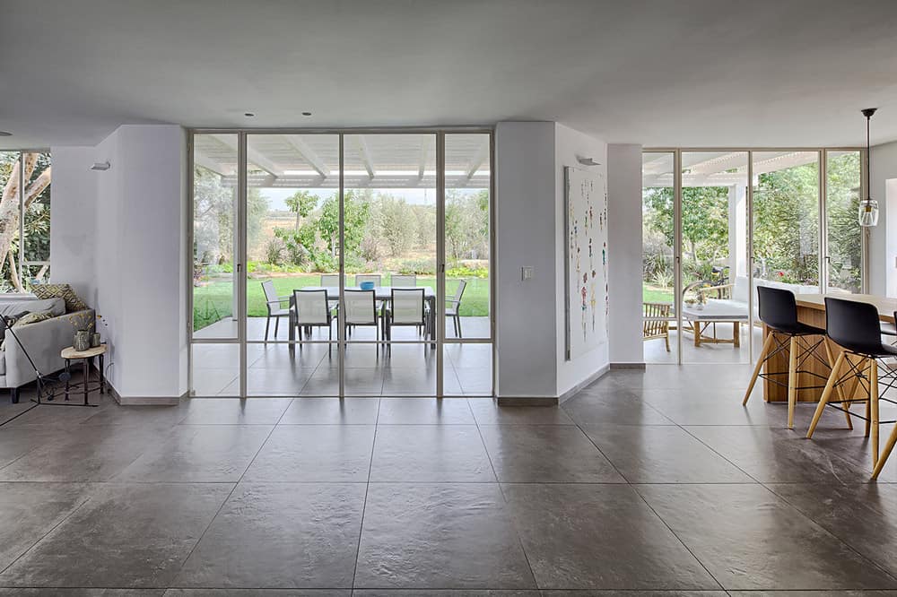
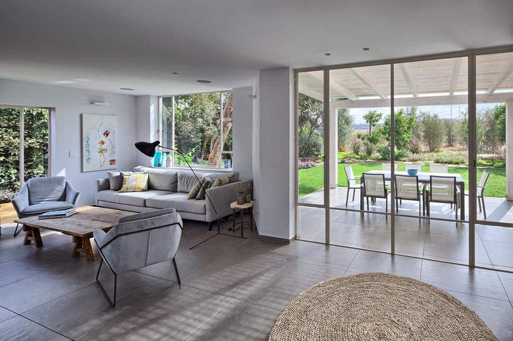
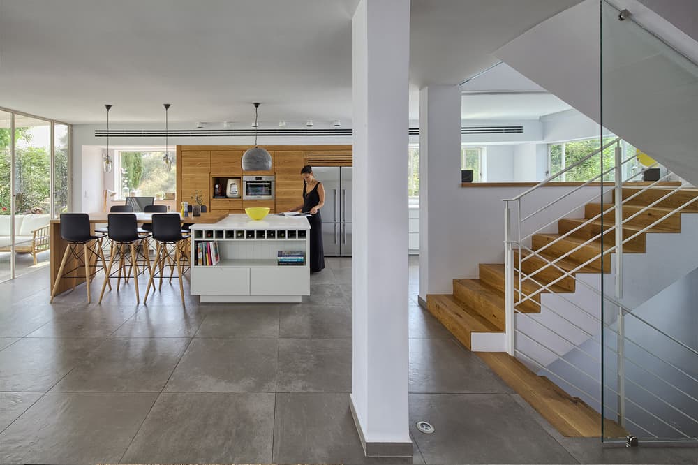
When the design team at Studio Dulu first entered the property, it was clear that a complete renovation was needed, whilst maintaining the existing structure. In order to give the property a fresh and modern look, the designers made two key changes: firstly, they opened up the living room to the views of the surrounding woods by creating large openings, framed with Belgian aluminum profiles. Secondly, in order to accommodate all common areas on one level, the designers took down all the partitions on the ground level and adjusted the various ceiling heights, creating one symmetric, proportionate and large open space. An entrance hall wall that was used for the staircase banister, was also taken down and replaced with a glass wall.
The Dulu designers explain their choice to downplay the angles of the external wall as an architectural tactic. “Diagonal lines naturally create a sense of overload, which is the complete opposite from the clean design we aimed to create, and so we worked to rectify this from the initial planning stages. One of the things that helped us achieve this was to design custom-made carpentry units that allowed us to visually straighten the angles internally”, explains Hebron.
In the property’s original layout, the front door opened up into a closed and narrow hall. The kitchen was located on the left side of the level and despite its size, it was minimally furnished and fitted with only one row of cabinets. “The kitchen is the most significant space in the property”, Says Klein. “Most of the family activities happen here, and it’s the family’s central meeting point. The kitchen was originally separate from the lounge area and in the new layout we opened this up to one big open space”, adds Fershtman.
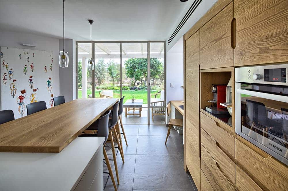
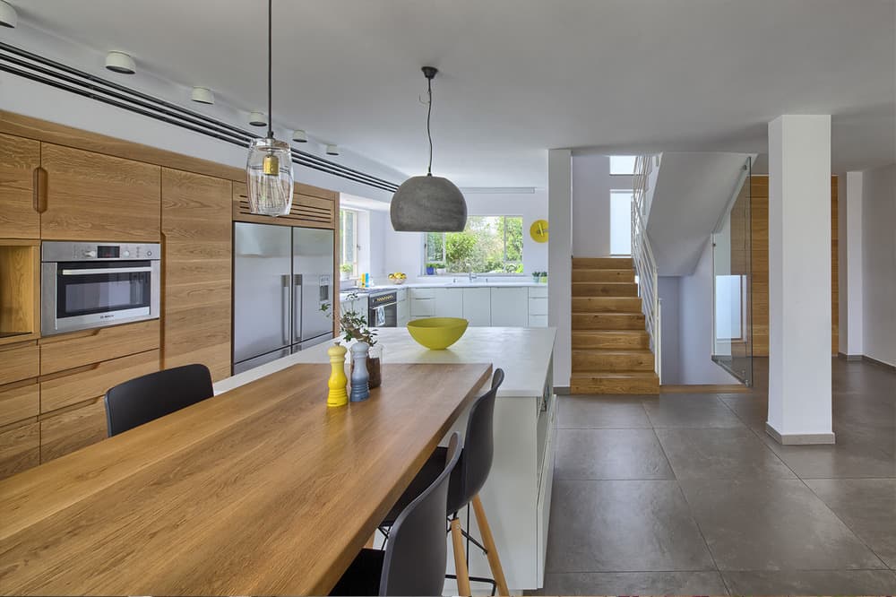
As part of the kitchen renovation, the designers added four large openings to improve fresh air circulation and natural daylight: two around the worktop area, a window above the home office corner, and another glass door through which the garden can be accessed. The low cabinets are white, whilst the top cabinets are a warm wood. The functional kitchen island is used for storage and extends into a wooden surface that is used for dining.
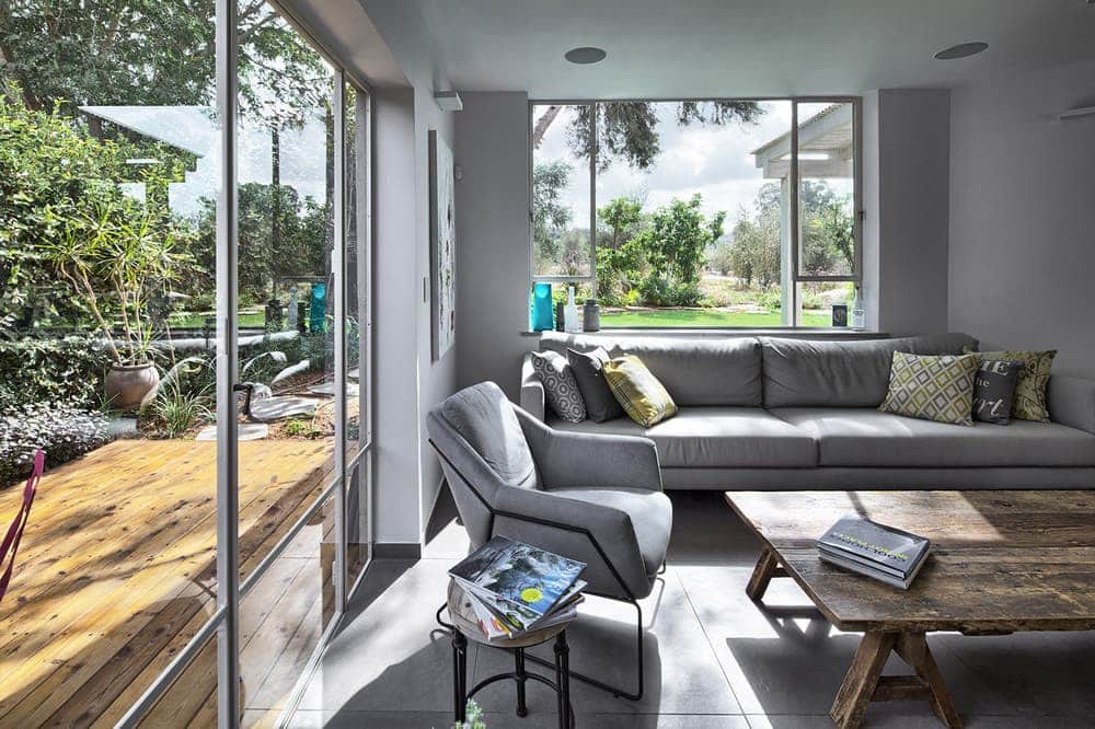
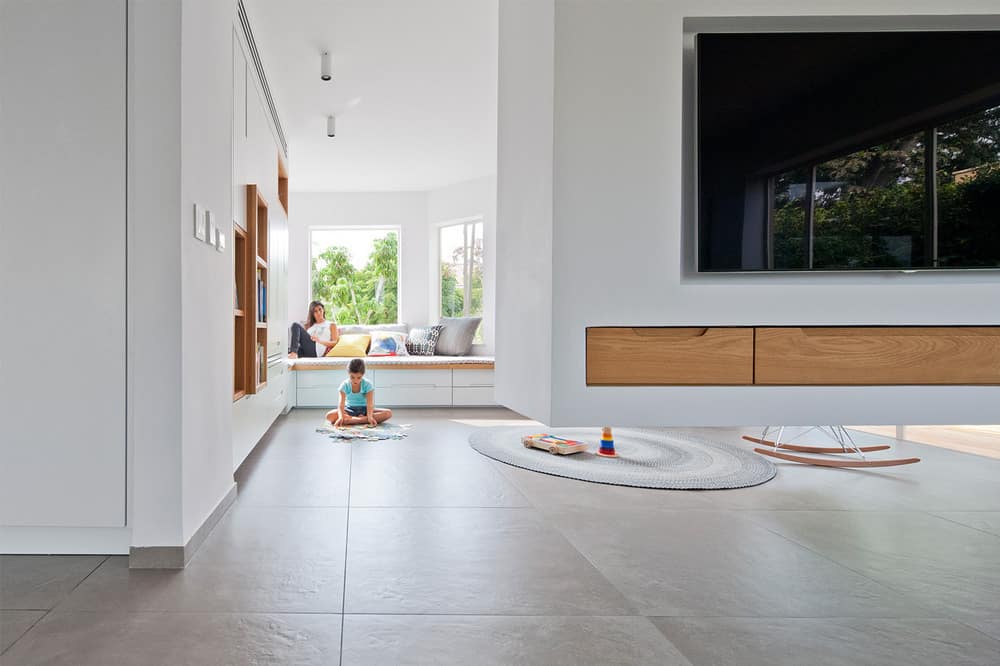
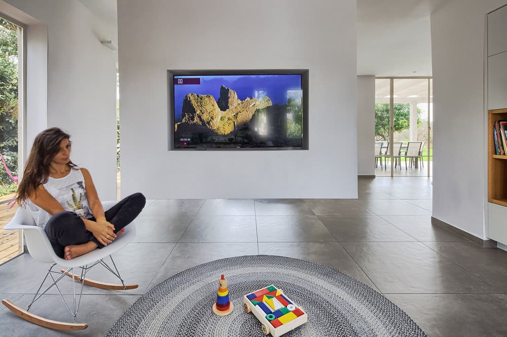
The original lounge was of intimate proportions and just right for the family. The design team redecorated it with a gray modern sofa, a wooden table and a black free-standing lamp. A suspended wall, used for storage and fitted with a TV, was incorporated into the space to create a subtle partition between the lounge and the family corner.
“We had a dilemma as to how we could renovate the original staircase in line with the new design concept”, says Dulu designer, Fershtman. “One of the ideas that came up was to replace the whole staircase with light stairs that would double as a sculptural element in the space. We eventually passed on the idea as it was cumbersome and expensive to implement. Instead, we fitted the stairs with wooden treads and added light fixtures and a large clock on the wall”. The designers all agree that the real gimmick was the use of a fitted glass window that allows for eye contact between anyone going up the stairs and anyone in the kitchen.
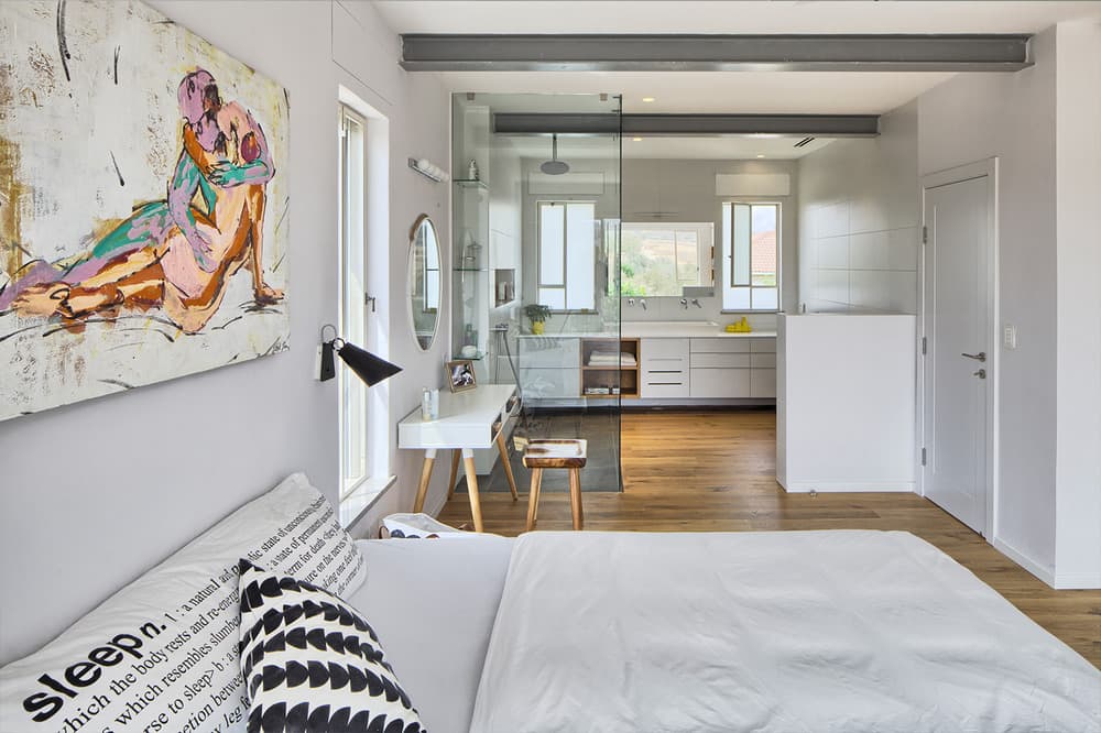
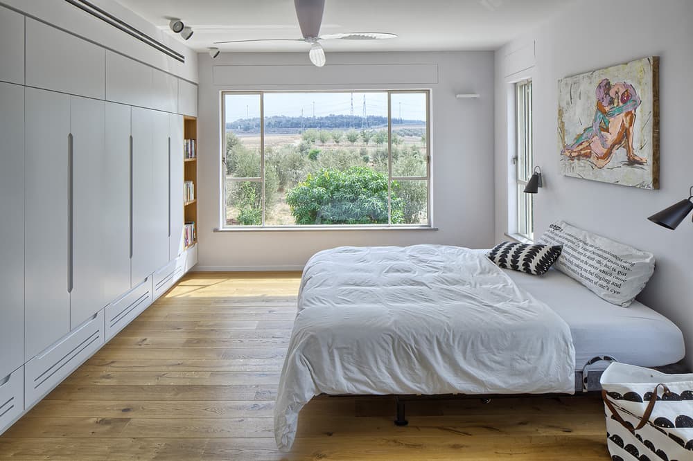
Though the bedroom level was replanned, the master bedroom stayed in its original location due to the stunning view that can be seen through the windows. The designers chose to reposition its entrance door that was previously located next to the staircase, in order to create a space that was free of partitions. All bedrooms are located to the left of the door. A wooden open-shelf wardrobe was fitted across from the bed. The bathroom is located on the other side of the room and separated by a glass partition, which reinforces the harmonious design theme of minimal partitioning, except for the toilet that is concealed by a low wall. A large, impressive sink, that can be used by the couple simultaneously, sits on top of a suspended open-shelf wooden cabinet.
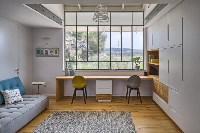
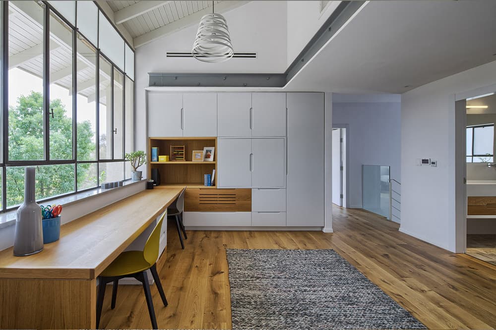
A family corner that overlooks the serene view is in the center of the level and a cupboard separates between the corner and the young girls’ bedroom. When the girls are older, it would be possible to remove the cupboard and turn the space into two separate large bedrooms.

