Project: Vila Olimpia Apartment
Architects: Diego Revollo Arquitetura
Location: São Paulo, Brazil
Size: 828 square feet
Photographer: Alain Brugier
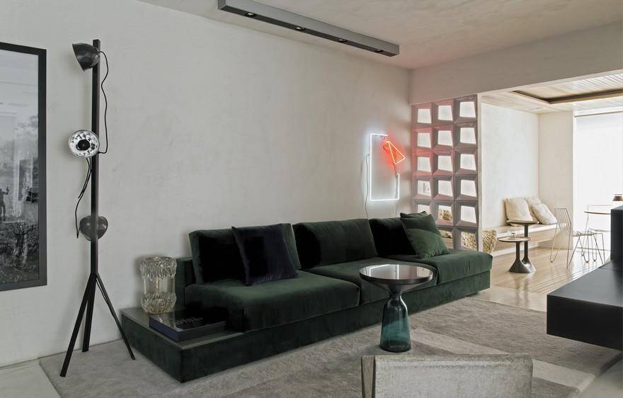
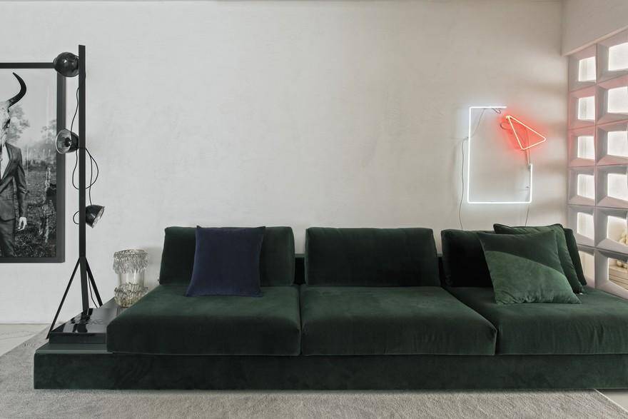
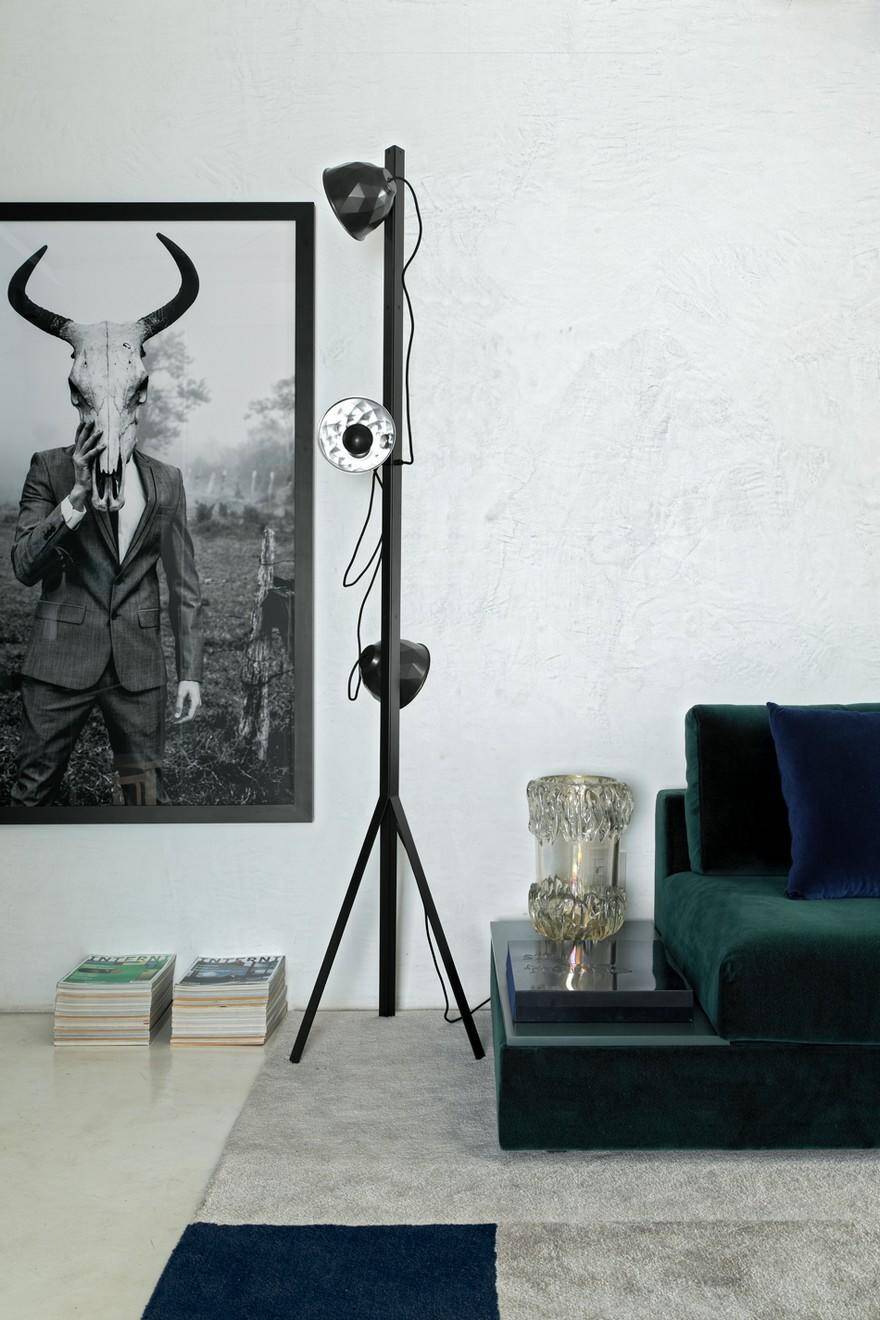
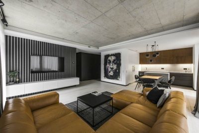
The decorative composition of this apartment is the result of a trend that has been gaining strength in recent years: that of a minimal, clean décor, in which the sobriety of the whole is punctuated by specific pieces. The outcome is based on the assumption that we now live with less; there is no room to accumulate little things, nor is there time to enjoy them. It is necessary to reinvent and remodel to a trend that’s here to stay, hence the proposition of this stripped-down lifestyle, compatible with the daily life of the client.
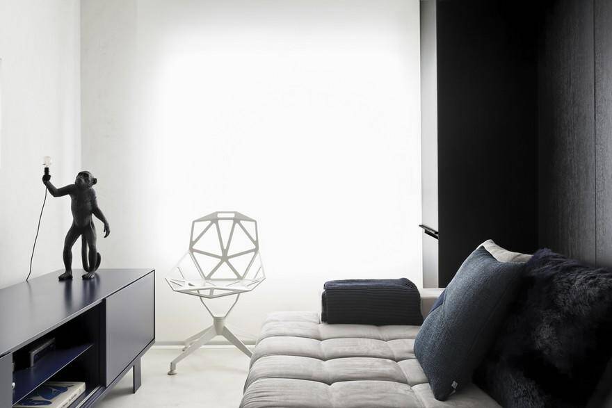
The color palette of this Vila Olimpia apartment, in São Paulo, definitely lives up to its name: black and white delimit the 77m², which were very well used by Diego Revollo in yet another one of his projects. Located in a densely populated and business-oriented area, the residence is set in a modern, corporate and cosmopolitan setting. In his first contact with the office, the client was extremely empathic about the need to start from a design that tied up all the spaces of the apartment, with no forgotten or unused corners. It was necessary to integrate and value each square meter.
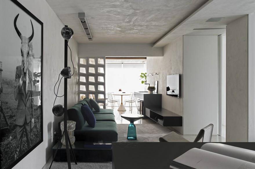
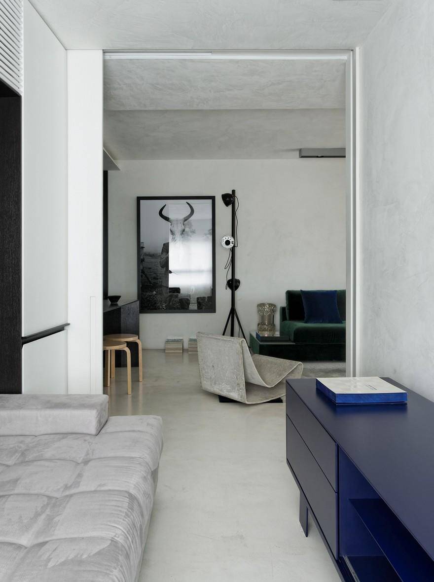
Hence the challenge and the difficulty that motivated the development of the project: it was necessary to aggregate each of the parts without the owner of the apartment losing the privacy of his dormitory. The second bedroom was annexed to the living room, taking the form of a TV room separated by sliding frames. The expansiveness of the living room also merged the entirety of the balcony space into itself, becoming the central point of the apartment due to its amplitude and the interaction between the balcony and the home theater.
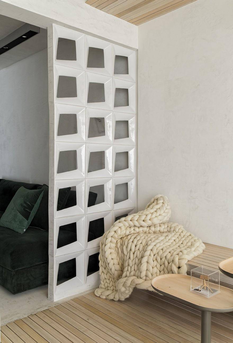
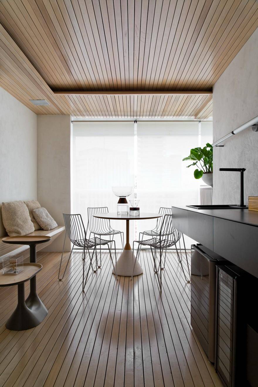
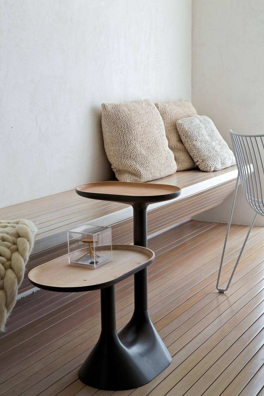
On the importance of tying all existing environments, the terrace of the apartment stands as a great point of relaxation, entirely lined with solid slats of bleached Tauari, giving it a Scandinavian mood. In addition to being cozy, this space is always the starting point of any and every party, guarantees the owner. It is not difficult to understand why: instead of gourmet appliances, all utensils necessary for drink making were selected, as expected!
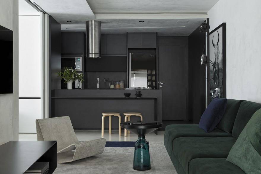
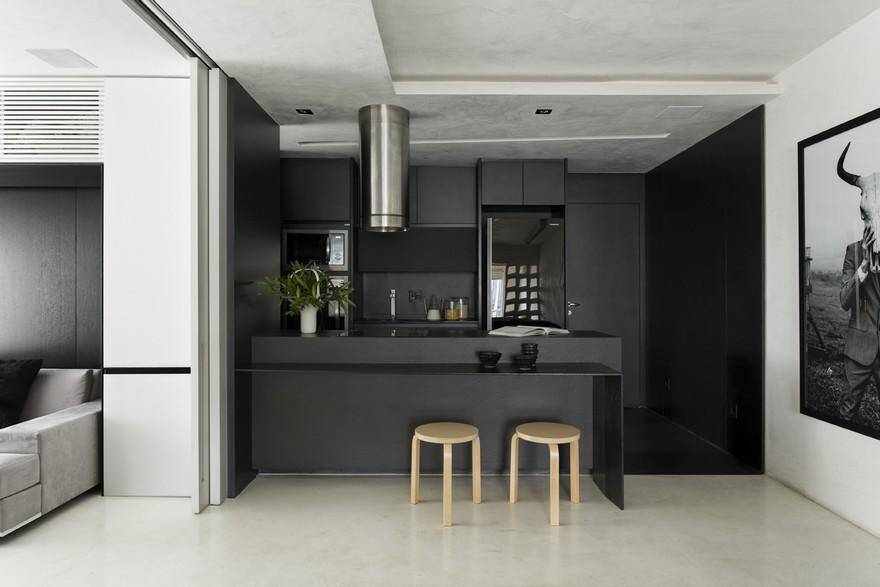
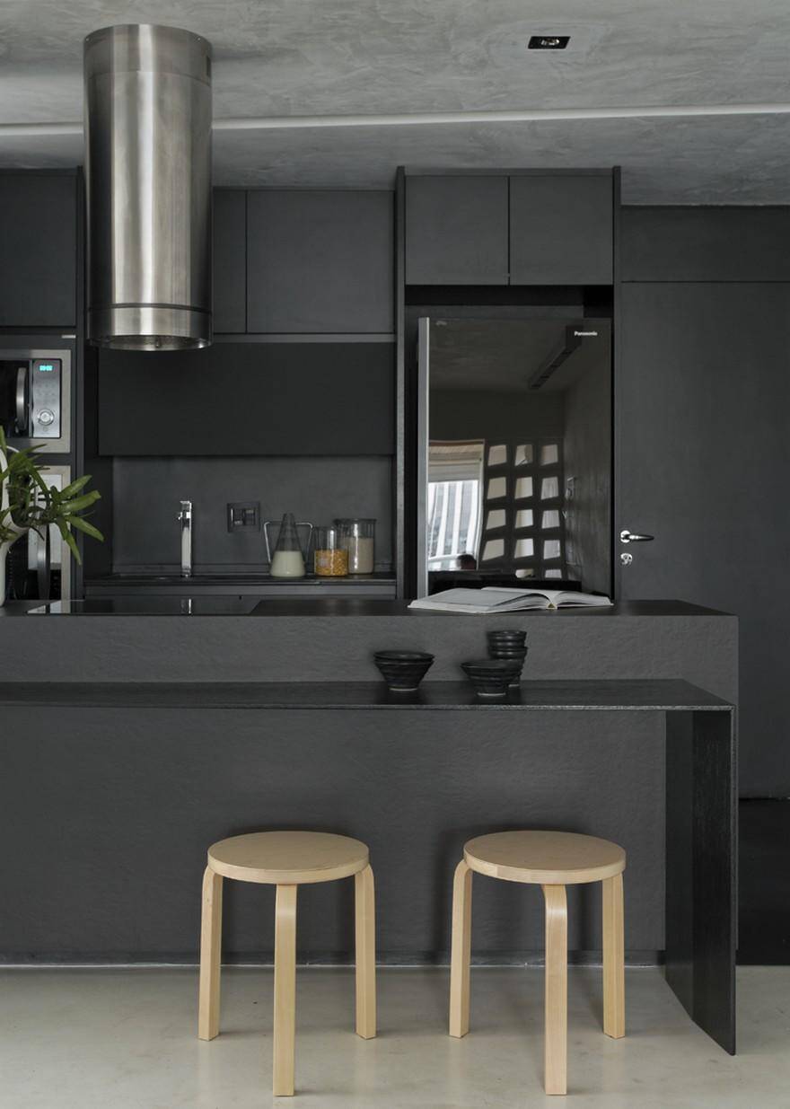
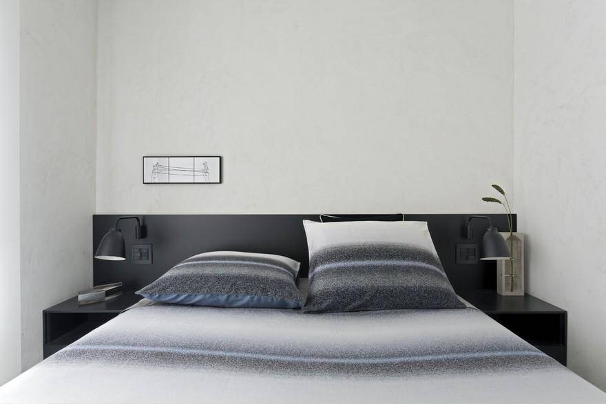
The black color of the woodwork stands out against the white burnt cement used in the apartment. While black delimits the space, the white frames the entire composition. The kitchen remains attached to the entrance of the apartment, confined to the limits of its own color, while the white of the walls, floors and ceiling end up framing it. Not to mention the fact that the clarity of the burnt cement provides a diffusion of light capable of bringing enough brightness to prevent the lighting of even a single lamp during the day. The chosen shades create a light atmosphere, capable of reflecting the light from outside into the apartment.
The environments were sectioned by color, according to their use and function. The social and more intimate spaces received the white of the cement. The services area was lined with black and the balcony was lined with shades of honey. Thus, the visual division is created by the colors chosen for the spaces, and not by walls or other physical elements. In fact, the balcony was clad differently from the living room because one did not want it transformed into a social space, but to be sure that it would be used frequently for moments of leisure and relaxation.
The light, bold furniture reflects the jovial and festive spirit of the apartment owner: the purpose was to adapt the home to the lifestyle of a single man, in a relaxed and masculine atmosphere. Using glass, metal plates and perforated elements, it was possible to ambulate the entire visual path of the living room cleanly, without excess, and always tying one space to the other. Perforated elements, popularly known as Cobogós and introduced in the 1950s, are an absolute success to this day, as they allow for the passage of light and ventilation as well as possess a unique aesthetic. Nonetheless, the decorative bait of this apartment is undoubtedly the vibrant contrast between the uses of black and white, marking uses for an essentially contemporary apartment.

