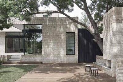
Project: A Home for Ana and Pau
Architecture and Interior Design: Pablo Muñoz Payá Arquitectos
Team: Marina Giménez, Nuria Casas Gento, Elena Navarro Senent,
Sonia García Pérez, Pablo Marcos Vila
Location: Elda, Alicante, Spain
Year: 2019
Area: 184 m2
Photo Credits: David Zarzoso
In the collective imagination, the worst thing about a mid terrace house, a place which by definition is deep with most of its sides being shared parameters, is darkness. It is true that in houses of this kind it is common to find oppressive spaces, the result of a complicated spatial management when an appropriate professional has not been consulted and when loving care is not given.
Looking at Pablo Muñoz Payá’s project “A home for Ana and Pau” we can see how the antithesis of this perception can be achieved, free from the connotations that such typologies may entail.
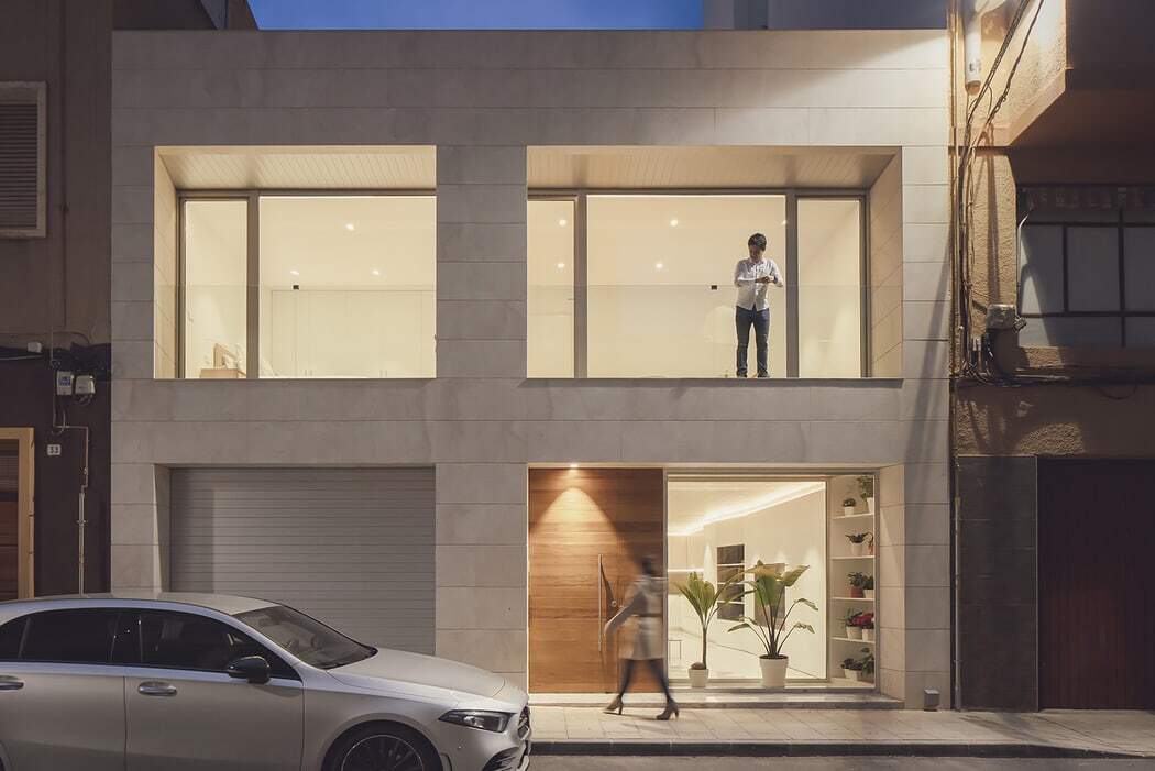
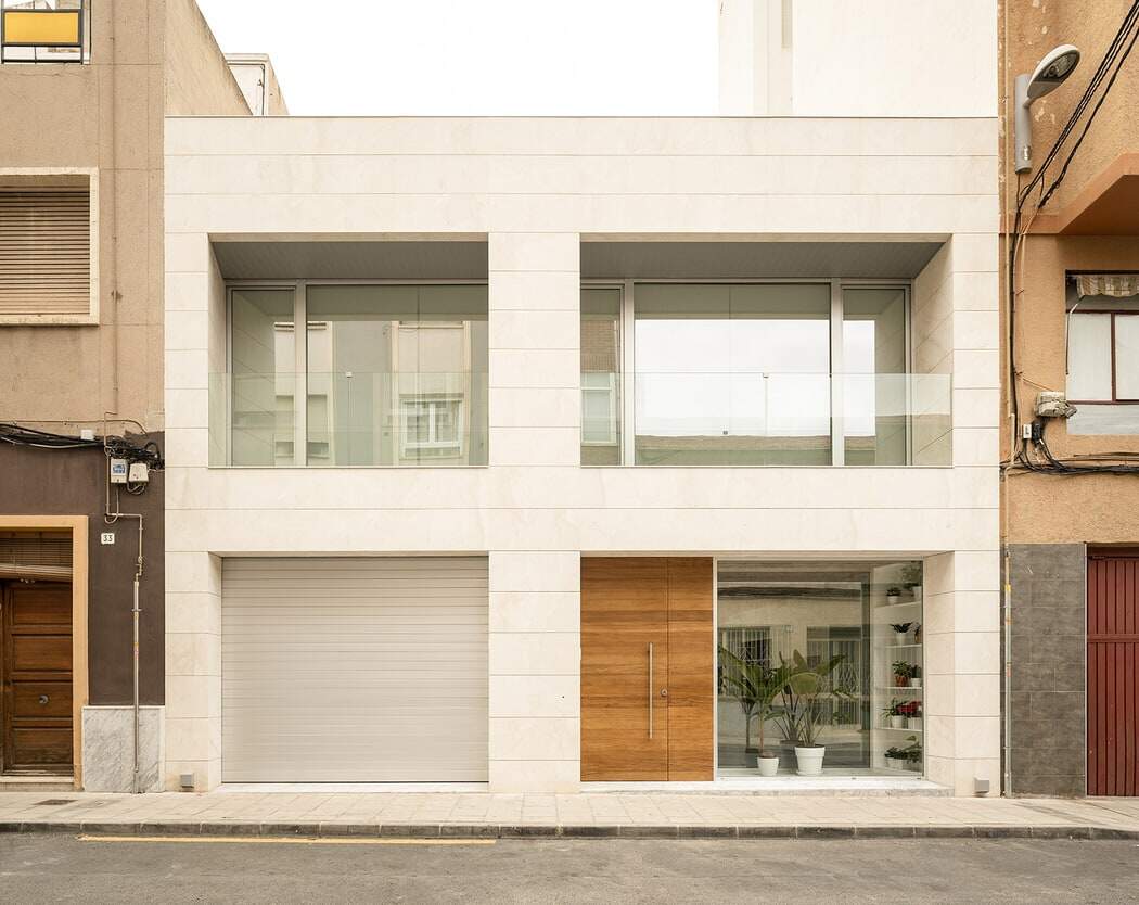
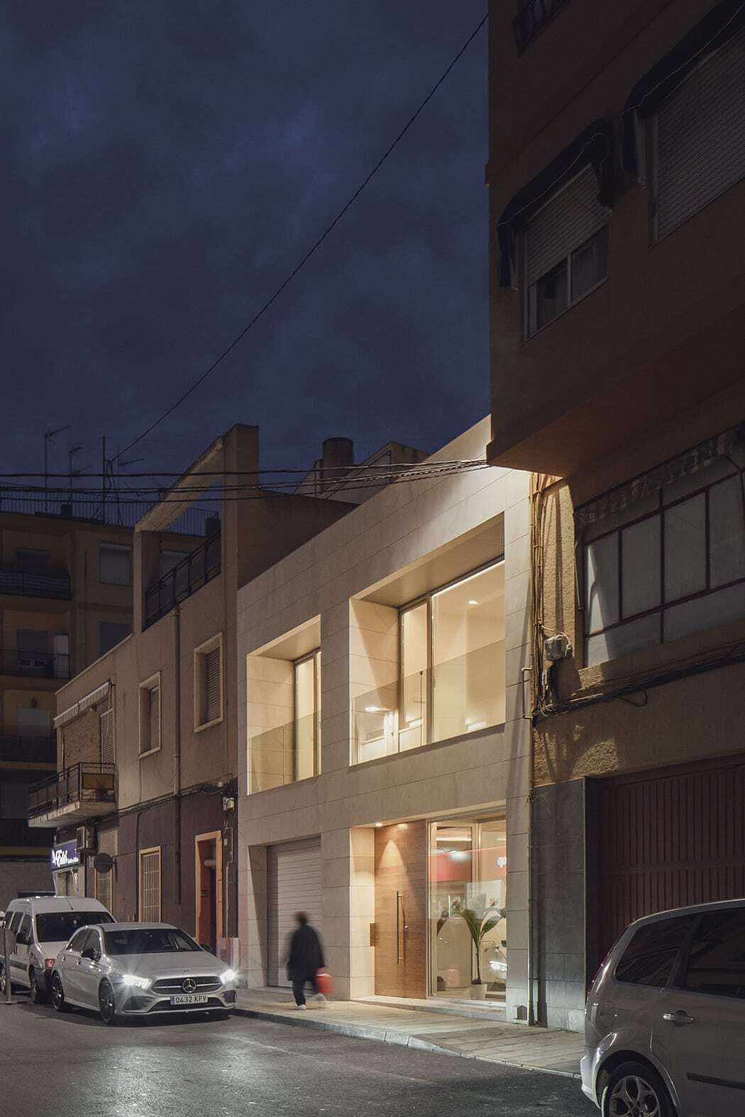
The home is situated on a 120m2 plot in the centre of Elda, with only an 8.64m front on the exterior and 13.34m in depth. The building is on two levels, the ground floor being given over to more social uses, while the first floor has a more family character.
Popular architecture has always worked with elements that allow for the creation of empty spaces, aerations, that introduce air, light and that transversely break up the length to create a relaxed spatial perception, that does not absorb, such as vestibules and patios. Both are put to use in this home.
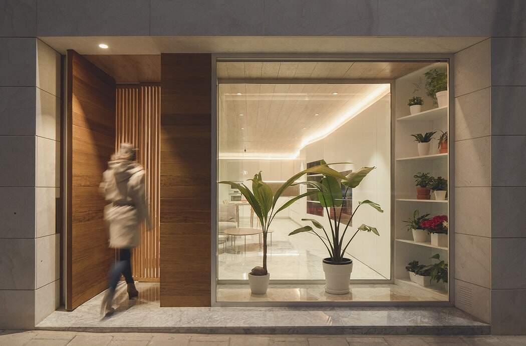
The main strategy of this project, paradoxically, is the longitudinal division of the ground floor, contrary to the usual procedure in these cases. The garage has been placed in the northern half and a patio at the back of the same dimensions. Dividing this lateral into two parts, we find the staircase that leads to the upper floor. Part of these spaces open to the interior (the patio) and part to the exterior (to the street).
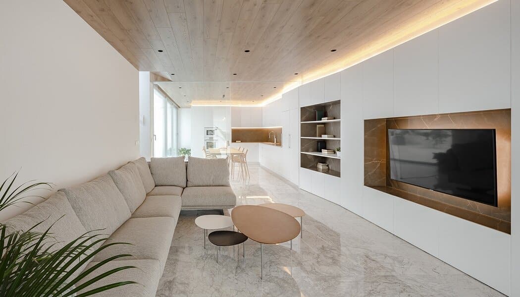
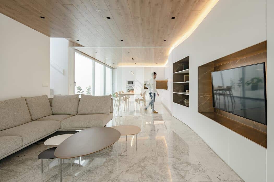
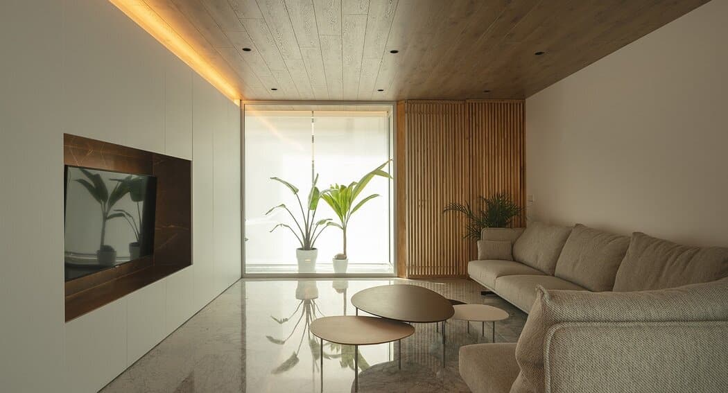
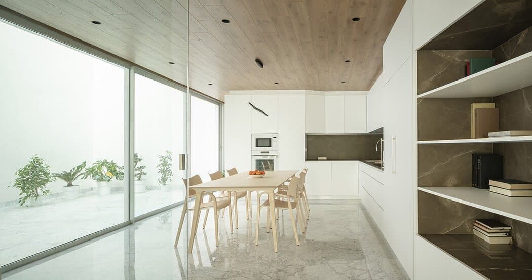
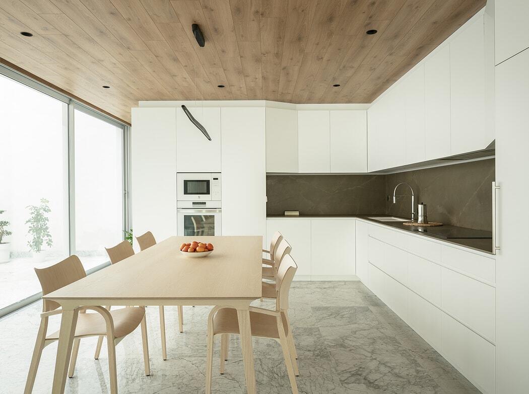
This defines, on the ground floor, a setting for a living room, kitchen and dining room, longitudinal and translucent, which allows part of the spaces to open to the patio. Around these, an “equipped partition” unfolds, housing storage space and integrating kitchen furnishings, at the back, without losing the continuity of the lines, a matt white design that softens the forms and eliminates corners. Perforated in this, as geometric spaces in stone (polished, shiny brown marble) are the holes for the hob, shelves, TV etc.
Behind the kitchen, a bathroom is hidden thanks to the turn in the furnishings. The flooring, in white marble, continues into the patio, creating continuity throughout this level. The patio brings light to the living space and produces reflections in the marble.
Niches define spatial relationships: opposite the kitchen space is the dining room; opposite the shelving, the stairs; opposite the television, the living room; three environments in the same space with no need to make divisions beyond a light glass partition that closes off the kitchen, a 13m depth broken up transversally thanks to a kitchen that acts as an antechamber to the backyard.
Above this the first floor is in the shape of an L. Here the main bedroom opens onto the patio, materialising in an interior balcony, while the second bedroom and the study open onto the street. As with the ground floor, the interior flooring of the bedrooms, (in this case of wood) continues towards the exterior onto the balconies. The façade has a powerful presence and large openings in this shorten the linearity of the front.
This house, light and clean, never gives the impression that it is between three blind parameters. Its simplicity, geometric clarity and resources which enrich and enhance, result in a resolute, pleasant home which at no point loses spatial quality.

