Project: Gale Apartment
Architects: Memola Estúdio, Vitor Penha
Project Team: Veronica Molina, Vitor Penha, Simone Balagué, Fanny Fouquet, Nina Sivalli
Engineering: CYMZ Construtora
Location: São Paulo, Brazil
Area: 320 m2
Year: 2021
Photographs: Fran Parente
This apartment, located in the west region of Sao Paulo, was entirely renovated. The project’s main goals were to create a new connection throughout the rooms, value the couple’s works of art, expand the visual contact with the surrounding natural environment, renew the interior’s atmosphere, and promote new dynamics in the use of the kitchen.
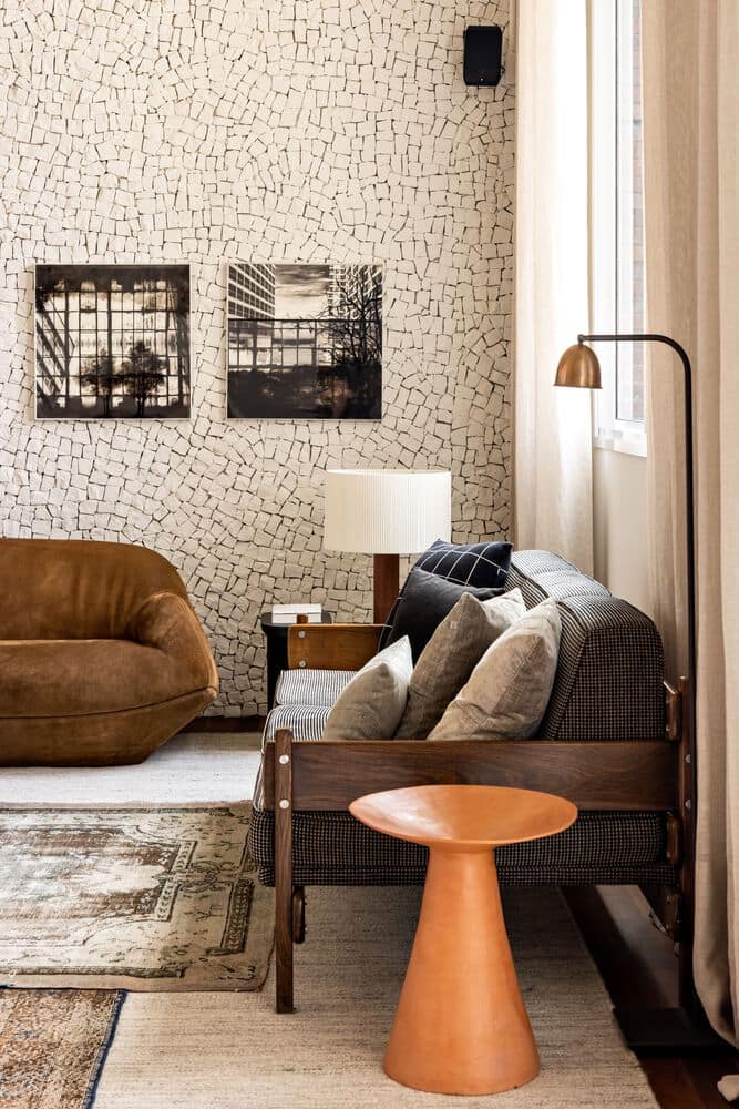
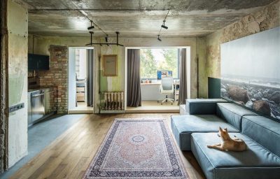
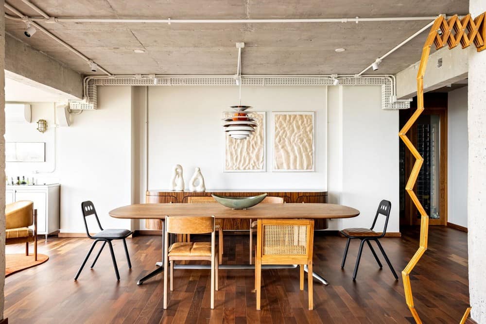
The idea was to oppose the natural materials’ rusticity, such as the slate and wooden floors and the hardwood furniture, to elements that speak to the owners’ cosmopolitan personality. For that same purpose, the exposed concrete was celebrated through the demolishing of walls and ceilings and the removal of coatings. Just as well, the custom-made furniture features metal work and evokes industrial design.
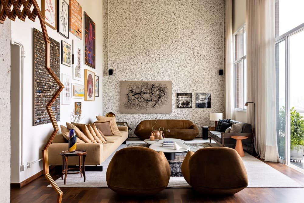
Therefore, a balance was created among the conceptual elements of the design, which was then used to establish a neutral background, timeless and serene, to highlight the couple’s works of art and the newly acquired pieces. If the floors on the social areas and part of the furniture are made of wood, then the walls above them are either white or concrete.
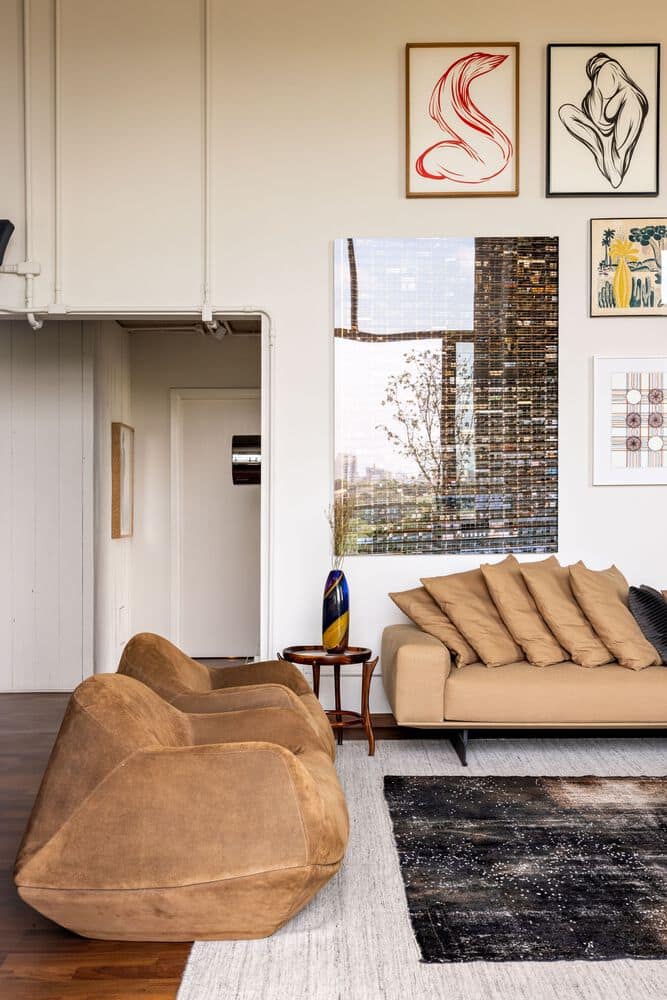
The core interventions are concentrated in the removal of the ceilings from the social areas and the kitchen, exposing the concrete in the walls, the entirety of the changes in coatings, and complete renovation of the electrical wirings and lighting fixtures.
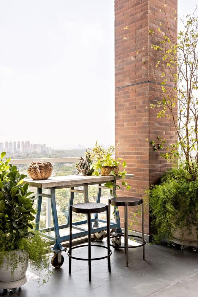
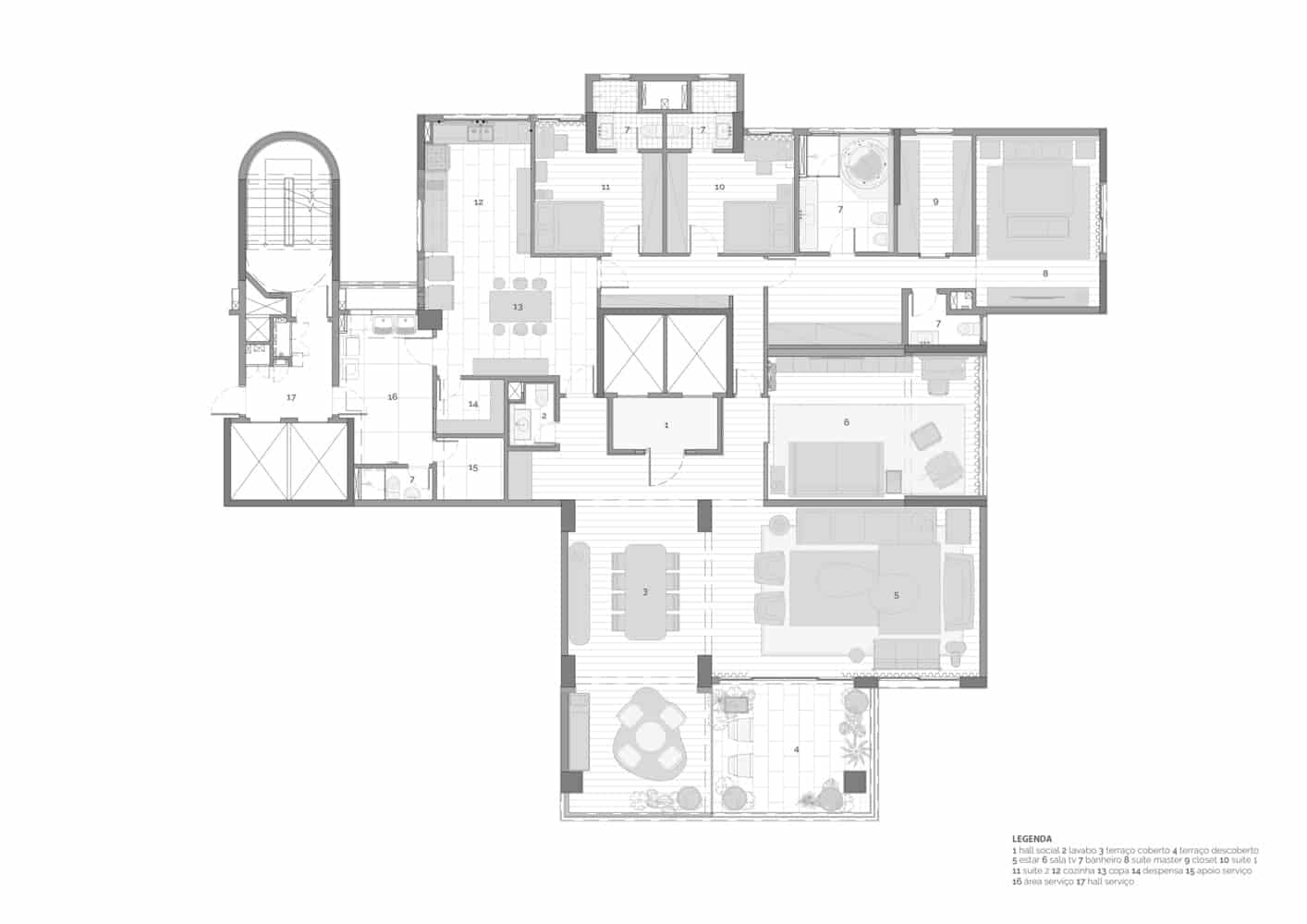
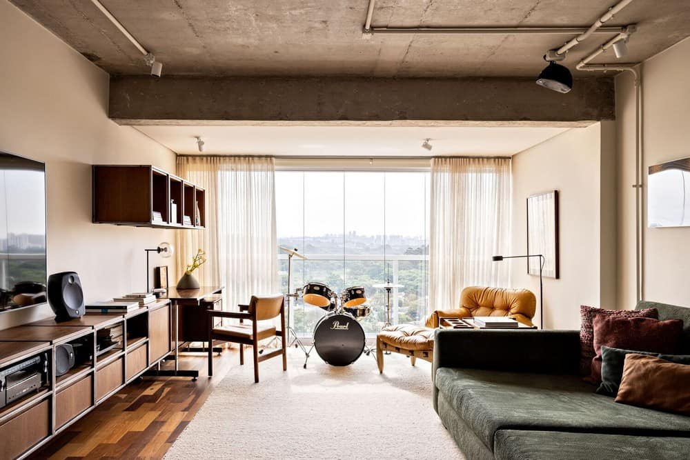
A few strategic walls were demolished, opening up new interior perspectives, such as the broad view of the dining, living, and balcony now possible from the entrance hall, while layout alterations from the removal of some of the indoor frames improved flow and comfort. The two highlights are the new TV room, now connected to the multipurpose terrace – a small office and music room – and the dining room, now expanded to one of the sections of the old balcony.
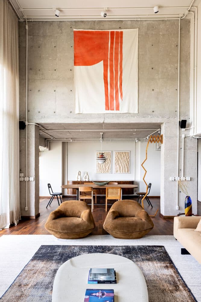
There was careful mixing of the new contemporary furniture and the modern pieces already in the home, such as the Jorge Zalszupin and Sergio Rodrigues sofas and the former’s Mole armchair. Old and new share neutral hues and the furniture has been reupholstered to match the new color palette, inspired by the autumn and the sunset colors found on the horizon.
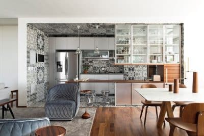
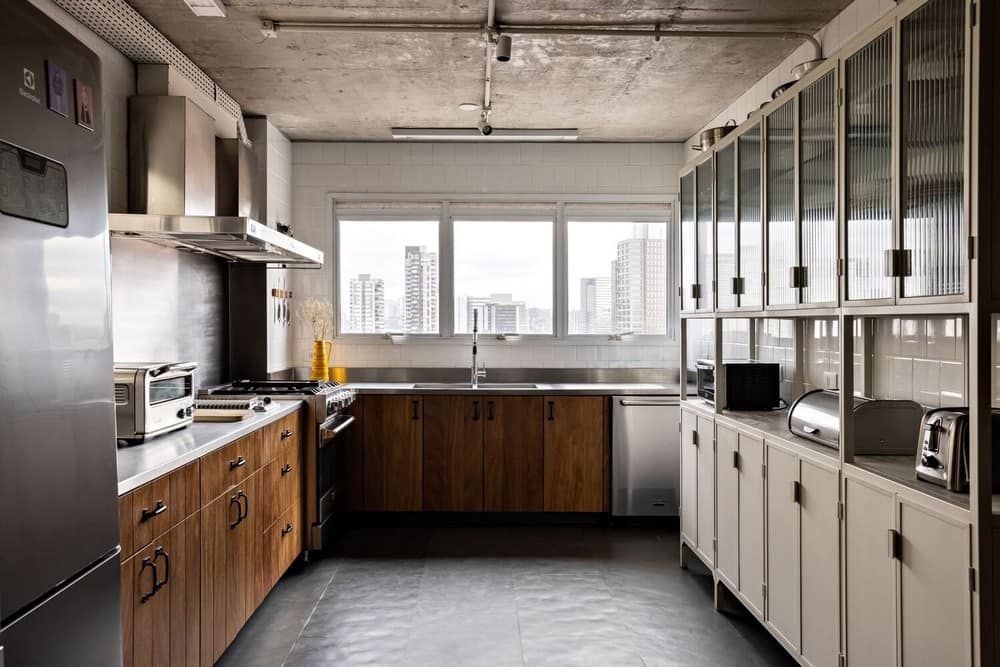
The kitchen’s renovation promotes the sharing of experiences around meal preparation and its everyday enjoyment. The room was enlarged by the incorporation of a pantry with an island, custom made and with a wood top, to be used as a table. On the opposite side of the room, L-shaped, the high-shelved walls were replaced due to the creation of a storeroom in part of the old laundry room, allowing for more natural light to shine through.
The floors are slate, at the same time complementing the furniture’s rusticity and balancing the industrial nature of the floor-to-ceiling cabinet that, inspired by olden days pharmacy counters, was made of metal sheets following a design created especially for the Gale Apartment.
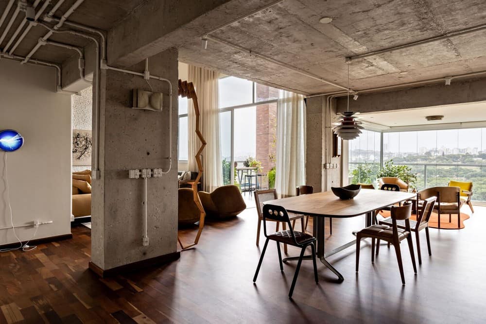
The central position of the apartment’s social entrance was enhanced by the removal of the wall that blocked its view of the social areas, which now granted better flow and visuals. There’s a new cohesion to the entrance hall, created by using the same demolition wood from the door on the walls, then painted white, whereas the dining room was expanded to one of the balconies. Now transformed into a mix of lounge and bar, a low wooden table at its center and the comfortable armchairs around it invite long conversations.
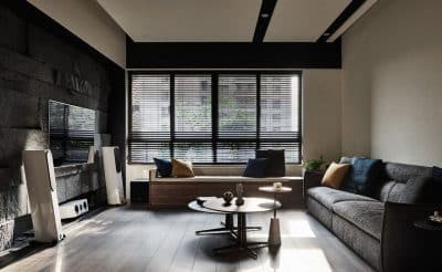
The living room, with its double ceiling, had its layout and atmosphere transformed. On one of the walls, the gray Portuguese stone mosaic was visually neutralized by a coat of white paint, similar to the effect on the entrance walls, highlighting the concrete surfaces. All floors have been leveled.
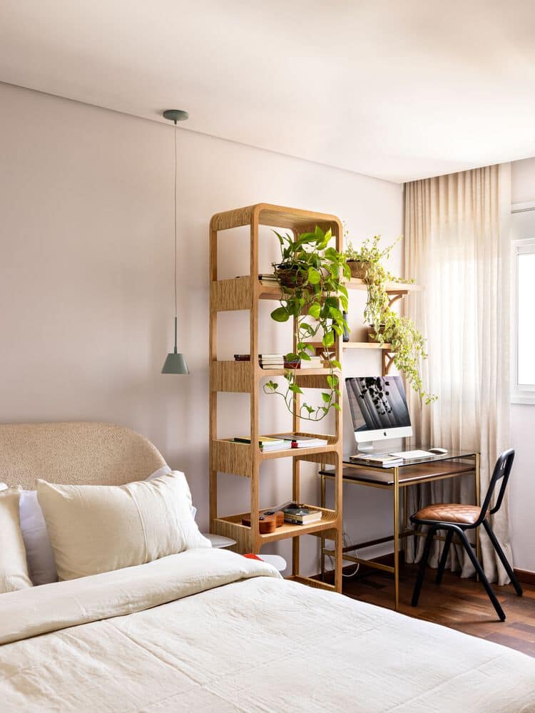
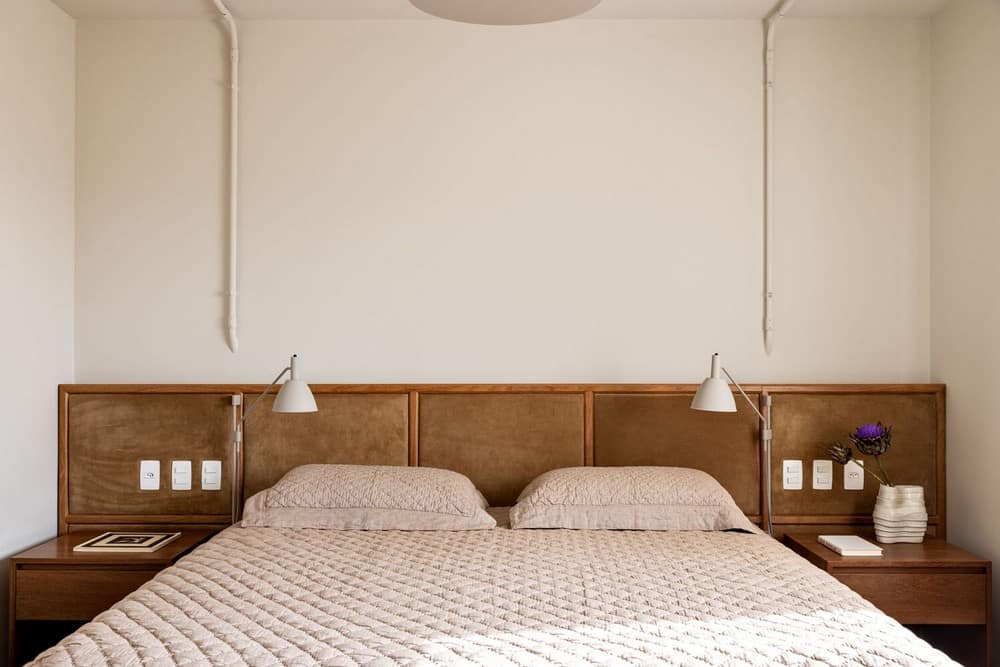
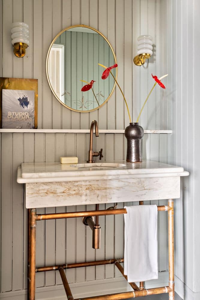
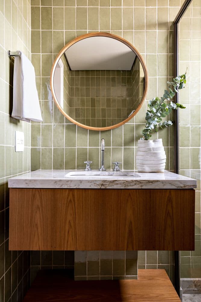
The smaller interventions in the private rooms are centered on the replacement of a few elements, such as the doors of all the closets and the coverings on the bathroom’s walls and ceilings, again mixing coziness and rusticity.
