Project: Harmony Apartment
Architecture: Idealist studio
Location: Ljubljana, Slovenia
Area: 58 m2
Year: 2021
Photo Credits: Blaž Gutman
Text by Idealists Studio
In one of Ljubljana’s newest developments, we designed a new apartment for a young couple who wanted to create a home and an elegant shelter that reflected them as a couple and as individuals.
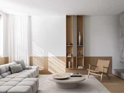
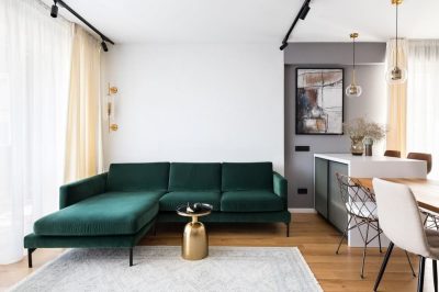
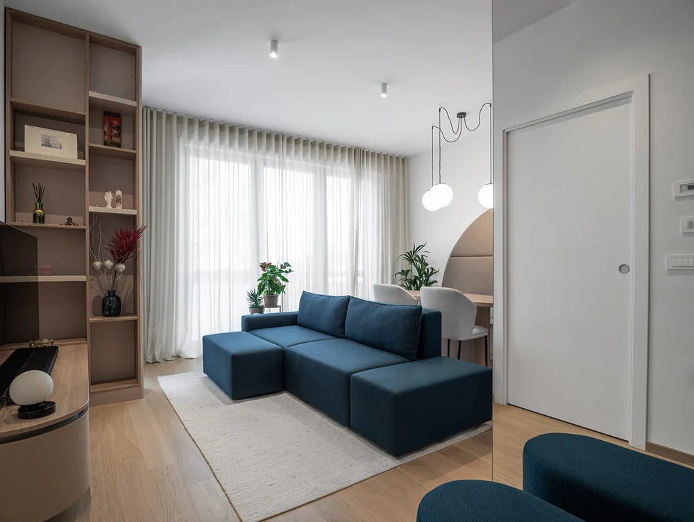
As a starting point for the design, we wanted to create a balance between masculine and feminine aesthetics. The spatial design of the Harmony apartment was read as a journey or a series of views through the changes from narrow to more open spaces and vice versa. We wanted to create a harmony of opposites – volumes and voids, light and dark colours, light and shadow, soft and angular strokes – in the frames that open up as we move deeper into the apartment. Using large angular and small rounded volumes and three shades of beige, we created a balanced base with the furniture, complemented by a careful selection of light and dark, rough and soft textiles.
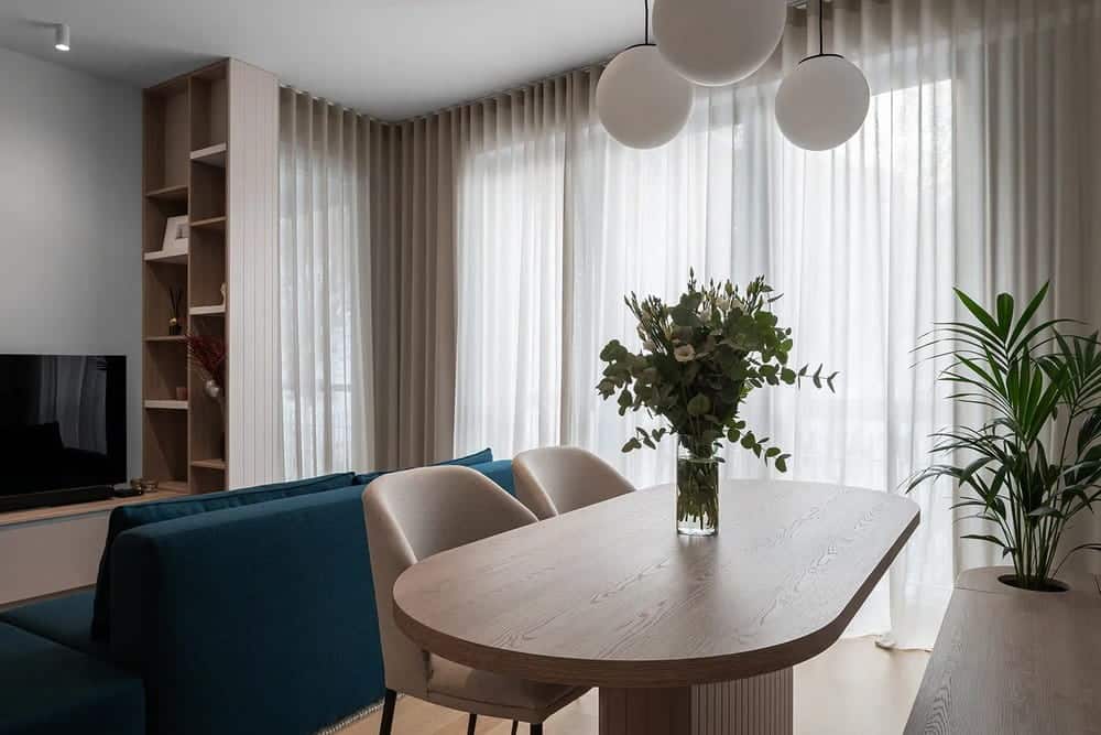
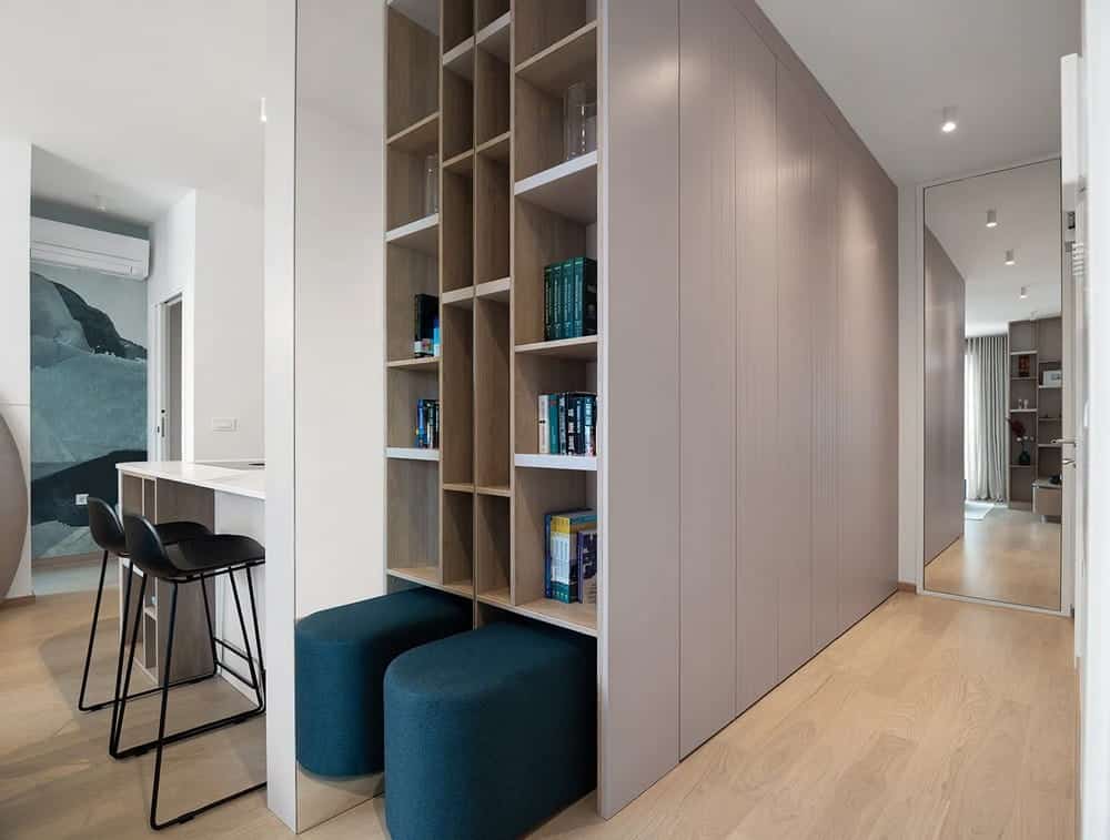
The layout of the Harmony apartment had already undergone some changes before our intervention. The addition of an extra bathroom has given the apartment a long corridor with plenty of storage space, which, for the sake of maximum practicality, can quickly come across as a rather cramped and cold reception on entering the apartment. The rhythm of the milling in the surface of the cupboards, which goes from dense to sparse, and the thoughtful positioning of the mirrors have seemingly freed the entrance hall from heavy volumes and opened it up towards the central post. The design of the volumes in the corridor communicates directly with the design of the high element at the TV cabinet, which continues in a soft way as light transparent curtains with an almost invisible transition. This, together with the soft light filtering through the delicate shades of textiles, creates a light ambience that contrasts with the furniture elements and the abstract wallpaper in dark turquoise.
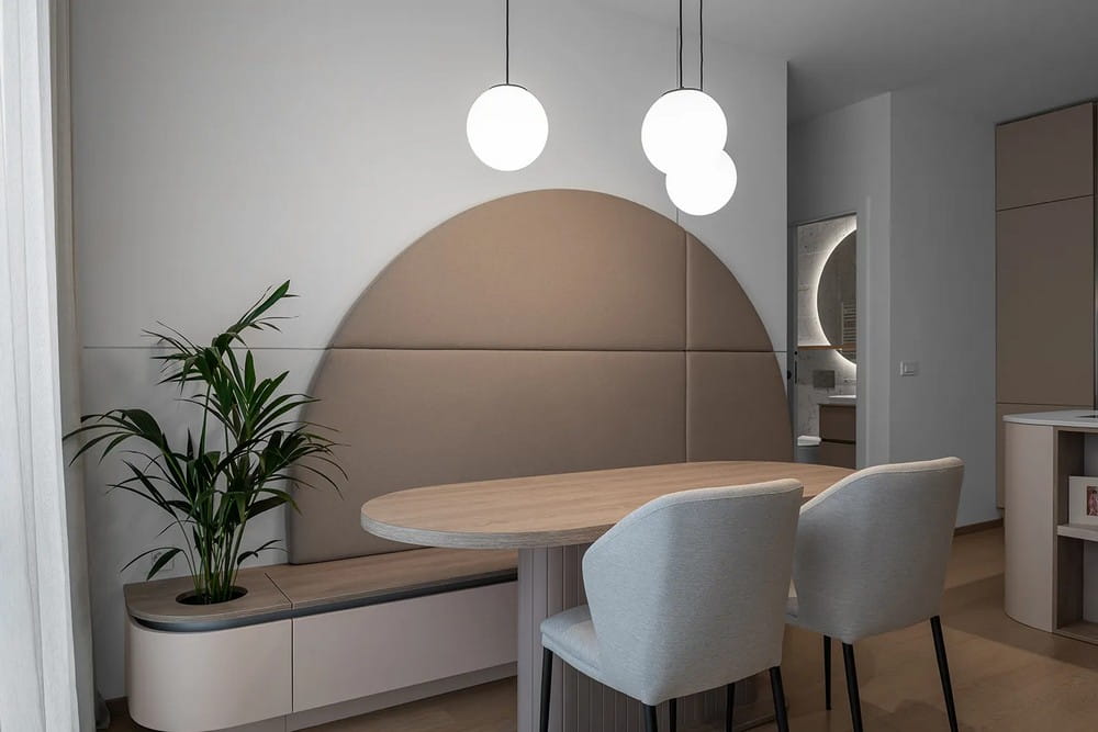
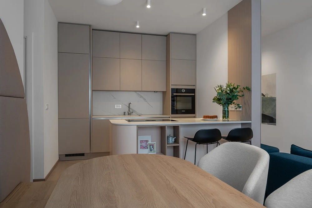
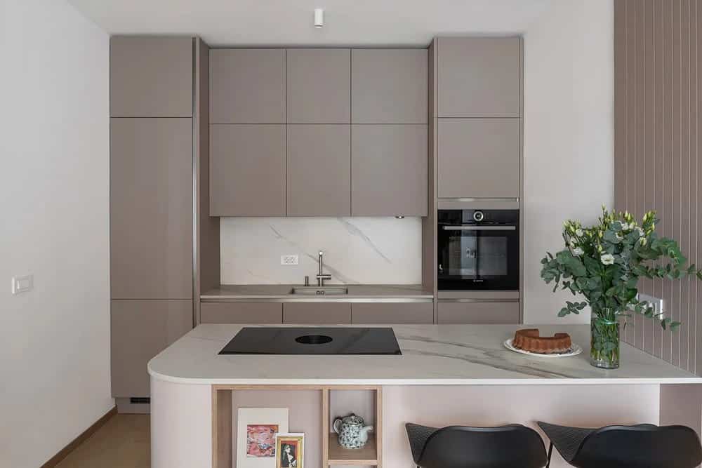
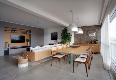
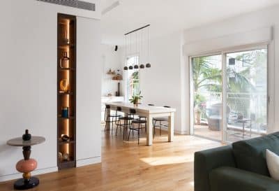
An alcove with a kitchen and peninsula, a dining area and a lounge are combined in the central living area. By turning the dining table and adding a bench, we have created extra seating for when large groups are visiting. The large circular armchair seems at first to be a surprise and an unusual artistic gesture, but with its carefully planned division and continuation in the form of silver lines on the wall and the bench with space for greenery, it acts as a base and link to the other furniture elements in the room. The modular sofa with movable tabouret can be transformed from a conventional three-seater into a cosy lounge in the evening.
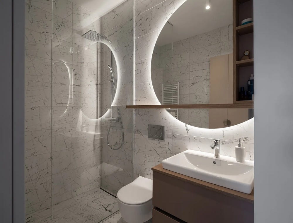
The bathroom, which had already been fitted with ceramics, was integrated into the whole by using the same volumes, colours and mouldings as in the other rooms. A large cupboard hides the washing machine and tumble dryer, while additional storage space has been provided in a narrow, high cupboard, which is discreetly reflected in a large, round mirror as you enter the room.
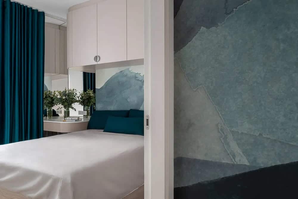
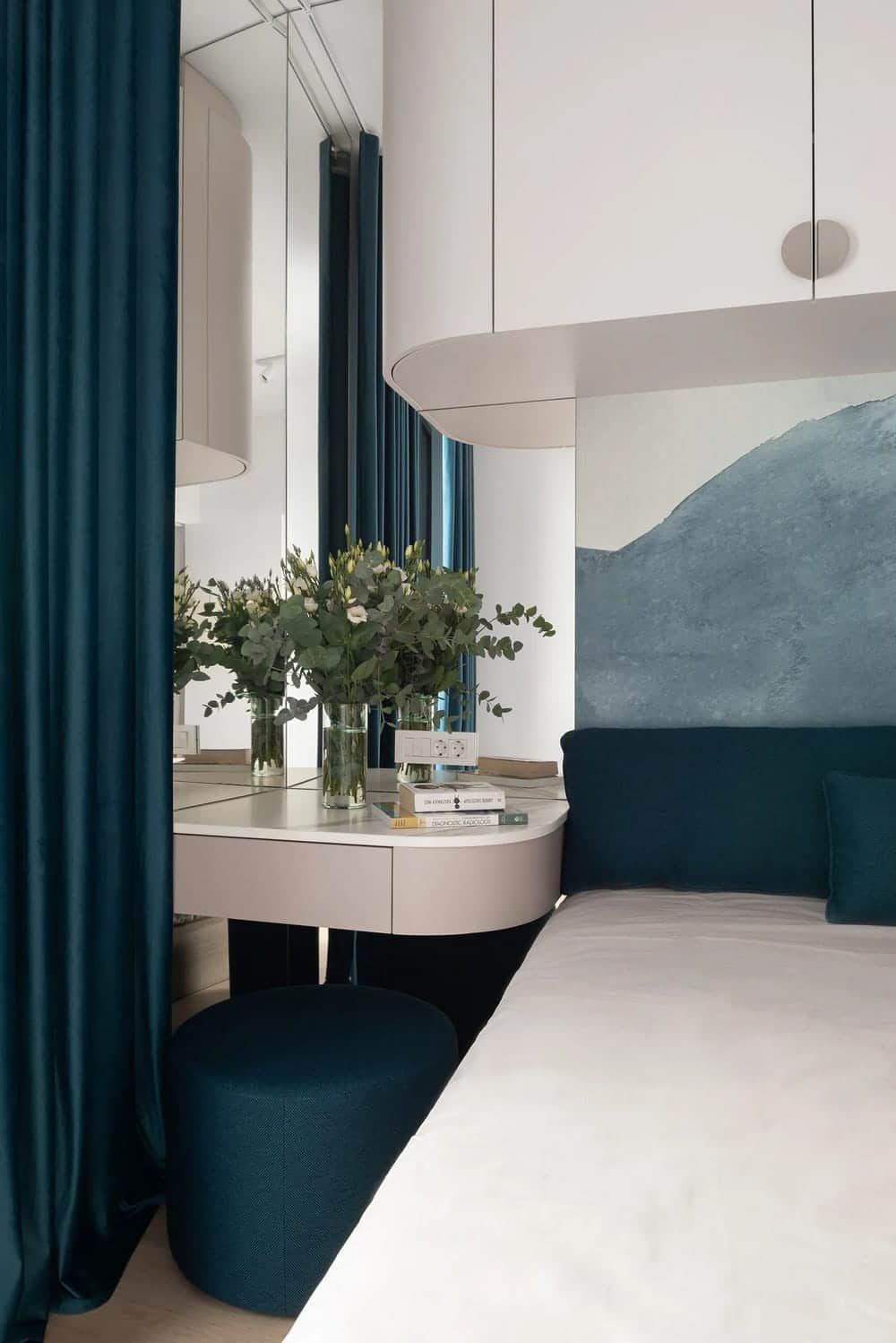
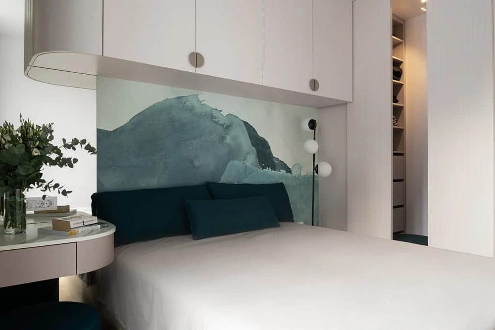
In the bedroom, the space intended for a corner wardrobe has been transformed into a small wardrobe, separated from the sleeping area by a sliding door, and additional storage space has been provided in the hanging wardrobes above the bed – Le – which, thanks to their soft design, act as a niche for the headboard. This softness, achieved in part by visually receding the storage areas and counterpointing them with deep turquoise textiles and wallpapers, has created a space of retreat and relaxation in an otherwise small square footage. We gave the bedside table a dual function – it can also be used as a make-up table, while the high bed allows it to serve its original purpose.
The journey through the apartment’s rooms ends at a large corner mirror, which creates a sense of an unknown dimension and reflects the harmony of the present. The design thus poetically offers an optimistic view of an otherwise mysterious future, but one based on the equilibrium of the present.
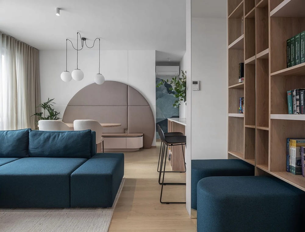
Complementarity represents an artistic balance in the design of this interior, just as Yin and Yang represent seemingly opposing forces that give the world its rhythm and dynamism, yet at the same time form a harmonious whole. – a space of harmony.
The spatial design of the Harmony apartment has been read as a series of views through the changes from narrow to open spaces and vice versa. In the frames that open up with each step, we wanted to create a harmony of opposites – volumes and voids, light and dark colours, light and shadow, soft and angular strokes. By using different volumes and three shades of beige, we created a balanced base with the furniture, complemented by a careful selection of light and dark, rough and soft textiles.
