Project: Light and Airy Residence
Architects: Axelrod Architects
Location: Israel
Year: 2019
Photo Credits: Amit Geron
Text by Axelrod Architects
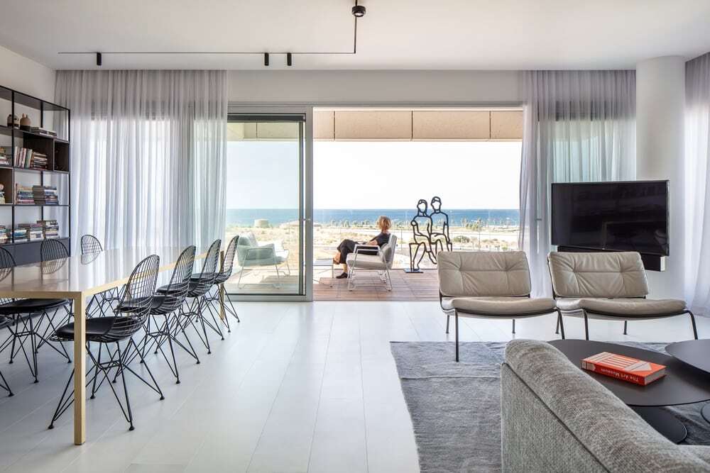
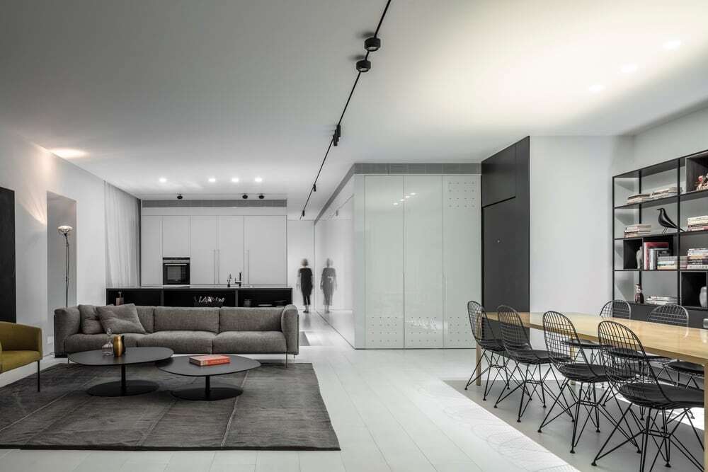
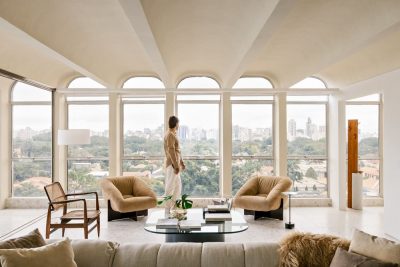
This light and airy residence with sea views started life as a standard and rather boxlike contractor’s apartment. To meet the needs of its new owner – a woman seeking an oasis of calm in a vibrant metropolis – we created a pristine, white space that filters out the buzz of the city, draws the eye to the open sea, and brings sea and sky and calm into the heart of the home.
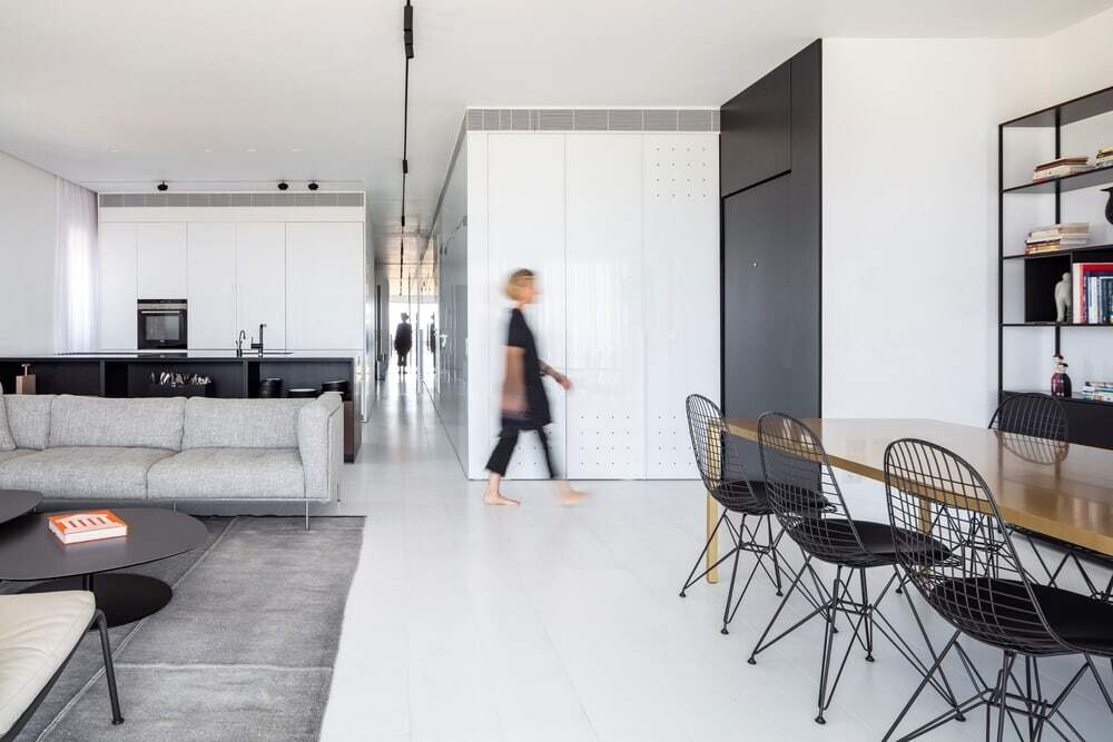
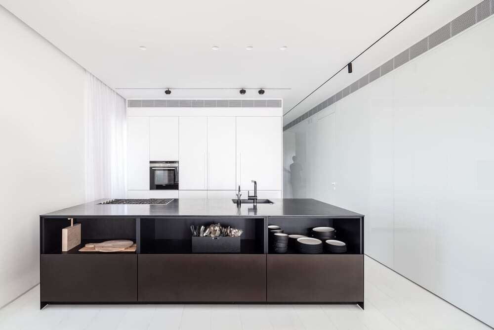
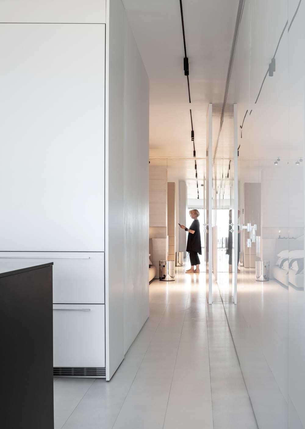
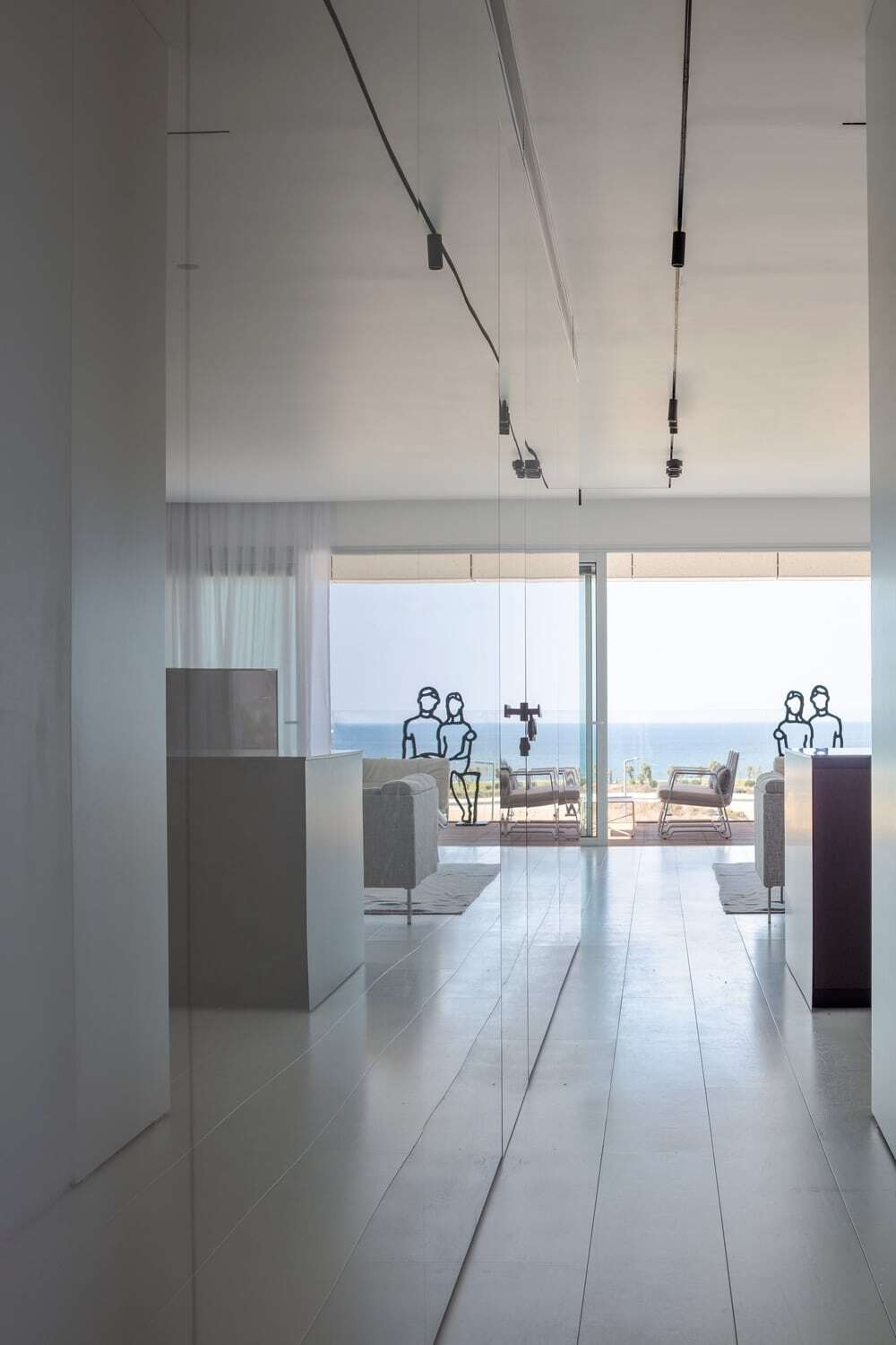
As a starting point, the architect created a central wall, white and reflective, leading from the entrance, where it almost immediately turns a 90°corner and continues along the entire length of the apartment’s long axis. The reflective wall, coated in white glass, lightens and brightens the apartment, while also cleverly concealing a bathroom and storage cupboards behind the main feature: a seemingly endless, smooth and calm-inducing mirror.
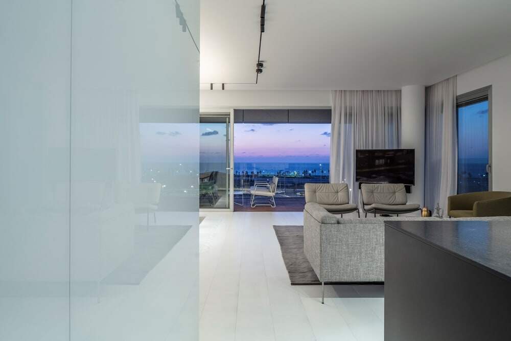
The white glass captures the reflection of the sea view, creating a duplicate vista along the length of the hallway and through to the rear mirrored wall of the apartment, where once again you come face-to-face with yet another ‘sea view’ even though you’re now faced away from the ocean. As well as appearing to bring the ocean indoors, the white sheen, the central treatment in the apartment, expands the sense of space and openness visually overcoming the apartment’s relatively modest dimensions.
The chain of reflections also introduces an element of playfulness as one enjoys multiple reflections – one’s own, the movement of anyone else in the apartment, and the sea views. As the day draws to a close, reflections multiply – the interior of the apartment is reflected on the almost full-height glass sliding doors across the entire western façade, leading out to the generous terrace, from where they appear to be at sea, only to deflect back again, along with the reds of the setting sun, onto the milky-hues of the mirror façade.
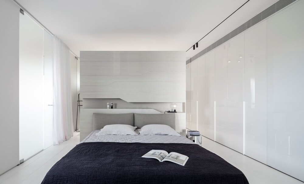
The lighting has been designed to strength the central axis in space. It runs along the ceiling between two end points: from the edge of the dining and living areas via the kitchen and through to the master bedroom – where it is reflected in a mirror and creates a sense of a single endless line.
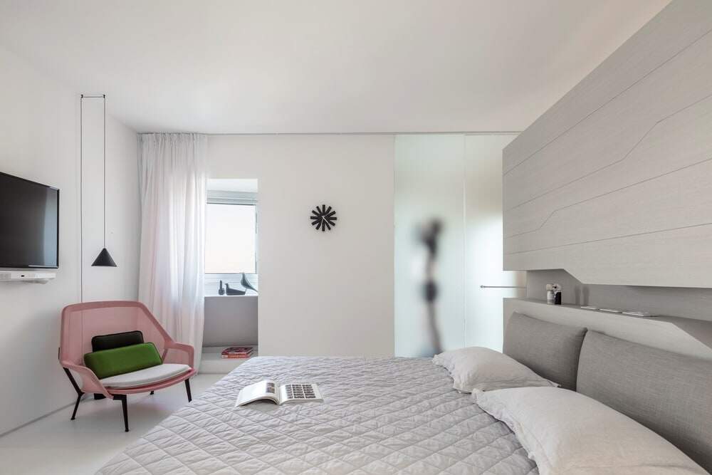
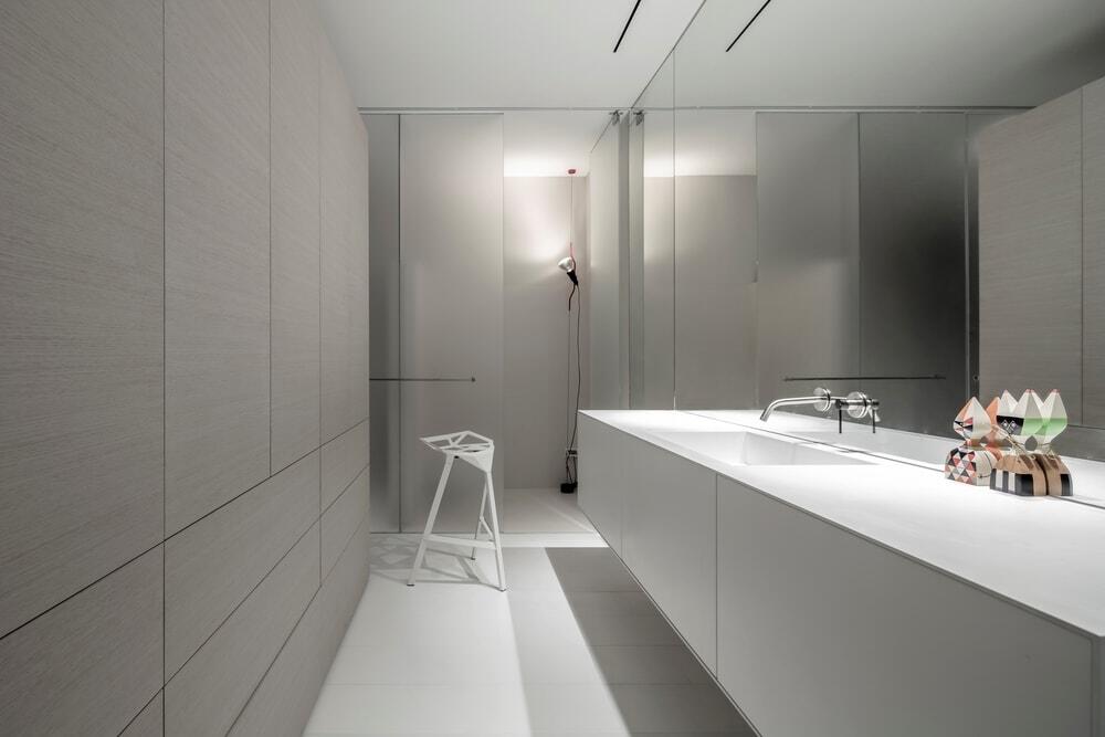
The master bedroom suite, designed without the traditional separation between bedroom and bathroom, creates a single space comprising both functions. The bed’s headboard is a free-standing multi-functional element – a wardrobe, a built-in night stand that is both decorative and practical, and a partition between the bed and the handbasin. The shower and toilet are located along the side wall next to window openings and are separated from the sleeping area by semi-transparent frosted glass that allows daylight to penetrate and bathe the bedroom in natural light.
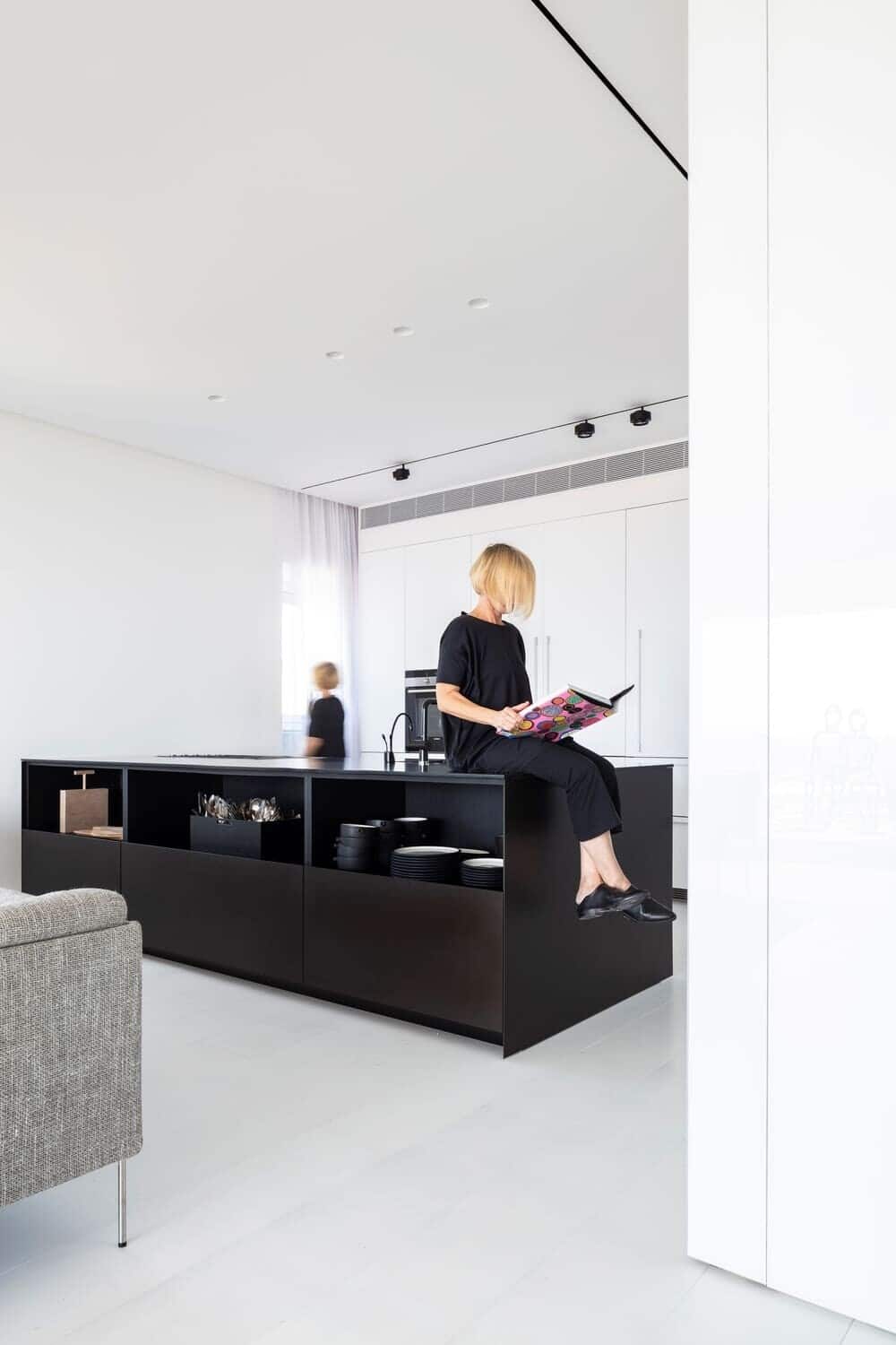
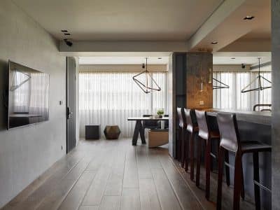
The palette of colors used in the apartment gives a sense of clarity, calm and airiness, “broken” only by a few elements in black that clearly delineate functional areas, such as the entrance hall, the work island in the kitchen, and the library unit.
The owner, who had concerns about downsizing, loves her home. She sees it as is a sleek almost spiritual sanctuary offering the perfect antidote to city life, knowing the perfect ‘escape room’ awaits her.

