Project: Pearl House
Architects: MXMA Architecture and Design
Project manager: Maxime Moreau, architect
Team: Isabelle. A. Jolicoeur, Gabrielle Morin
Contributors: Francis Raymond (GMV3D)
Contractor: Demonfort
Location: Borough of Saint-Laurent, Montréal, Canada
Area: 2128 sq. ft.
Project end date: August 2018
Photo credits: Annie Fafard
Text and photos: MXMA Architecture and Design
Pearl House is the new home of a South Korean family with two young children.
Upon their arrival in Québec in 2008, Min and Yuong moved into a small condo on the top floor of a large residential building in Montréal. In the 10 years they lived there, the family celebrated the birth of two children. The toddlers, however, were spending a lot of time playing indoors and the apartment began feeling cramped.
For Min and Yuong, the desire to move into a home with well-balanced living spaces and to allow their son and daughter to play outside freely became a priority.
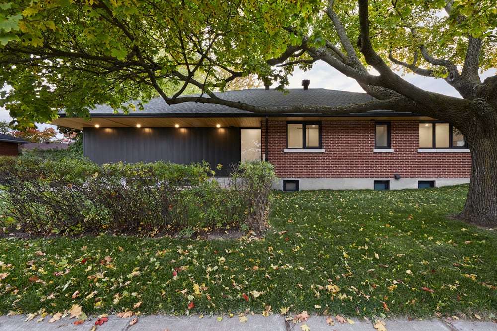
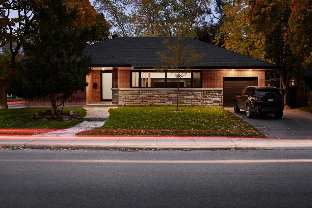
After some research, the couple fell in love with a bungalow located on a large corner lot, surrounded by mature trees, in the borough of Saint-Laurent, in Montréal’s north end. Although the interior decor needed a major facelift, the house, inspired by the modernist movement of the 1960s, featured clean lines and compelling architectural elements: ideal conditions to implement a project full of family appeal.
Even before moving in, Min, a design enthusiast, had several ideas for modernizing his future home. He wanted to open up the interior spaces to allow his family to gather in a vast unobstructed room, expand the house to include a primary suite, and transform the backyard into an exterior extension of the living spaces.
With this in mind, it was obvious that the original shape of the house would need to be significantly updated. However, it was important to the clients that a single contemporary building emerges from the new architectural language of the house, as opposed to an assortment of distinct architectural volumes.
After meeting with several architectural firms, Min decided to work with Maxime Moreau, architect and founder of Montréal-based MXMA Architecture & Design. The two professionals quickly learned to work in close collaboration and set off to discover new spaces.
The architect’s concept and strategy
Pearl House was born from a strong and simple concept: as a design element, a house must be a place of sanctuary.
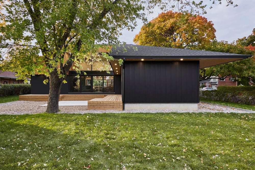
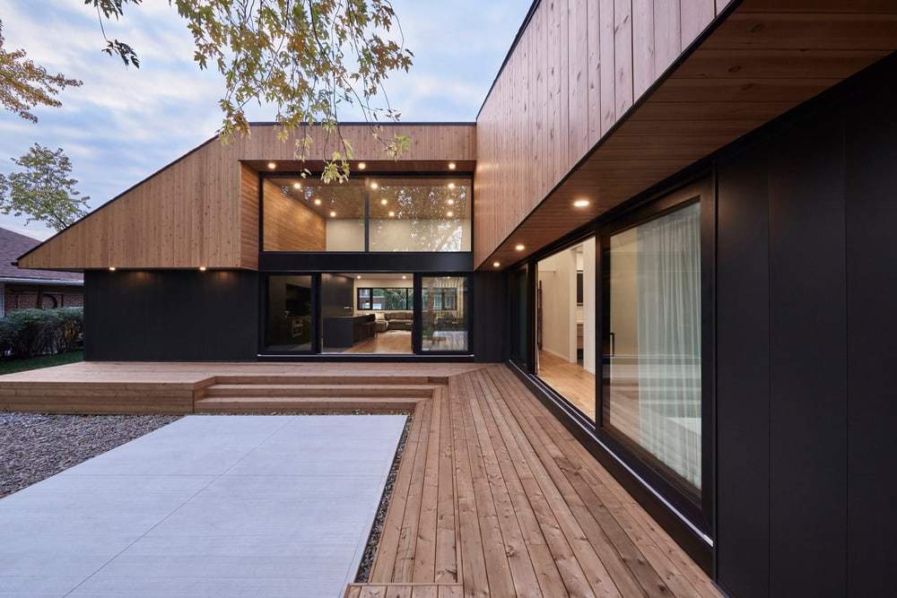
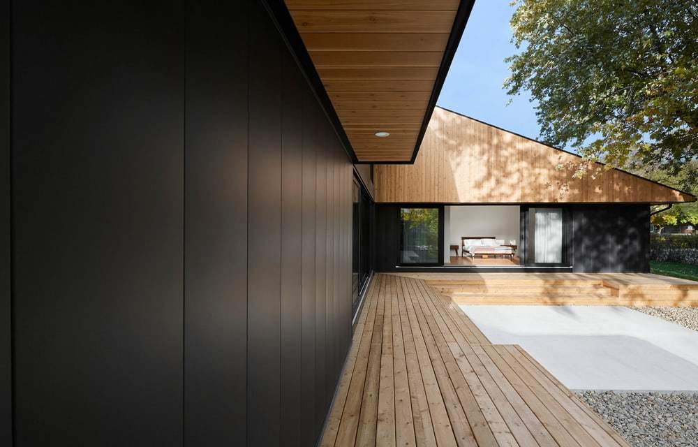
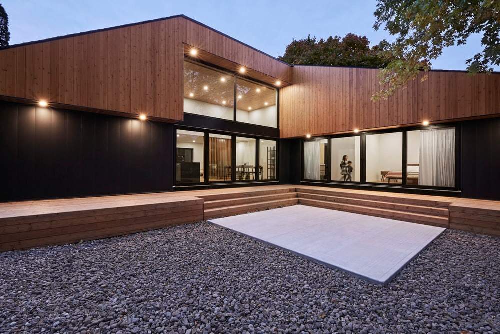
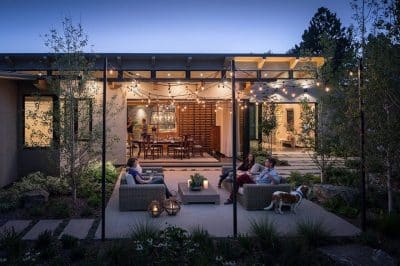
To achieve this, the architect imagined the house as a single large box containing the original residence as well as the new primary suite. He then removed a portion of this box to create a void, an inner courtyard, a protected place that highlights the large maple tree in the middle of the garden. This subtraction allowed for the passage of natural light through the entire plan of the house, revealing surfaces with warm, contrasting textures. The backyard became a soothing indoor-outdoor space where the family could gather to have a meal, play, or simply relax.
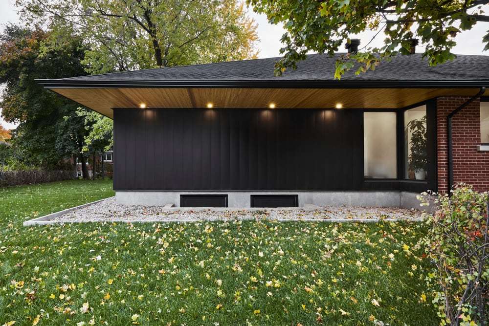
An important issue in the modernization of this house was the relationship between the different sections of the roof. The existing house had a hip roof, in addition to the flat roof of the mezzanine, the shape of which was not compatible with the architectural style of the house. In order to create a continuous and homogeneous volume, the architect chose to demolish the mezzanine and then extend the surfaces of the existing roof to cover the new primary suite, while respecting the existing alignments, lines, and eaves. Consequently, the shape of the original house evolved naturally to become part of a harmonious whole.
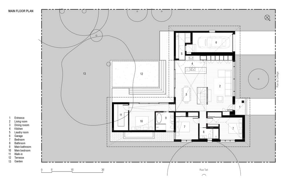
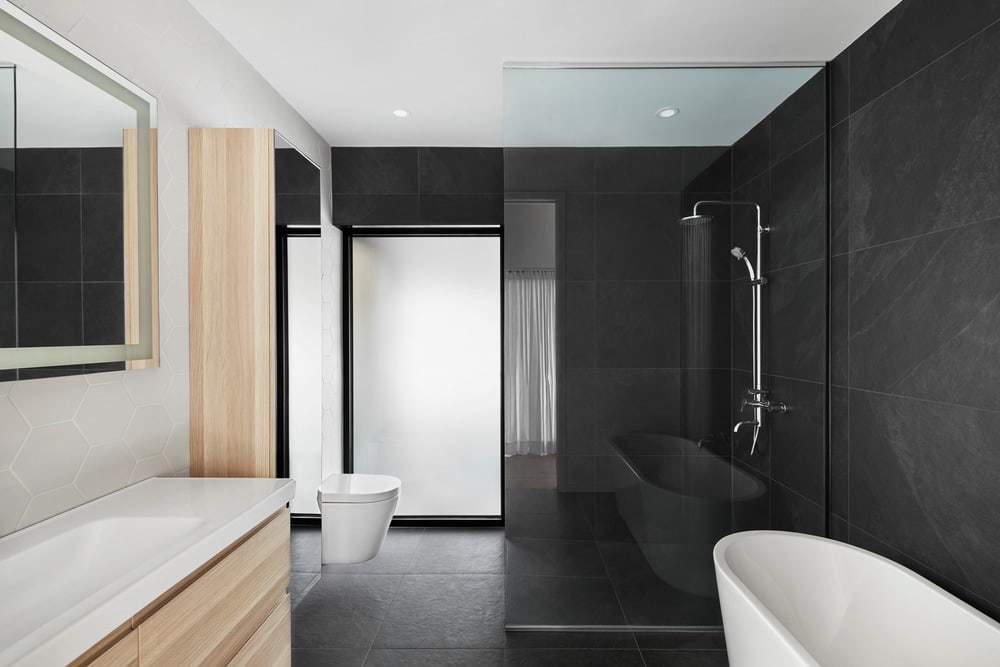
The house’s L-shaped plan is divided into four zones. The first, to the north, is a connected series of intimate spaces. The children’s bedrooms, located in the original house, take advantage of the existing windows, which allowed for minimal work on the facade. A new bathroom separating these rooms ensures acoustic comfort. In the new extension, the primary suite is aligned along the same axis. It includes a spacious bathroom and a walk-in closet. A 20-foot-wide patio door allows the couple to fully enjoy the garden from their bedroom.
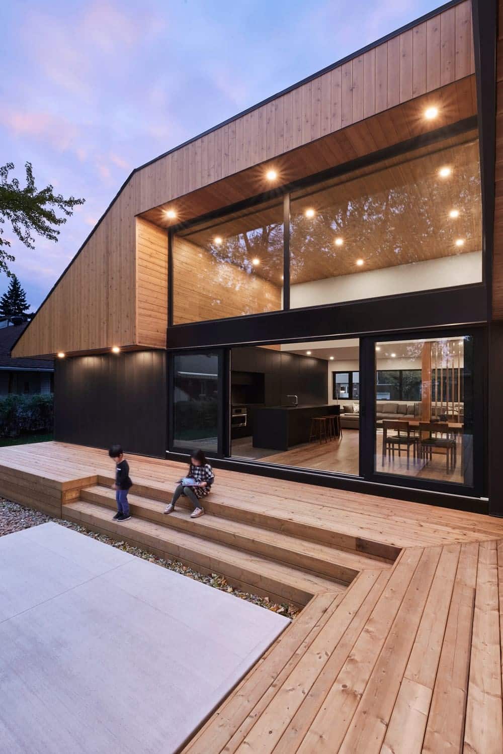
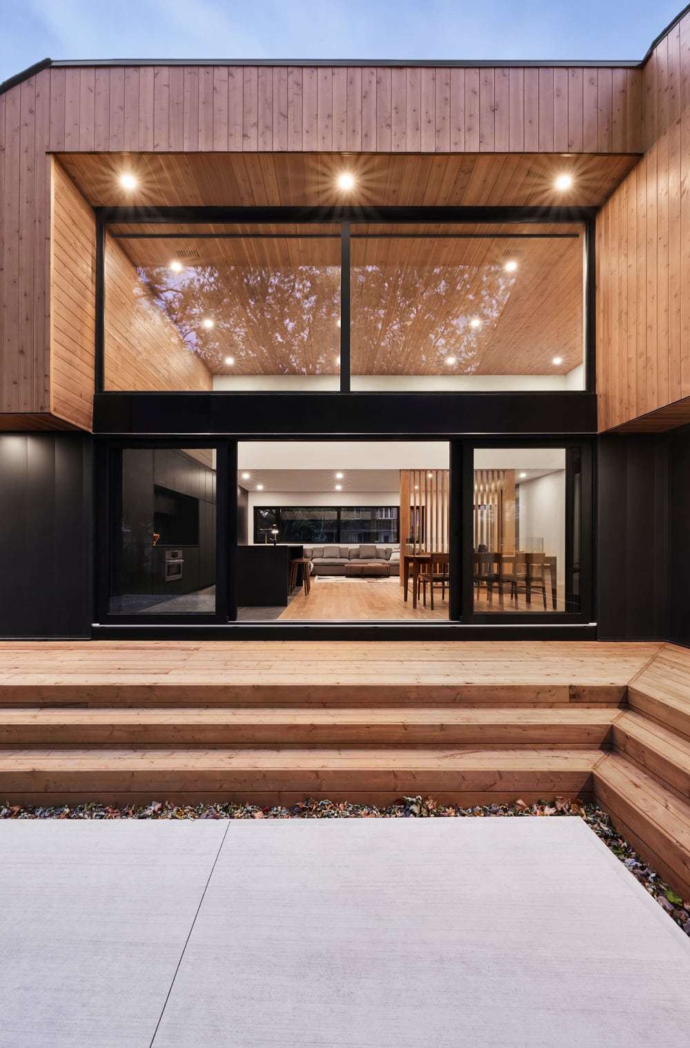
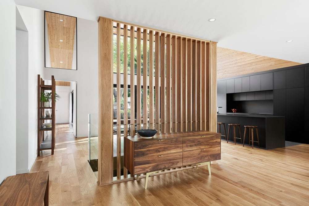
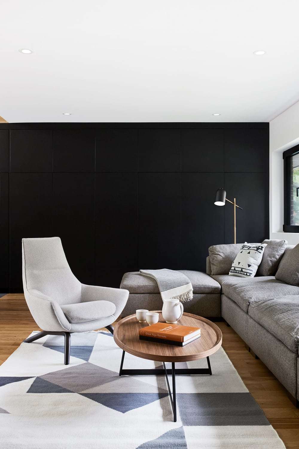
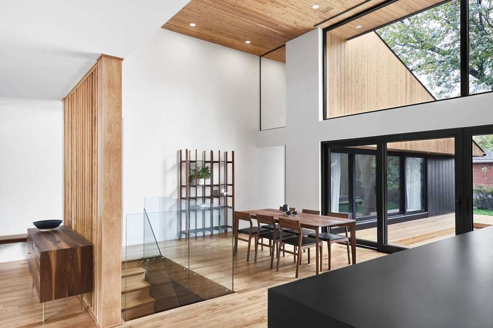
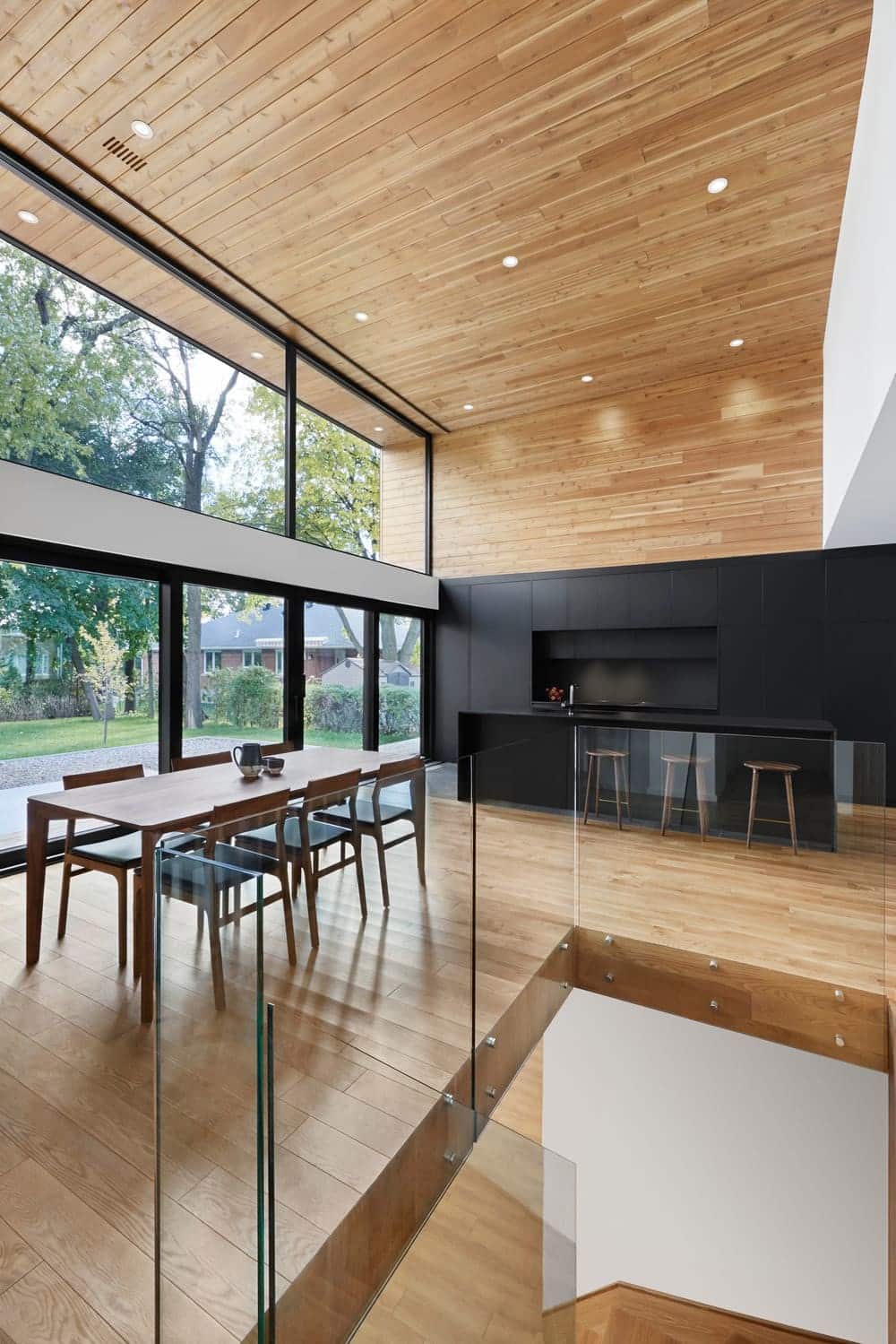
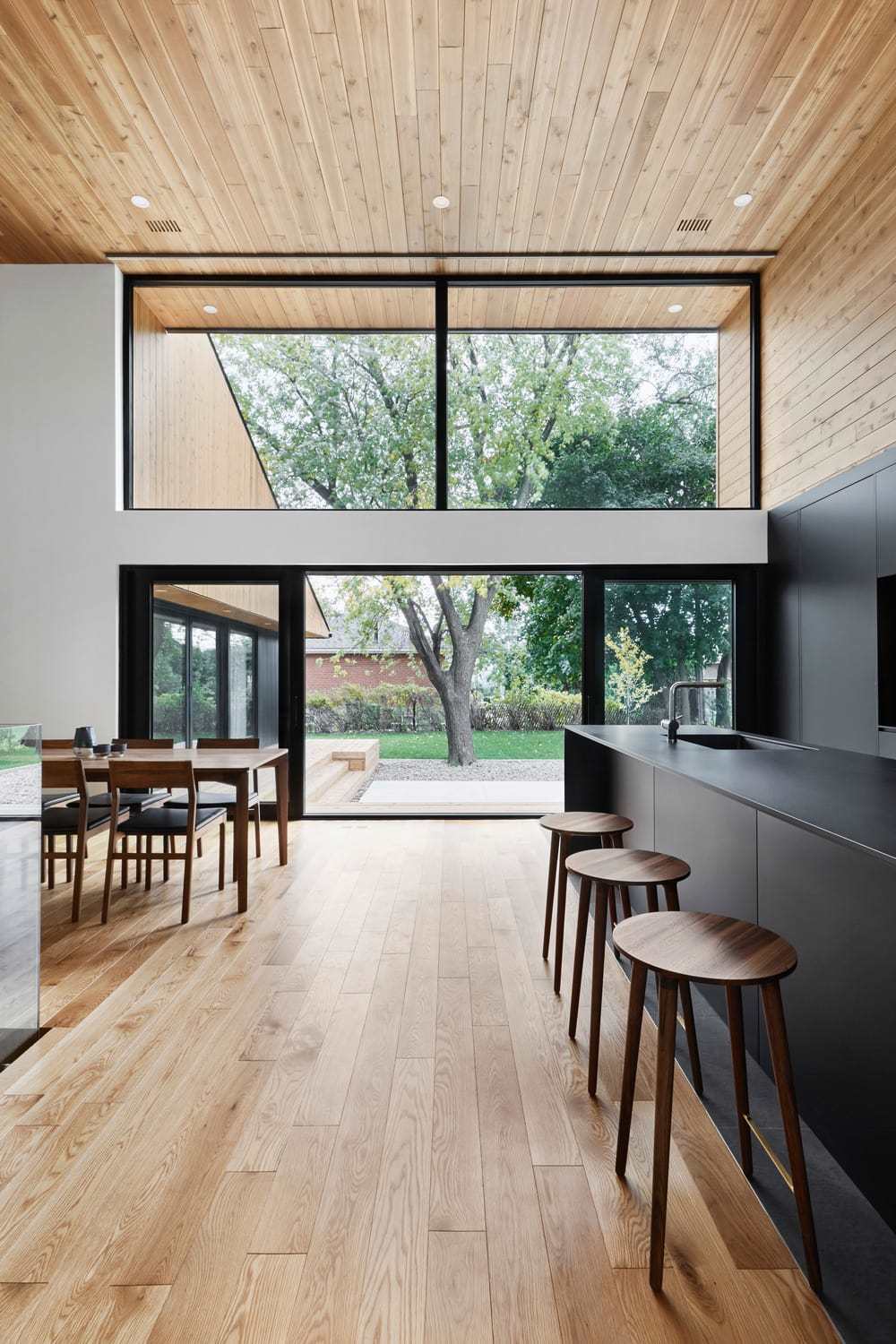
The living room, kitchen, and dining room have been grouped together to form a large living area in the center of the house. With a height of 15 feet, generous floor-to-ceiling windows, plenty of built-in storage, and transformable living spaces, the large room invites family members to share unique moments while enjoying abundant natural light and a soothing view of the outdoors. At the west end are functional spaces such as a garage and a vestibule with a laundry area. Finally, facing the backyard, a large cedar terrace frames the first floor, allowing the interior spaces to project outward while giving the impression of a more spacious home.
In celebration of wood
The idea of encasing precious interior spaces within a shell became an opportunity to celebrate natural light and vegetation, but also to showcase wood as durable and living material. In the backyard, the vertical walls and soffits that make up the new roof are covered with planks of western red cedar. To strengthen the relationship between the interior and exterior, the same wood was also used inside the residence. The white oak floors, in the same tone as the walls and ceilings, lend an inviting and warm character to the rooms.
An environmentally friendly home
Special emphasis was given to the use of certified wood and metal to create durable and environmentally friendly exterior cladding. The exterior walls, composed of staggered posts, provide superior thermal insulation that is cost-effective over the long term. To illuminate the living spaces and recover solar thermal energy naturally, high-performance glazed windows were placed on the southern facing side of the building. In addition, all the trees on the property were preserved.
Central to the design of the new house was the large maple tree located in the heart of the garden, which became an architectural element in its own right, honored for its ecological, aesthetic, and social benefits. Additionally, the team planted three new trees to reduce the heat island effect. With its style, materials, spatial organization, and variable energy strategies, Pearl House is the very definition of environmentally friendly architecture, greatly enhancing the quality of life of the family who dreamed of living in contact with nature.
The kitchen
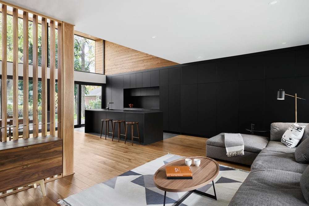
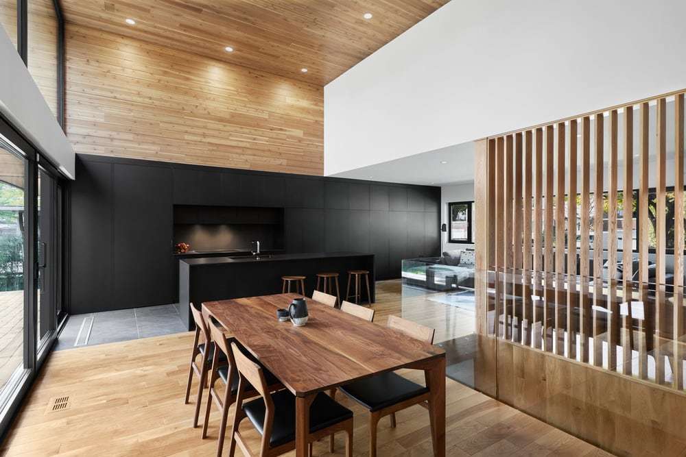
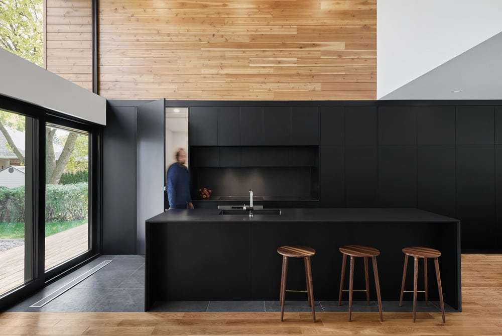
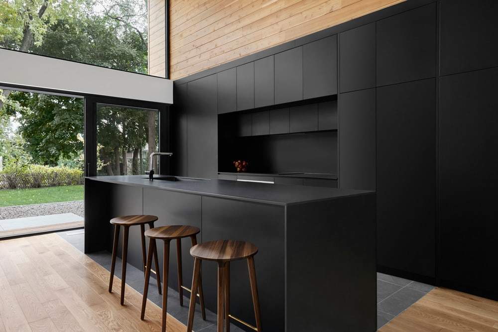
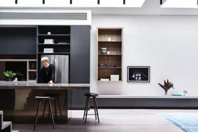
Drawing inspiration from materials, colors, and textures, the Pearl House kitchen is a warm space, open to the whole family, and perfectly integrated into the overall concept of the home. The black metal shell, which wraps around the body of the house, folds inward to become wall-length black cabinets: the central element of a sophisticated kitchen. This innovative gesture reinforces the idea of architectural continuity between the inside and the outside.
The color black, which in Korean culture represents both mastery and a cycle of our existence, is echoed in the matte black finish of the cabinets and countertops. In this way, the fully integrated style of the kitchen lends a new beginning to the very heart of the house, an expression of cultural identity very dear to the homeowners. The dark kitchen furniture also stands in stark contrast to the bright white oak floors and the abundant light of the interior spaces. Finally, the multiple storage spaces, which meet the family’s daily needs, are hidden behind large doors and integrated into the interior architecture to create a functional place with a true minimalist aesthetic.
At last, Pearl House can be viewed as a precious work of art, an innovative and protective shell containing a treasure: a family.

