Project: The Architect’s Private House Stodolove
Architects: Anna Maria Sokolowska Interior Design
Location: Rumia, Poland
Completed 2022
Photo Credits: fotomohito.eu
1. General description of the project
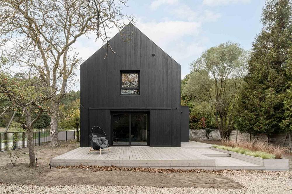
The project consisted of the conversion of an existing farm building dating from 1940. The farm building with a living room was located on a plot surrounded by greenery and old fruit trees in Rumia, in the Szmelta district, which is a remnant of a former village.
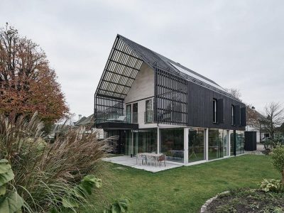
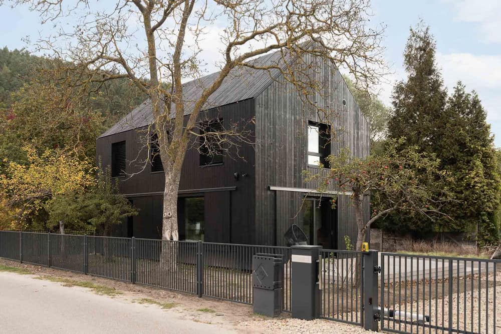
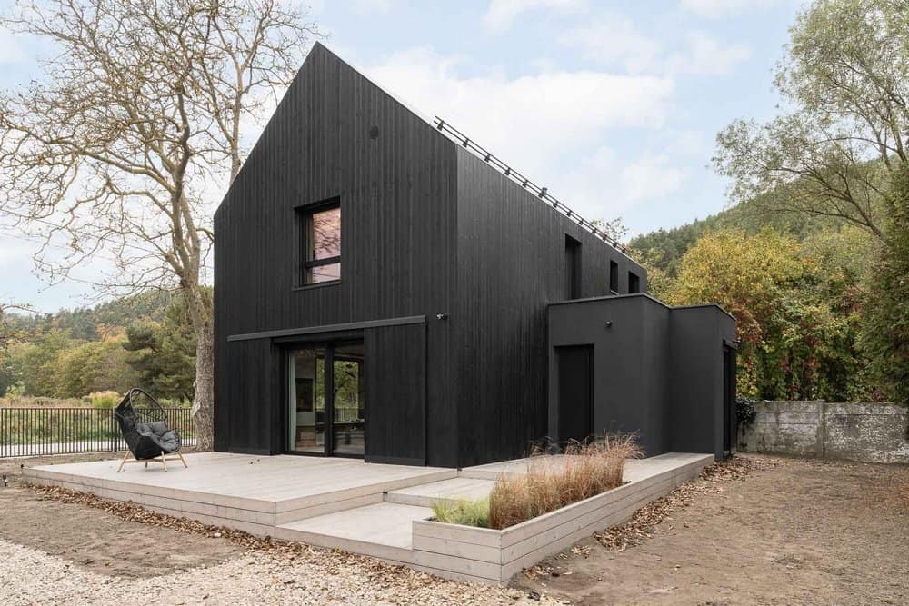
The current form of the building and the finishing of the façade with black tan board is a reference to the old wooden barns, of which there are still several preserved in the area. Respect for the history of the site initiated analysis, collecting photographs and archive maps of the area in order to create a building that would be a link between the tradition and the present day.
Once you have a clear outline into which you fit new functions it should be easier, designing for yourself and your family, however, makes conceptual work much more difficult. The multitude of solutions and decisions that have to be made at the same time as your client and the architect are the biggest challenges, which only those who have decided on this combination at least once in their lives will understand.
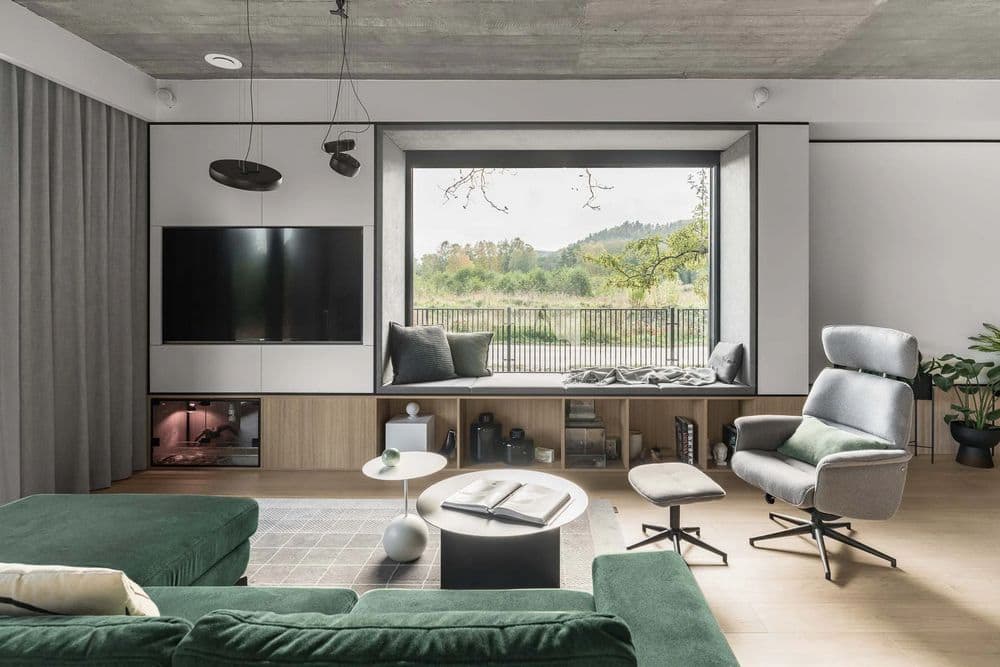
The planning of the interior layout on the ground floor started rather unusually, with the front window, with a seating area that was to be the central hub of the entire living space, and this was the foundation on which the layout of the other windows was planned. According to the principle of modernism and functionalism, ‘form follows function’, the design of the façade was preceded by a planning of the functionality in the building, and the pattern of the windows on the façade was matched to this, so that the whole had a consistent character.
I was very keen for the first floor to be full; I didn’t want an attic and slants directly overhead. Hence the almost full use of height from the available 9m. The open prefabricated truss in the upstairs bedrooms gives us almost 5 m of space up to the ridge and 2.4 m to the lower chord of the roof structure. In addition, the entire structure has been natural wood repainted white so that it disappears against the white walls and haunches.
All these elements contributed to the current shape of the house, to its height, proportions and functional layout of the interiors, but most importantly to the simplicity and yet uniqueness of the body of the building itself.
2. The idea for the interiors
The most important thing in the design of this house was the idea of interiors that are simple, minimalist but also give a sense of warmth and a calming feeling. Because of my profession, I deal with a lot of materials, patterns, colours and textures on a daily basis. I surround myself with this in the studio when we select materials for our interior designs. That’s why I was so keen to leave it behind the threshold of the office and enter my own space as an oasis of peace and tranquillity.
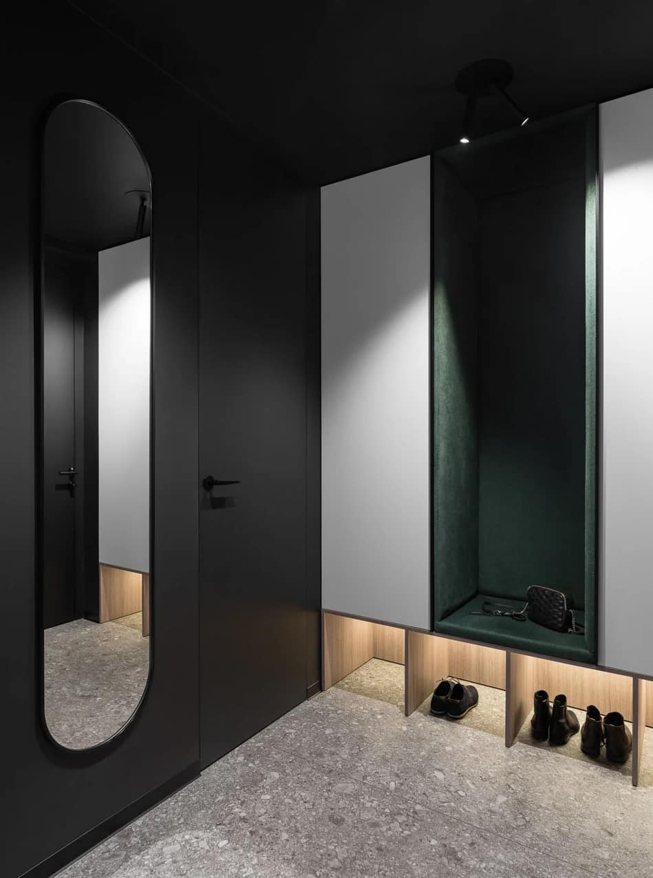
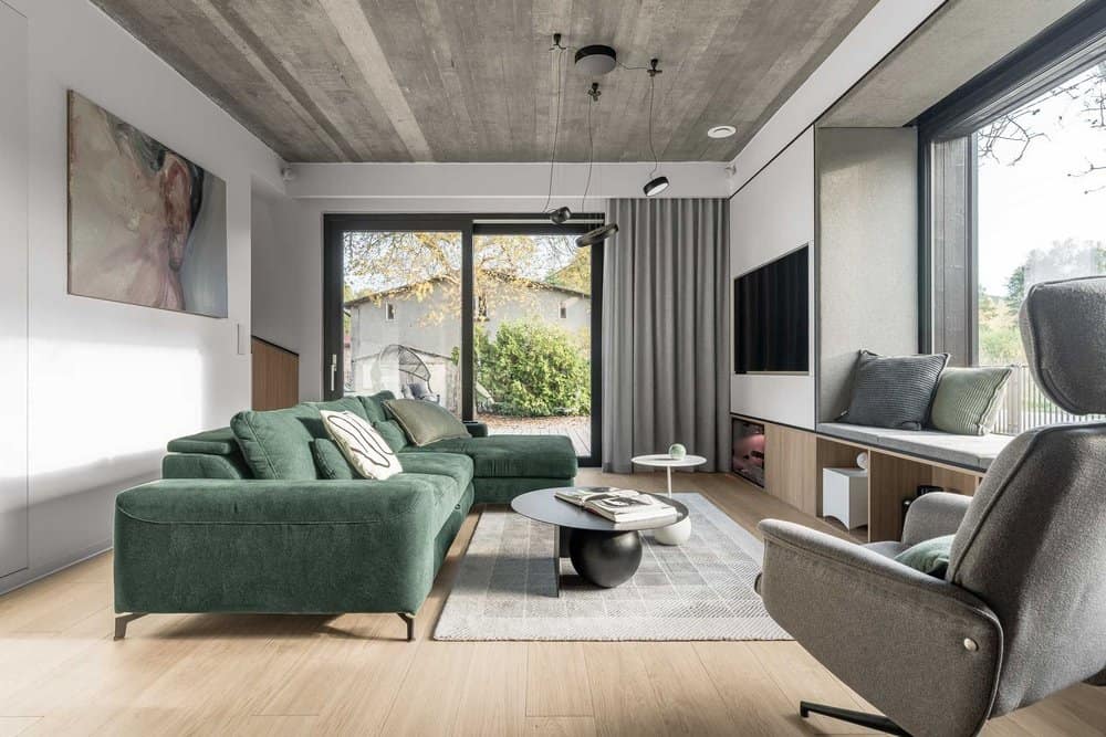
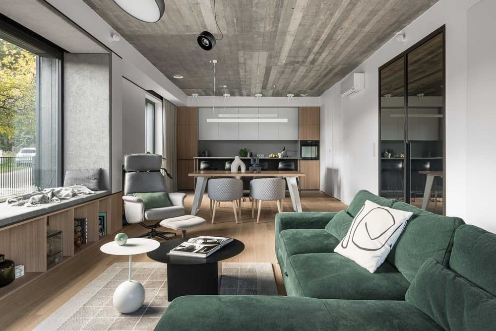
The interiors were planned in our standard material and colour base, i.e. white, grey, black and natural oak wood. In addition to this combination, I have added the colour green in small amounts, which appears on the corner in the living area, on the seat in the vestibule and on the headboard of the bed in the bedroom, due to the fact that it is my favourite colour.
These interiors are where I relax and calm down from an excess of stimuli. They are an oasis for me after a long day at work. It’s the kind of place you don’t want to leave and sometimes it’s hard to force yourself to go to the office in the morning. Nature and greenery enters the house and practically surrounds us on all sides. Opposite the house is a vast green area that is a remnant of the old ponds, next to it there is a river, and further on there are fish ponds with a trout farm and a wall of forest. I fell in love on the first sight of this magical place.
3. Inspiration, architecture and interiors
I was very keen to place the building in the context of the site and its surroundings. I wanted to respect the history and climate of the building, preserve the tradition and create a building that would attract the eye with its simplicity, but would not “shout” or “drown out” the surrounding nature with its form. A simple black block with a pitched roof covered with a tan Siberian larch board, Scandinavian spruce on the façade and black sliding shutters on the ground floor, whose form is meant to refer to a barn door, make the appearance coherent and unobtrusive.
I was not guided by fashion, trends or a particular style in the arrangement. I wanted to put together such materials and textures that would create a consistent, pure form for displaying art. No unnecessary elements, just what is essential in this interior supplemented with greenery in detail and the natural one in the form of plants. As a studio, we are known for using a timeless design base in our interior designs, which we complement with elements that are easy to maintain but also non-invasive when it comes to changing them. It’s important to us that, years later, our designs are still fresh and don’t require changes in the form of costly renovations.
I approach changes with great detachment and it takes time to introduce each one, as it is preceded by thorough analyses. That is why creating the interiors of my own home was not easy for me (I don’t think it is easy for any architect) because once the final decision is made, I do not allow myself to modify it. It is important to me that once a decision is made it is the most correct and certain one. I am probably in opposition to many architects who very often make changes to their interiors because they enjoy it and change is not a problem for them.
In the process of creating the building, the idea arose to leave the reinforced concrete ceiling with imprinted formwork planks, which were laid as a base before pouring concrete over the ceiling. The structure of the ceiling is irregular, not ideal and it was not possible to create a uniform colour and texture, but I think this is also the charm of the imperfection and naturalness of this material.
I am a minimalist, both when it comes to interiors, wardrobe, but also the objects I surround myself with. I like clean simple forms, I like things that are well-designed, and above all I love art. I’ve always wanted to be able to surround myself with paintings by selected artists, but I’ve never had the space to do so, which is why I’m so pleased that in my new home I will have the opportunity to display my favourite paintings on empty walls over the course of a few years.
4. Were there any challenges in the project?
This project was a challenge by itself, the most difficult one I have ever had. I have been working in interior design for 16 years and I must admit, to be honest, that despite my architectural education (a cubic architect after Gdansk University of Technology) and experience in renovations, this remodelling has surpassed me in every respect. It was the first time I had to manage an investment practically from scratch. From the beginning of construction, to its completion and moving in.
On a day-to-day basis, I usually deal with investments from the development stage onwards, and occasionally there are general renovations, including in historic buildings, but the scale of the investments I have had the opportunity to work on so far has never been so extensive and I have never been alone with it all. I can definitely call it my biggest challenge in life and I am all the more proud of myself that for more than three years I was able to manage this investment as an architect, investor, manager and interior designer, while also running the company.
5. Have interesting solutions been used in the interior?
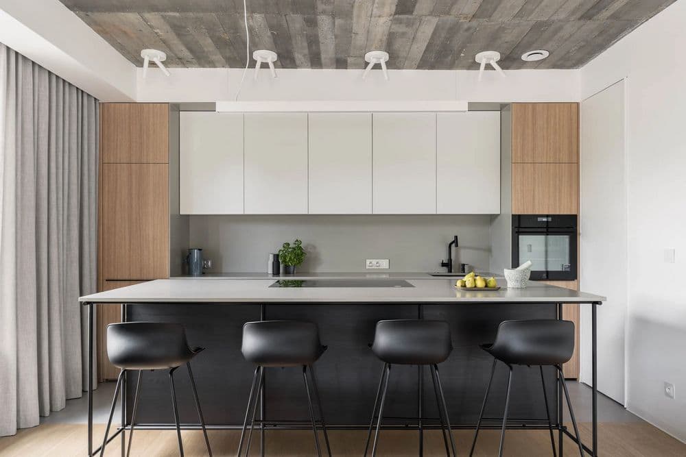
The interior of the open-plan part of the ground floor has a reinforced concrete ceiling, which is exposed throughout and is not plastered. Counterbalancing the concrete is the natural oak wood on the floor. The reinforced concrete attracts attention and is often commented on by people who visit us along the lines of “and it stays like this?”. It is definitely not the obvious material one expects when entering a house.
The vestibule is in an extension to the main body of the building and its walls and ceiling are black, as a reference to its external colour and the colour of the facade of the main body of the building. Many people are wary of dark colours in the interiors, for me it was the obvious choice for an introduction to the main space of the house. From the vestibule, there is an entrance to a small lavatory also in black with a mirrored wall, to the boiler room, which is also a laundry room in combination with a wardrobe, and a storage room under the stairs separated in an unusual way by a furniture door (construction like a wardrobe front) instead of using a standard door there.
The vestibule is separated by a glass door, which formally separates the two spaces. An open area with a seating area, dining area and open kitchen. In this space it is worth noting the glazed window display with seating. A cinema screen is hidden in the top upholstery and a narrow cabinet front behind the sofa hides the projector. This was an idea that was already born during the finishing work and works perfectly. On sunny days, the screen also acts as a blackout blind when we don’t want to cover the windows from the outside with automatic shutters.
The seating area, combines with the t.v. enclosure, a row of shelves near the floor and a side shelving unit that is open on the kitchen side, but not visible from the entrance to the living area. I appreciate the simplicity of the form and the large amount of lockable storage that creates uniform even surfaces and does not reveal its contents.
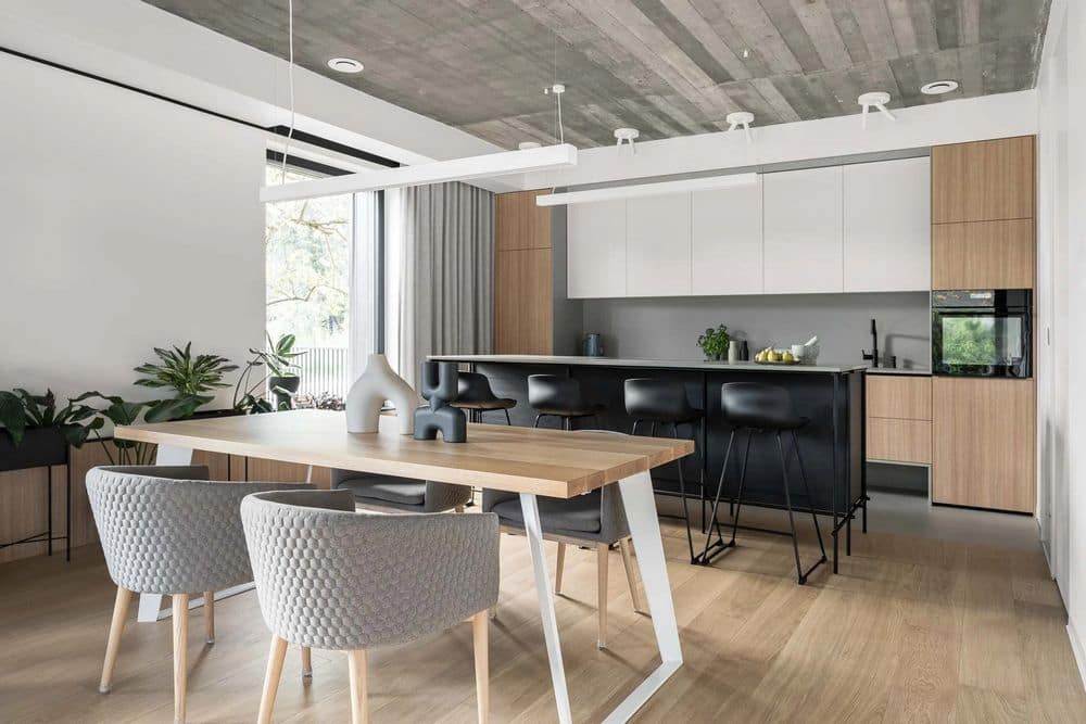
The kitchen has a symmetrical form, with two extreme posts, one side with the refrigerator (the freezer is separately located in the pantry) and a post with the dishwasher and oven. The dishwasher went into the post because the base cabinets in the kitchen row against the wall are suspended so floor-standing appliances would not be applicable in this concept. The basic colour scheme of white, grey and oak-coloured wood panel is a natural background for the island, which contrasts with the whole. The construction of the island’s cabinets is based entirely on a metal frame consisting of welded round tubes. A breakneck execution, but it succeeded in realising my vision of a lightweight frame and an overhanging island cabinet.
The main appliance on the island is a hob with an integrated extractor hood. This is an unusual model in that the extractor hood is pulled out from the hob and integrated with it, so that we have a combination of efficiency and functionality. I was keen to ensure that the clean and symmetrical form of the kitchen design was not disrupted by additional ceilings or overhangs in the form of the island hood on the reinforced concrete ceiling.
Directly adjacent to the kitchen is a pantry with an additional worktop, under which there is a freezer, trash separators and on the worktop there is space to put the coffee machine and other equipment that I don’t necessarily want to have standing on the worktop in the kitchen. There is also a utility locker next to it where we store cleaning products and hoovers. In the pantry and storage room, I also used a furniture front solution so that we have fronts level with the wall and a delicate vertical handle. A simple, functional solution and additionally economical.
The staircase is located “off to the side” and is fully enclosed on 2 sides with solid walls, so it is not visible from the entrance to the living area. It has double the height due to the open roof truss, and in this narrow but long space, pendant lights and wall cladding on the sides of the staircase finished with a black band have been arranged in an interesting way. The wall cladding in the same combination of materials and colours is also found on the seating area and the wall between the bookcase and the kitchen. These treatments have given a seemingly uninteresting space an extra decorative aspect. For me, it also provides additional space to display paintings in the future.
A smooth transition to the upstairs corridor area, where the wall cladding and the door to the children’s bathroom have been applied. The wall cladding is woodgrain laminated board, also a visually interesting effect, in a more budget-friendly design. On the other walls, as in the rest of the house, there is a door with a concealed door frame in the colour of the wall. The optical enlargement of this small space was achieved by using a mirror at the end of the corridor. It has an additional function when you leave the bedroom and need a wider perspective to inspect your styling.
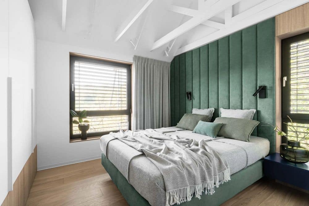
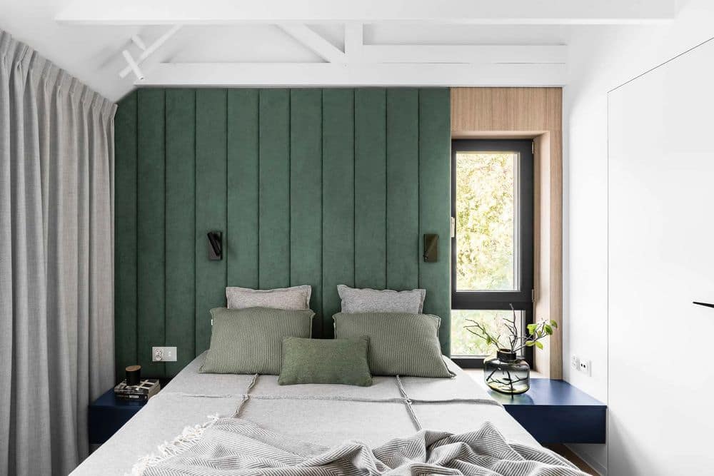
The bedroom is a small room, just under 11 m2, but we don’t really need anything else. It is unusual in that, as one of the 3 rooms on the first floor, it has an open roof truss and a height of almost 5 m upwards. Thanks to this treatment, the small room has gained in spaciousness. The continental bed, on high legs, looks as if it is levitating, thanks to the fact that the legs are set back from the edge of the base. This is complemented by an upholstered wall, all in green as an accent to break up the basic colour base and dark blue suspended bedside tables, surrounded by oak wood and white.
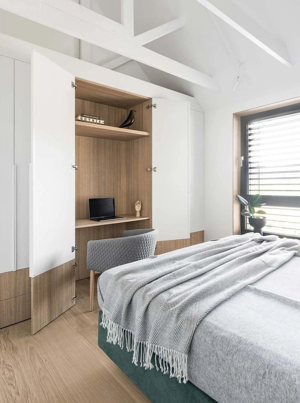
Windows with woodgrain furniture board treatment and a wardrobe with two colour finishes of white acrylic board and woodgrain board bottom, with thin edge handles cut to size. There is a hidden top in the centre of the wardrobe which can act as, if desired, a home office or a handy vanity table.
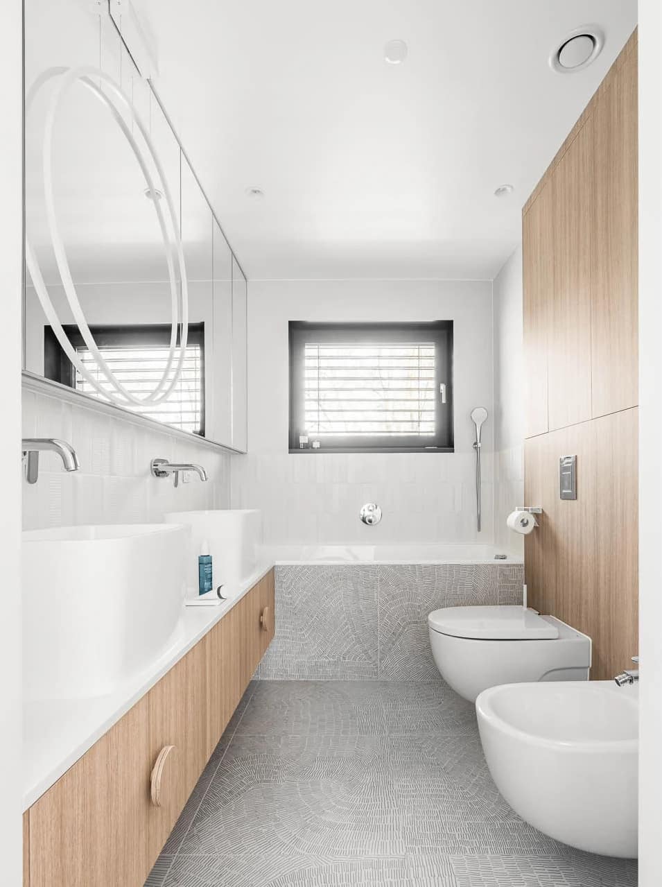
From the bedroom there is direct access to an internal private bathroom with a bath and two sinks. The wall with the toilet and the bidet is built entirely in woodgrain laminate board, which is found in all furniture pieces throughout the house. There are cupboards above the built in racks, as behind the mirrored fronts along the full length of the opposite wall. The only mirrored front that is a fixed element is behind the hanging circular lamp, the led lamp perfectly illuminates the face when applying make-up. The bathtub with its thin rim flows smoothly into the lines of the white Corian worktop under which are suspended additional drawers with an interesting form of handles made of plywood and covered on the front with the same laminate as the drawers.
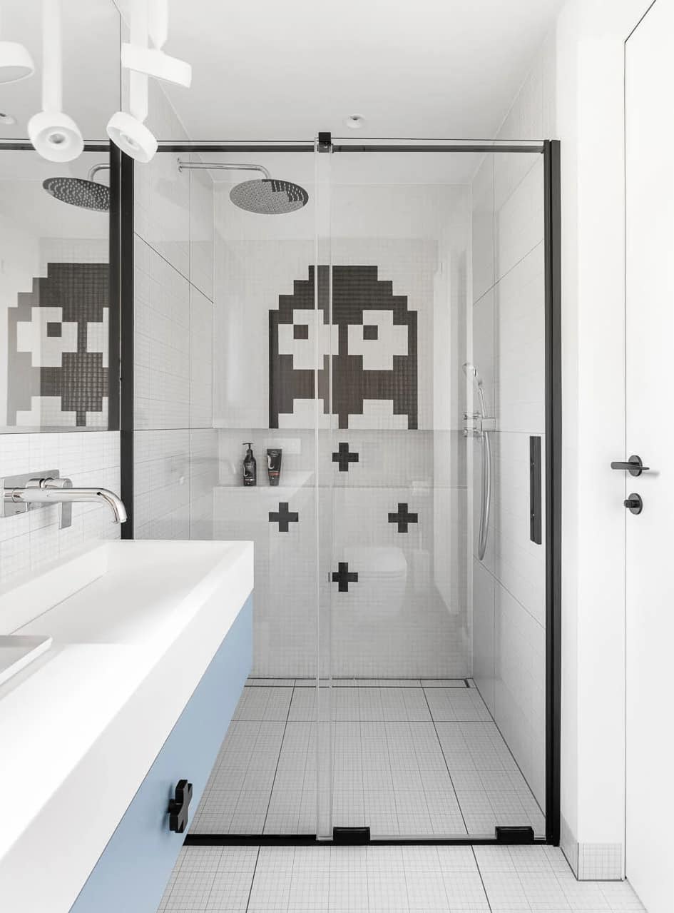
The second bathroom on the first floor is a typical children’s bathroom. Here, too, there is a woodgrain panel on the wc as a colour accent that warms up the interior, along with a combination of white tiles that look like a checkered page from a school notebook and a custom-made mosaic according to my design based on a graphic from a 1980s computer game. An additional colour accent in the interior is the laminate in blue and the accessories in black. A bidet was also installed here next to the wc. An additional interesting accent is the handle of the drawer under the washbasin, which is a direct reference to the detail on the mosaic.
This bathroom also serves a key function for the frontage in terms of being able to conveniently dispose of dirty clothes. The Corian washbasin with linear drain integrated into the worktop also has an opening with a lifting circular flap, under which the laundry chute is concealed. In this way, all dirty clothes land in a basket in the utility room near the kitchen and are transported from there to the laundry room.
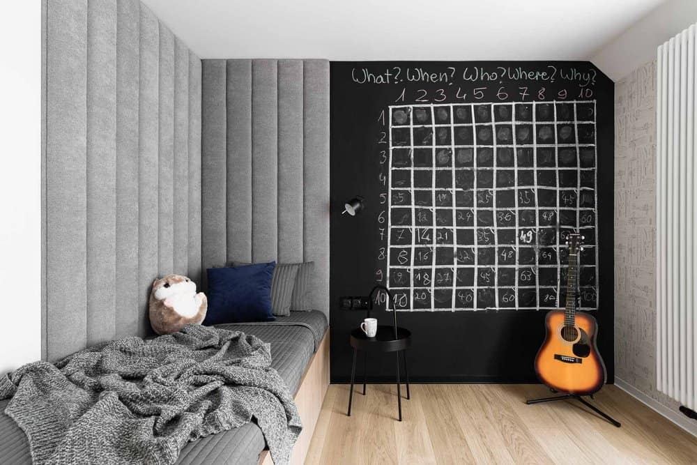
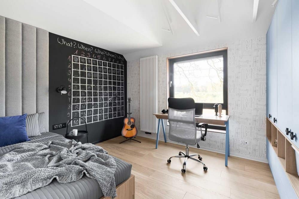
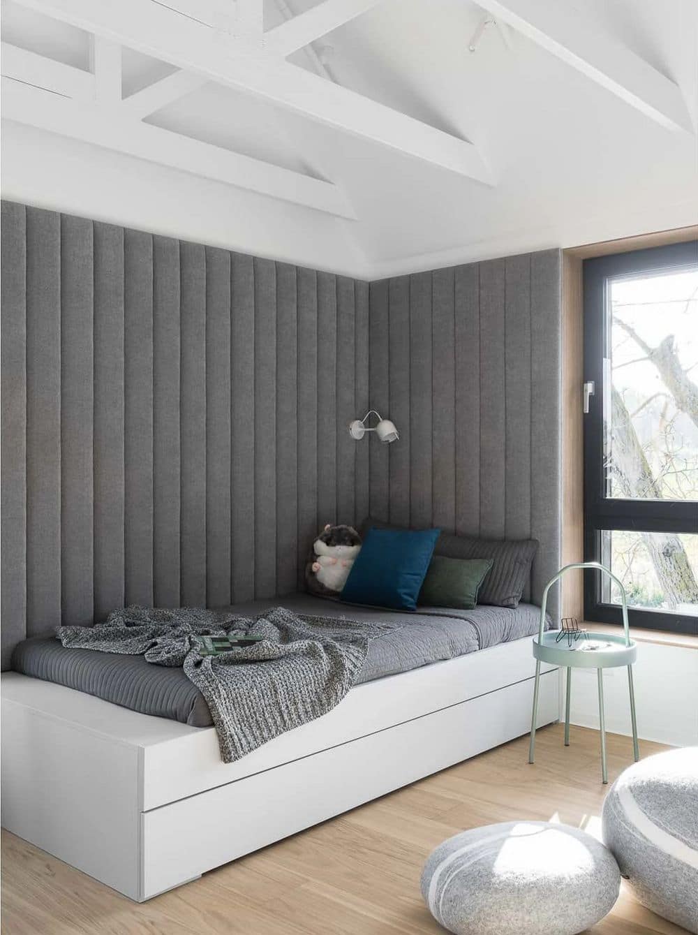
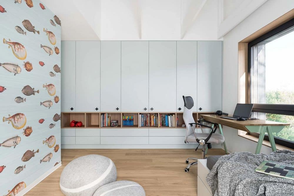
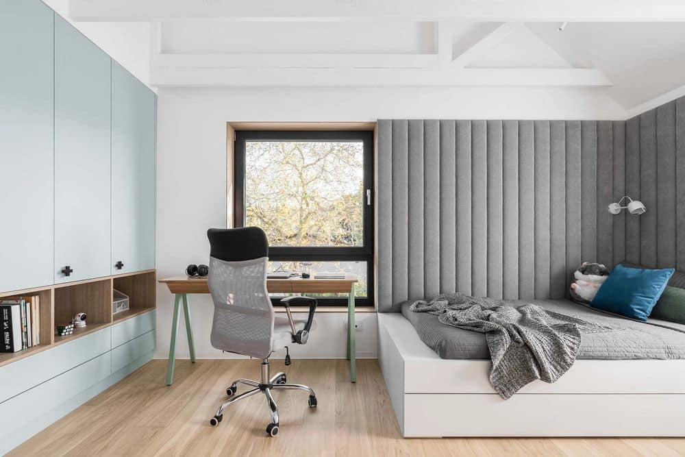
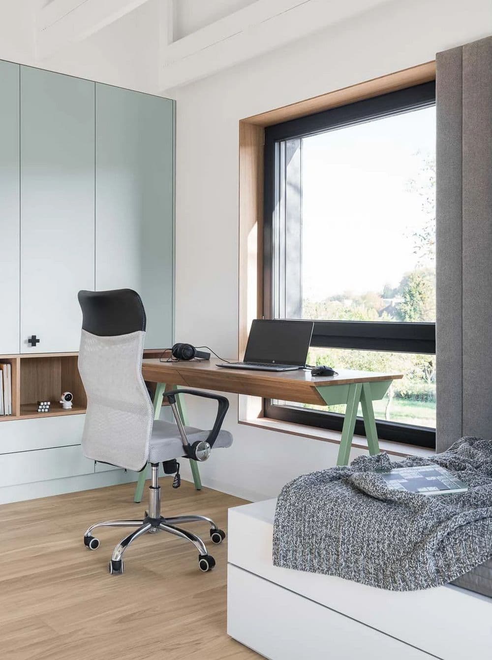
The last two rooms are the boys’ rooms, both also kept in a basic colour base, with a breakthrough of a favourite colour. The elements of both rooms are consistent, the colour of the upholstery at the beds and the form of the upholstered elements, the form of the bed cases, the wardrobes, and the window treatment. The wardrobes differ in colour and also have handles referring to the mosaic in the boys’ bathroom. The boys chose wallpaper as an addition to their rooms. In the room with the blue wardrobe, there is wallpaper on the window wall with technical drawings of aeroplanes and a blackboard wall, which comes in handy when both boys are studying. In the room with the green wardrobe, the addition is a wallpaper with a fish theme, in a shade that relates to the laminate on the wardrobe. An interesting element left to be realised for the future is the mezzanine floor between the boys’ rooms called the ‘hollow’, once the ladders to the loft have been made, the boys will have their play base there.
